Jany – Muesli
- Naming
- Branding
- Packaging
- Illustration
Jany was born around honey, but this project explores how a brand can grow without losing its coherence.
The muesli range emerges as a natural extension of the Jany universe — not from the need to add a new product, but from the intention to expand the moments in which the brand can become part of everyday life. The goal was not to compete with the core product, but to build a system capable of coexisting and complementing it.
Through a clean, restrained, editorial approach, the project introduces a new category within the brand while preserving its visual and conceptual essence.
Concept
The project starts from a simple idea: building a brand is not about constantly adding elements, but about expanding a language with consistency.
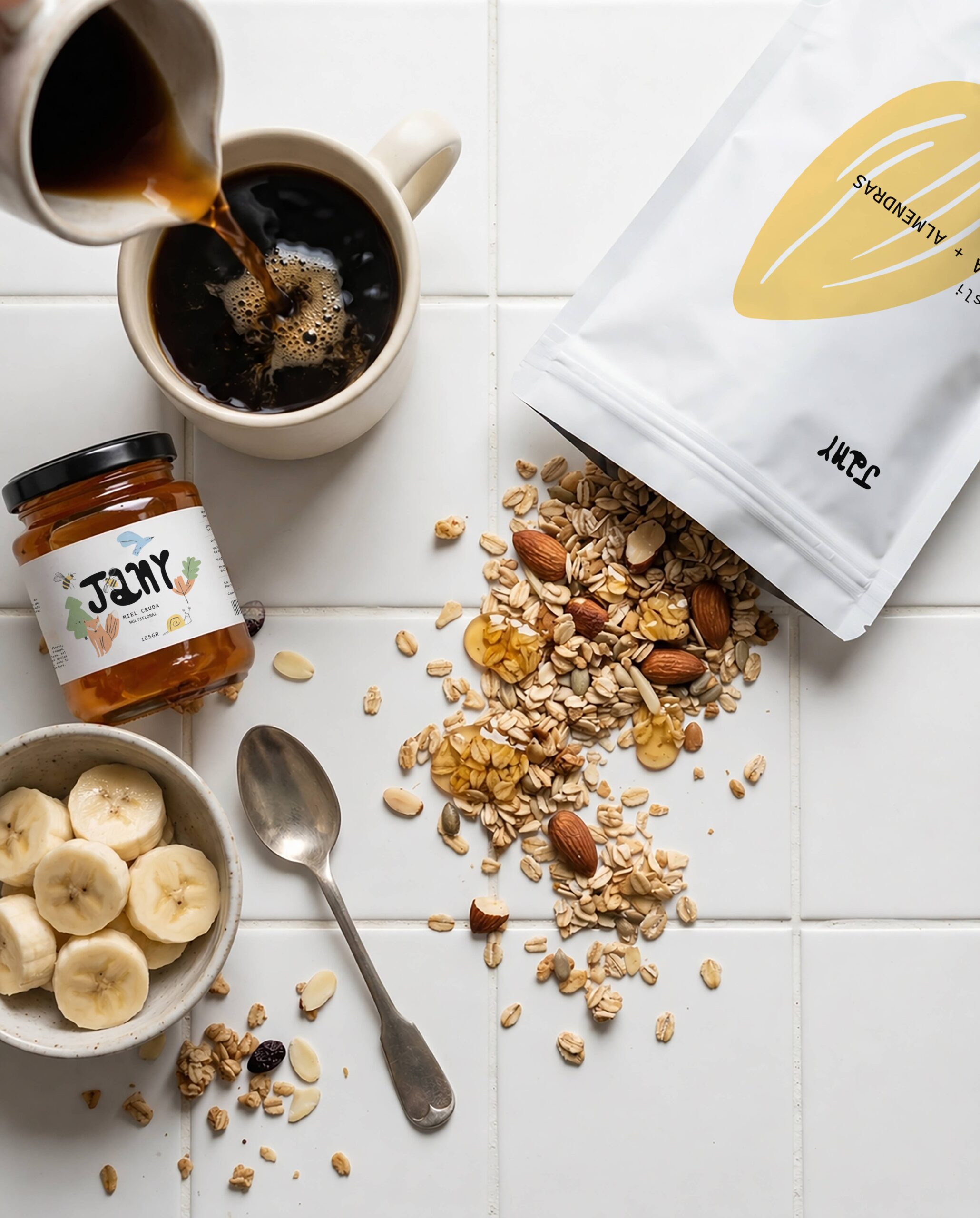
Muesli is introduced as a neutral, understated product, designed to accompany honey as part of an everyday ritual. Rather than taking center stage, it acts as a supporting element — a way to enrich the experience around the original product.
This extension demonstrates how a strong identity can adapt to new formats and consumption occasions without disrupting its balance or losing recognition.
Jany doesn’t sell muesli.
Jany creates new ways to enjoy honey.
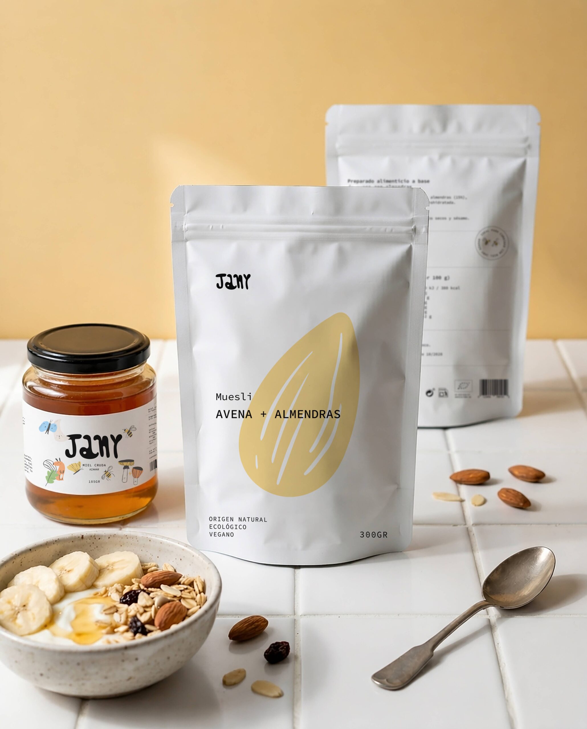
Packaging Design
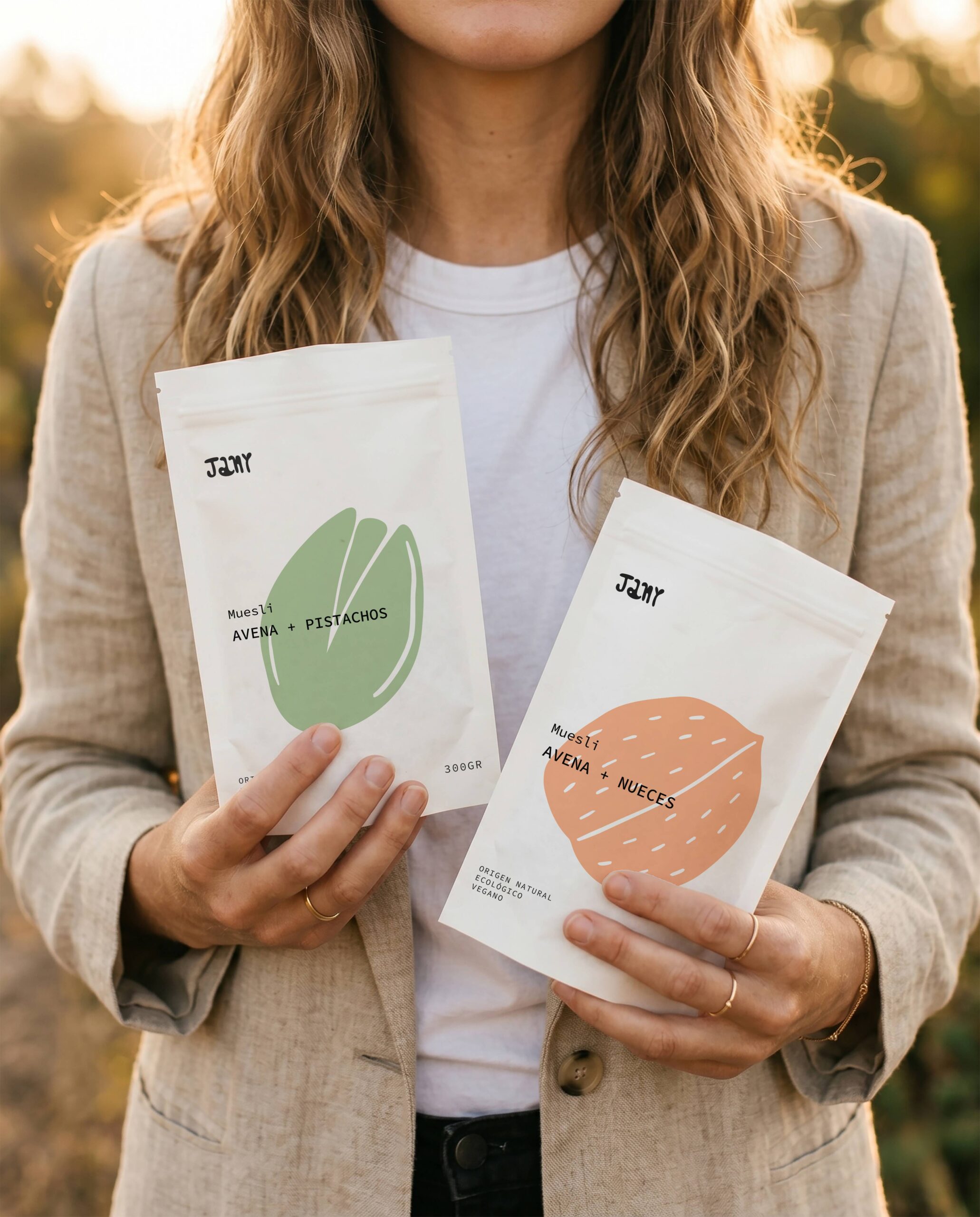
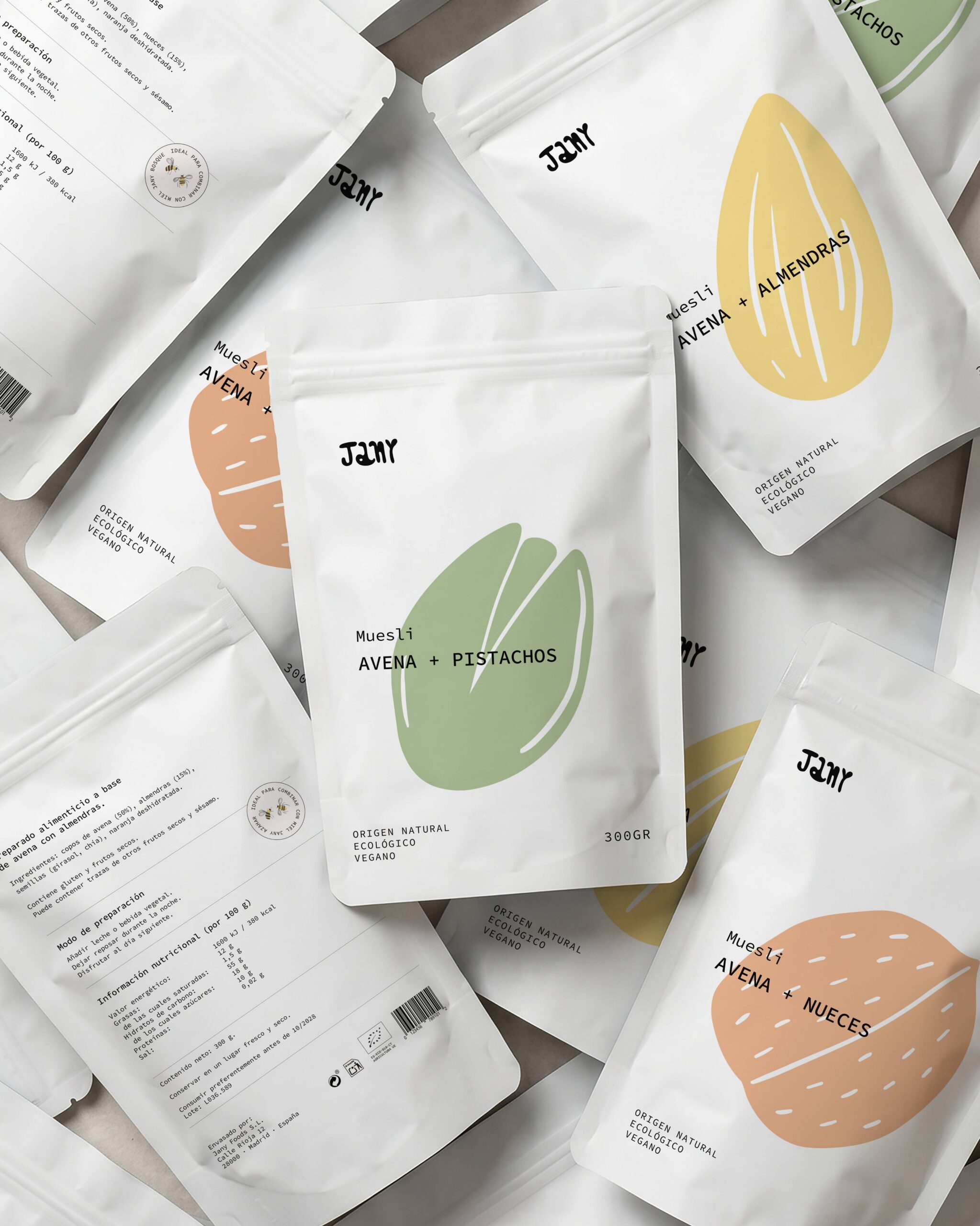
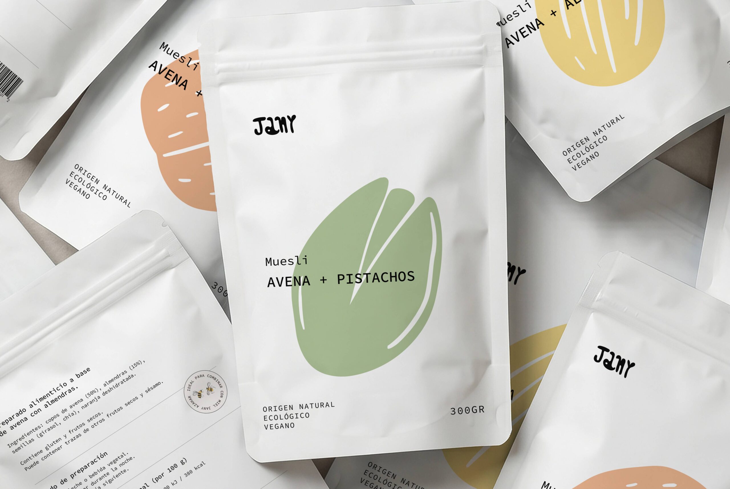
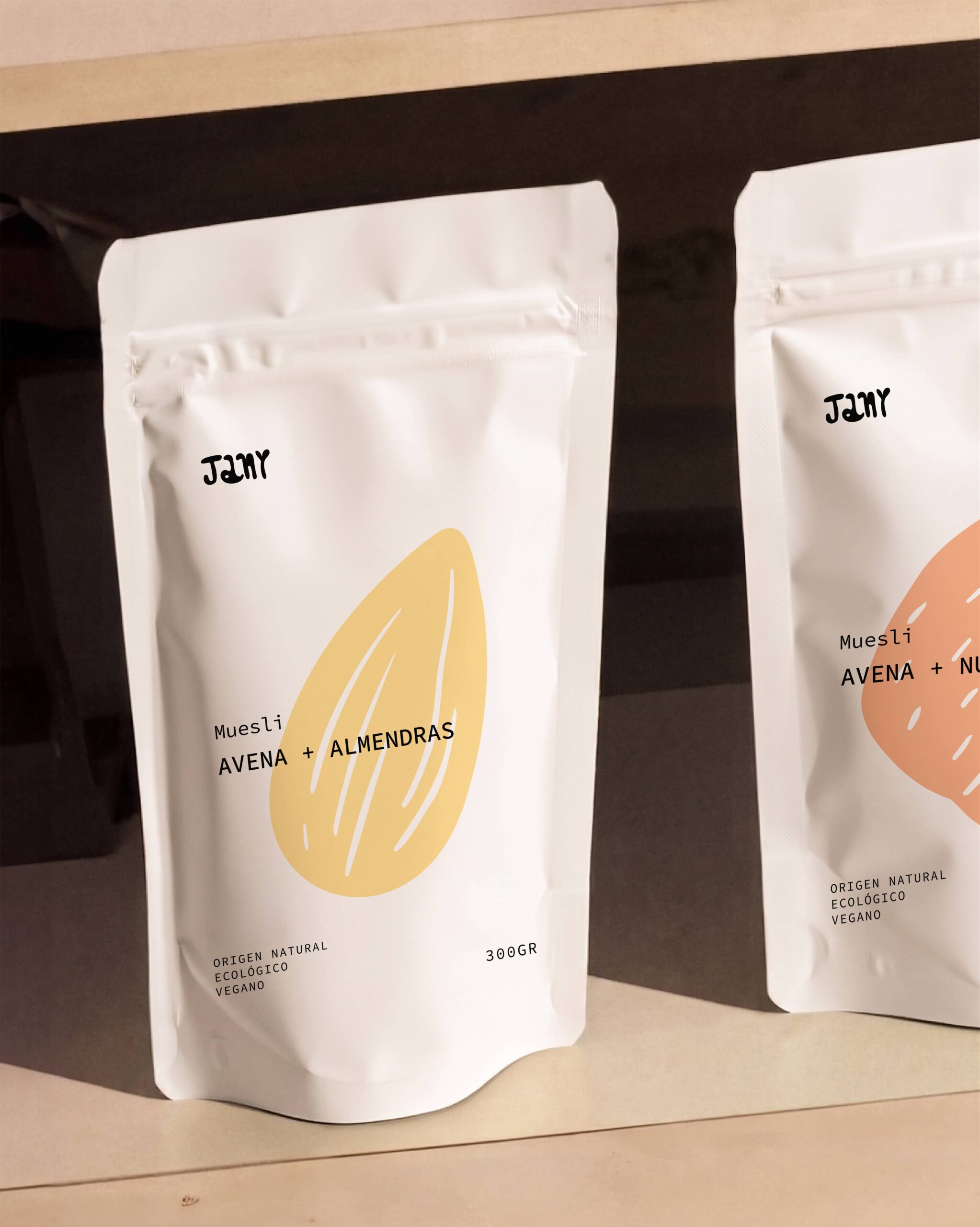
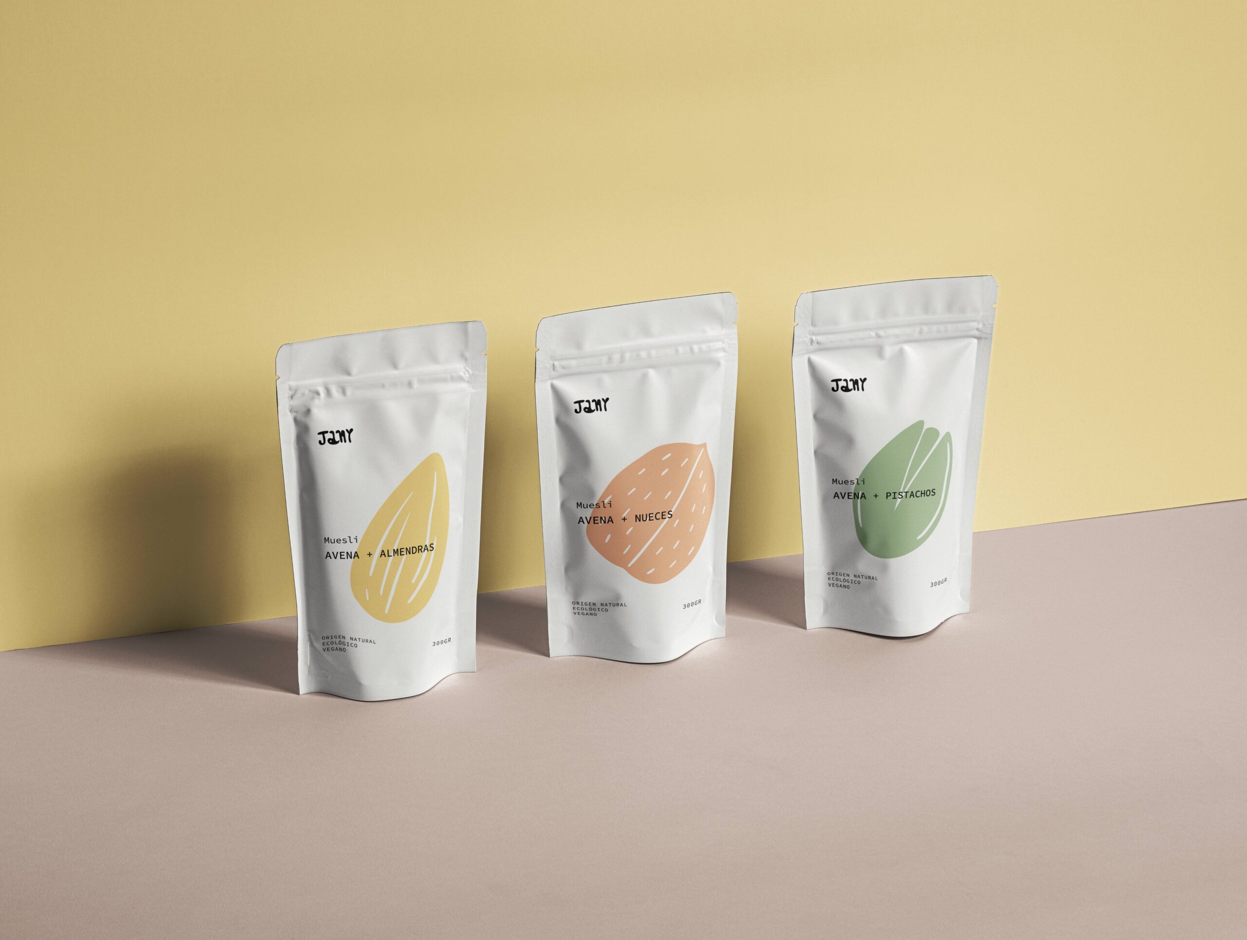
The packaging system retains the visual codes developed in the original project: minimalist composition, organic illustrations, and a calm, editorial art direction.
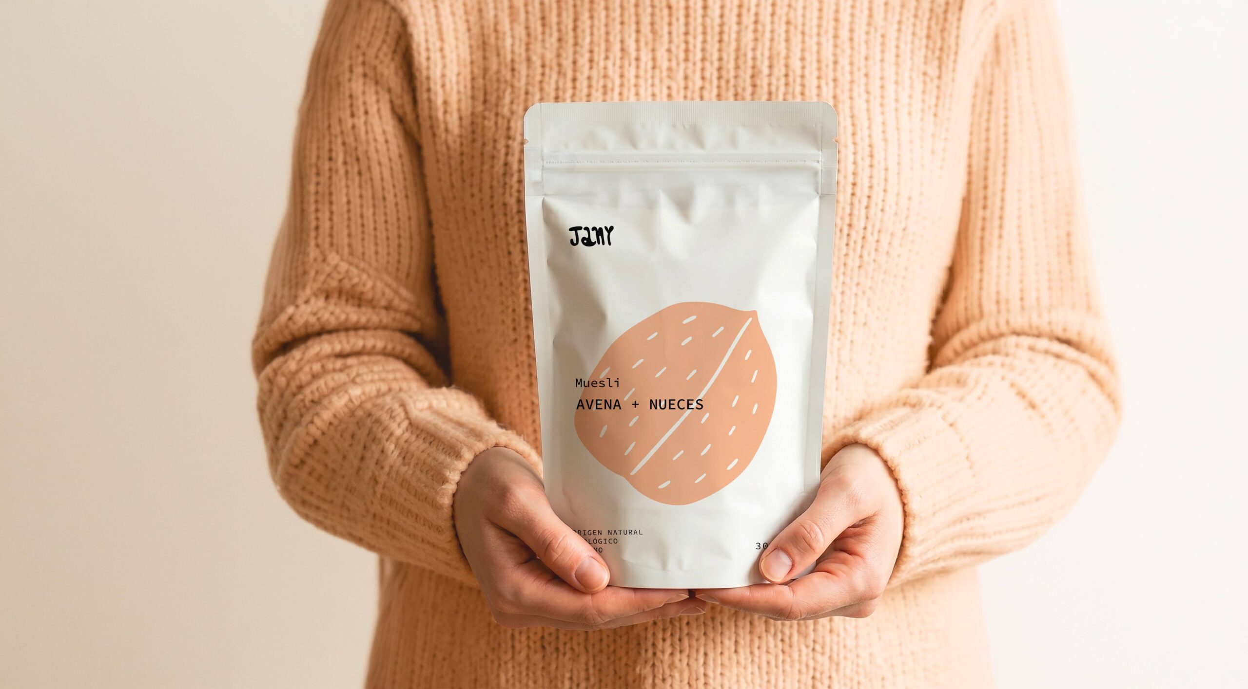
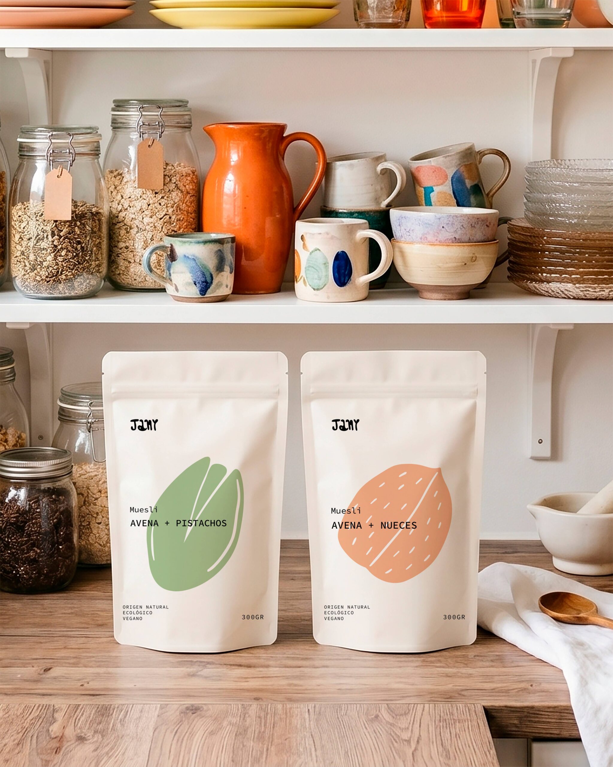
The design strips the elements back to a minimum, giving the product space to breathe while reinforcing a sense of simplicity and naturalness. The different varieties are distinguished through subtle changes in color and illustration, while maintaining a shared structure that brings consistency to the system.
The pouch format introduces a more everyday, functional dimension to the Jany universe, allowing the brand to enter new contexts without losing its identity.