Jany – Botanical Beverages
- Naming
- Branding
- Packaging
- Illustration
After developing Jany’s visual identity and its range of honey and muesli products, the next step was to explore how a brand built on a solid strategy can expand into new categories without losing coherence.
This collection of botanical beverages was created as an extension of the brand, demonstrating how a well-designed identity system can adapt, evolve, and retain its distinctive personality.
Concept
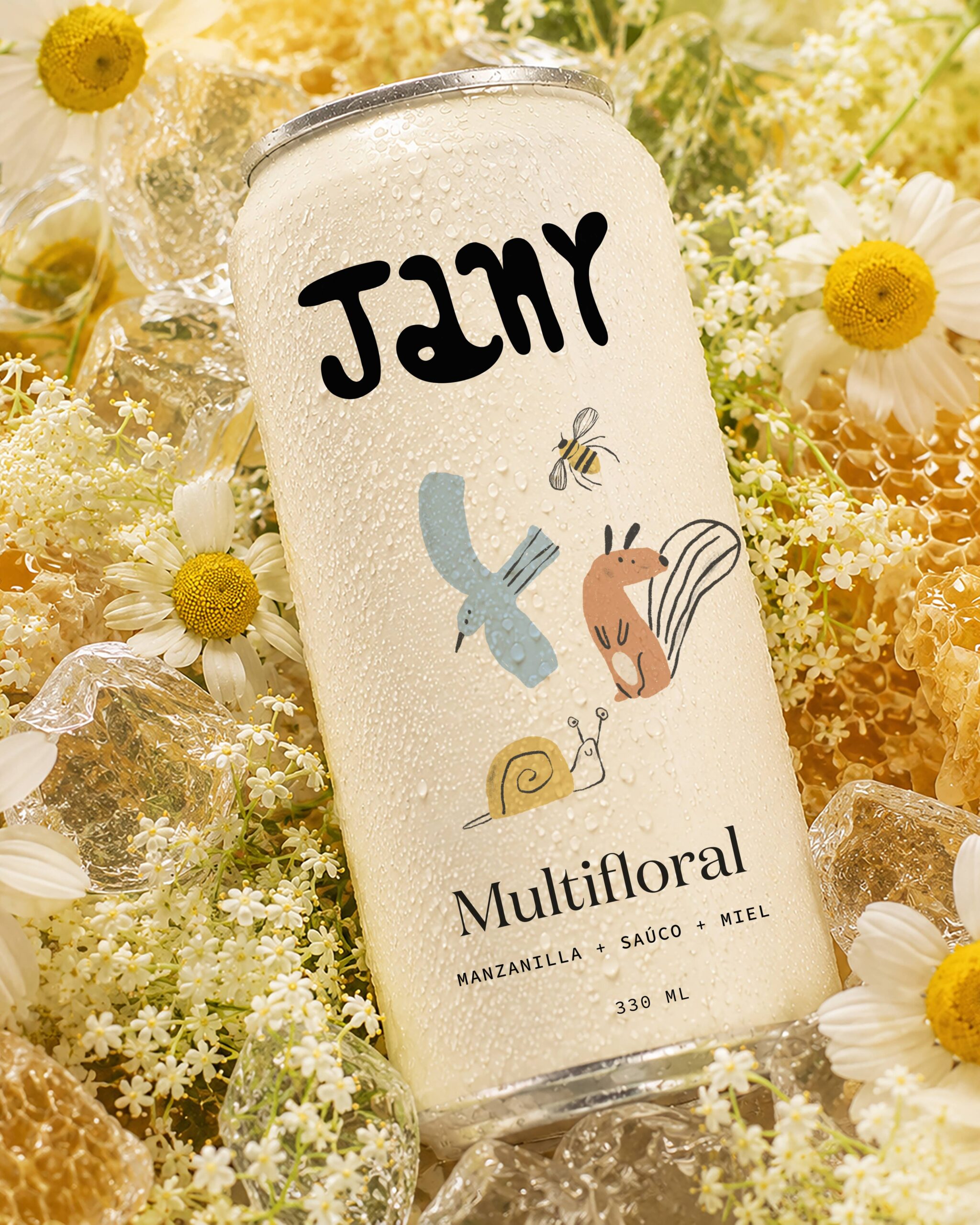
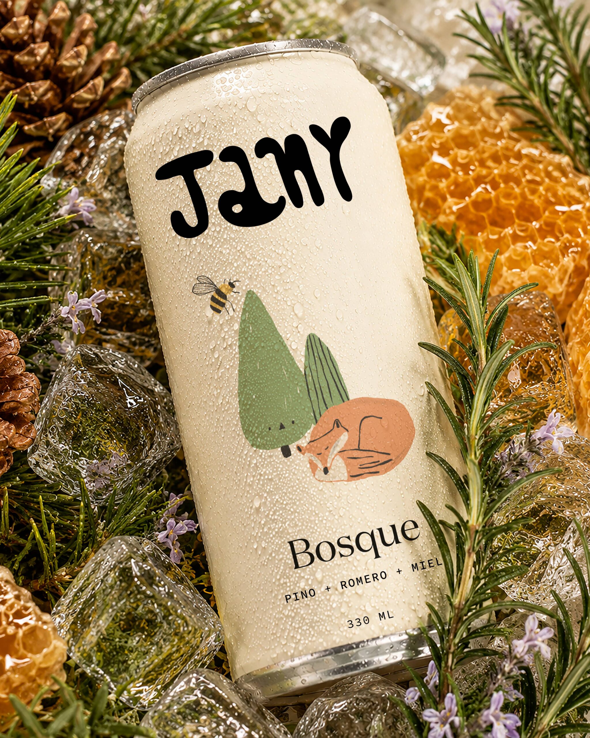
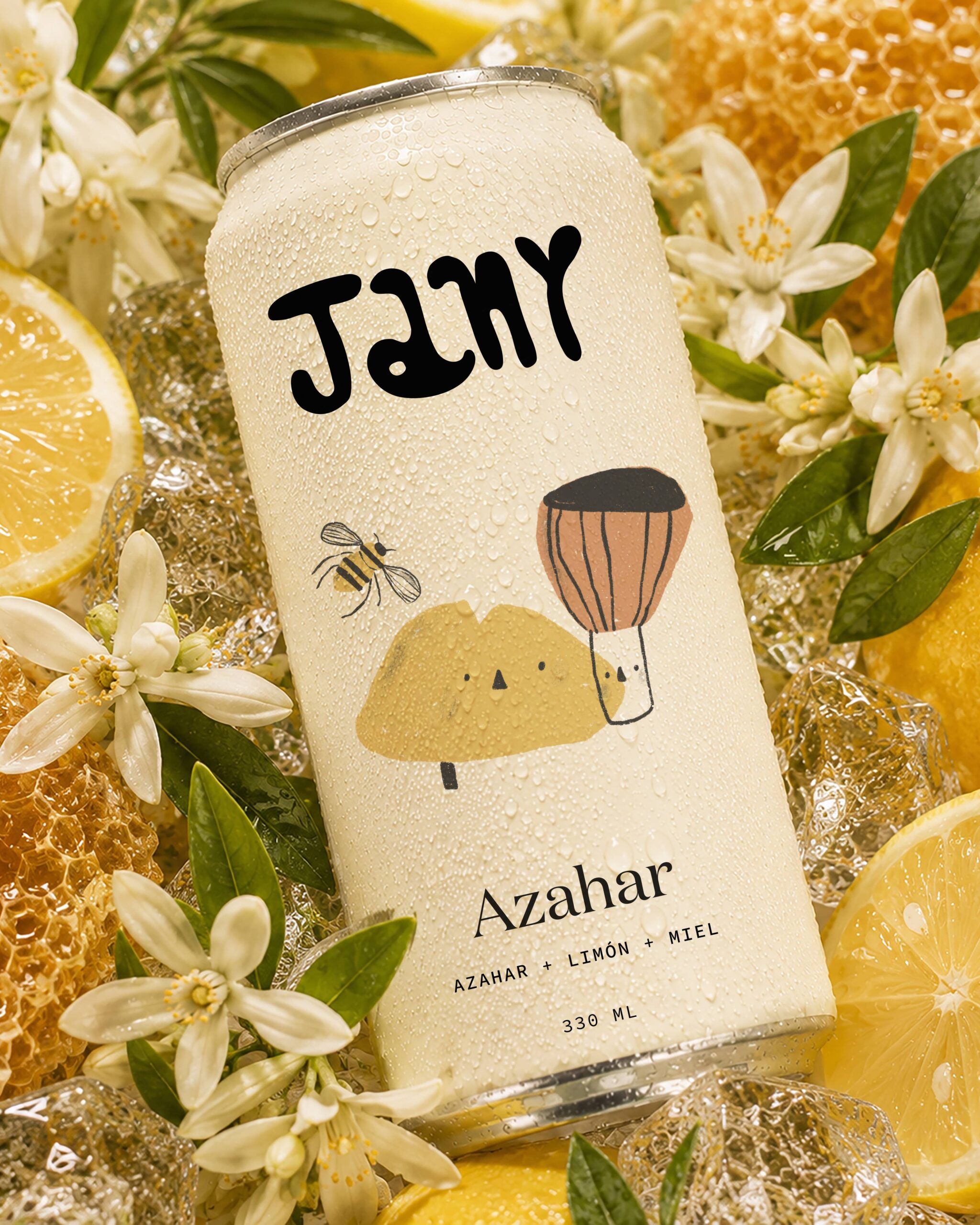
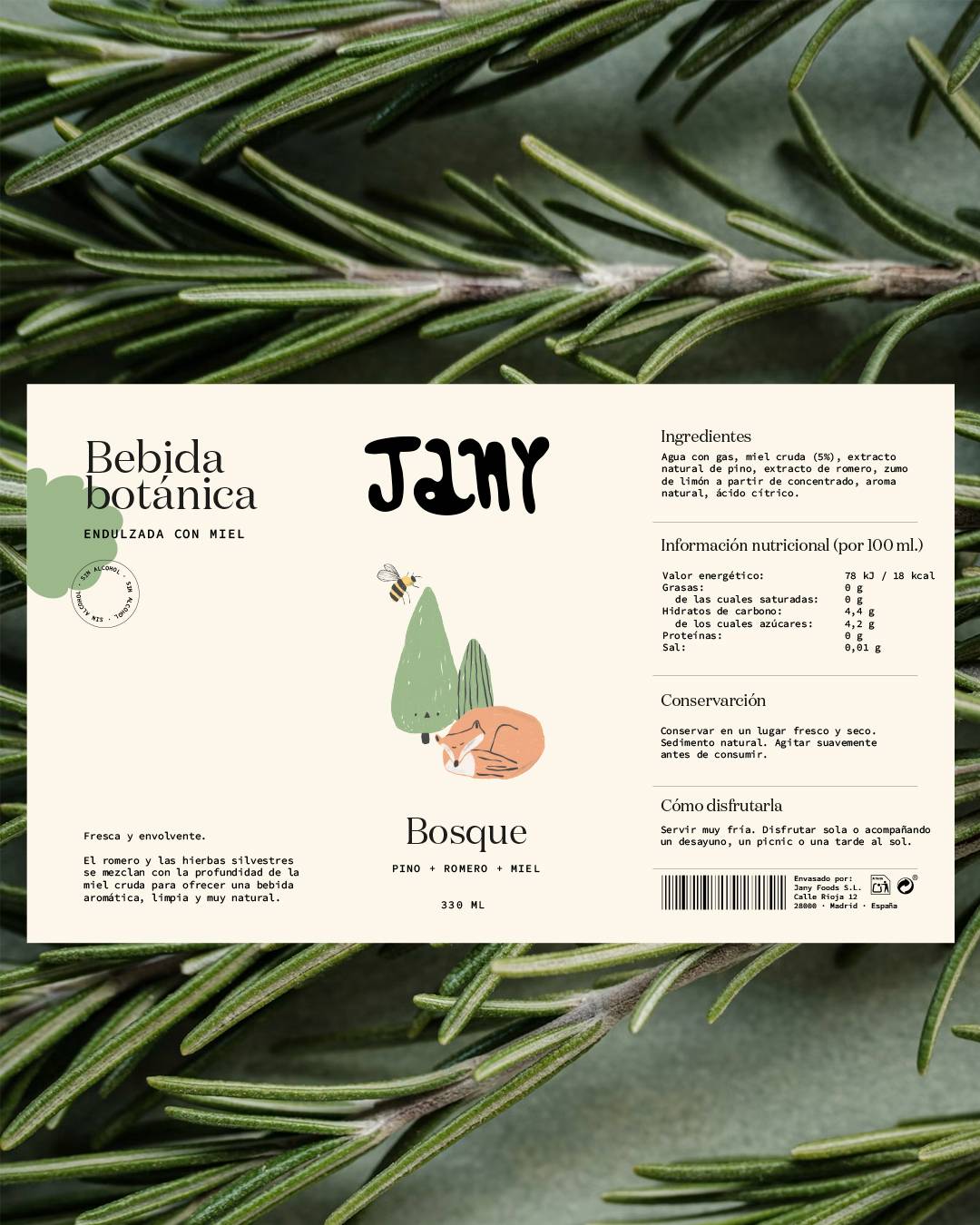
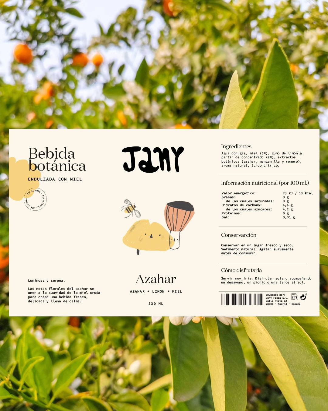
The proposal draws inspiration from Jany’s three honey varieties — Orange Blossom, Forest, and Multifloral — translating their aromas and nuances into a new product category.
Rather than simply designing a collection of beverages, the aim was to explore how the brand’s universe could naturally expand while maintaining the same visual language, approachable tone, and connection to nature and everyday rituals.
Each product becomes a new way of experiencing the essence of Jany, reinforcing the perception of a flexible, consistent brand ready to evolve.
Packaging Design
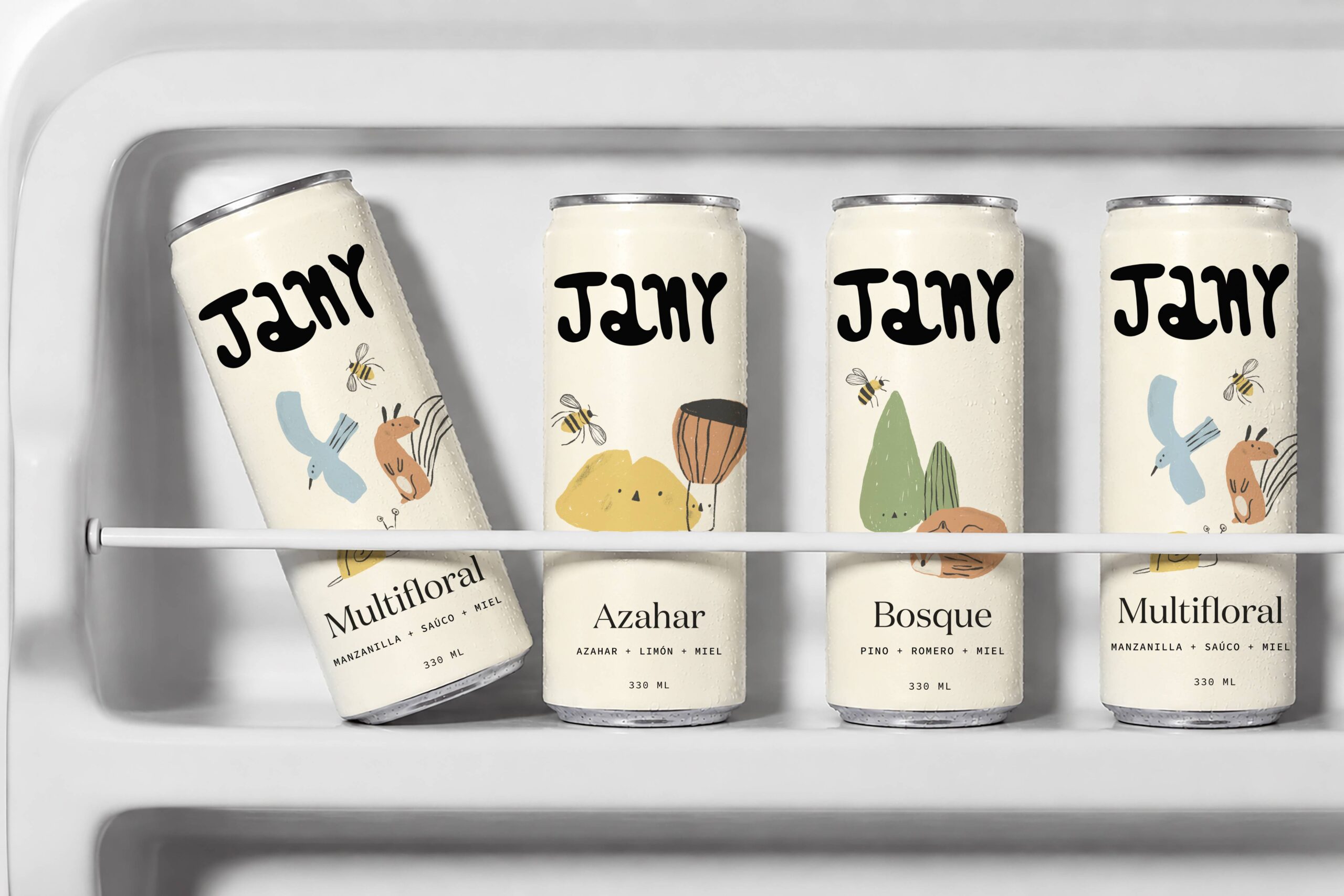
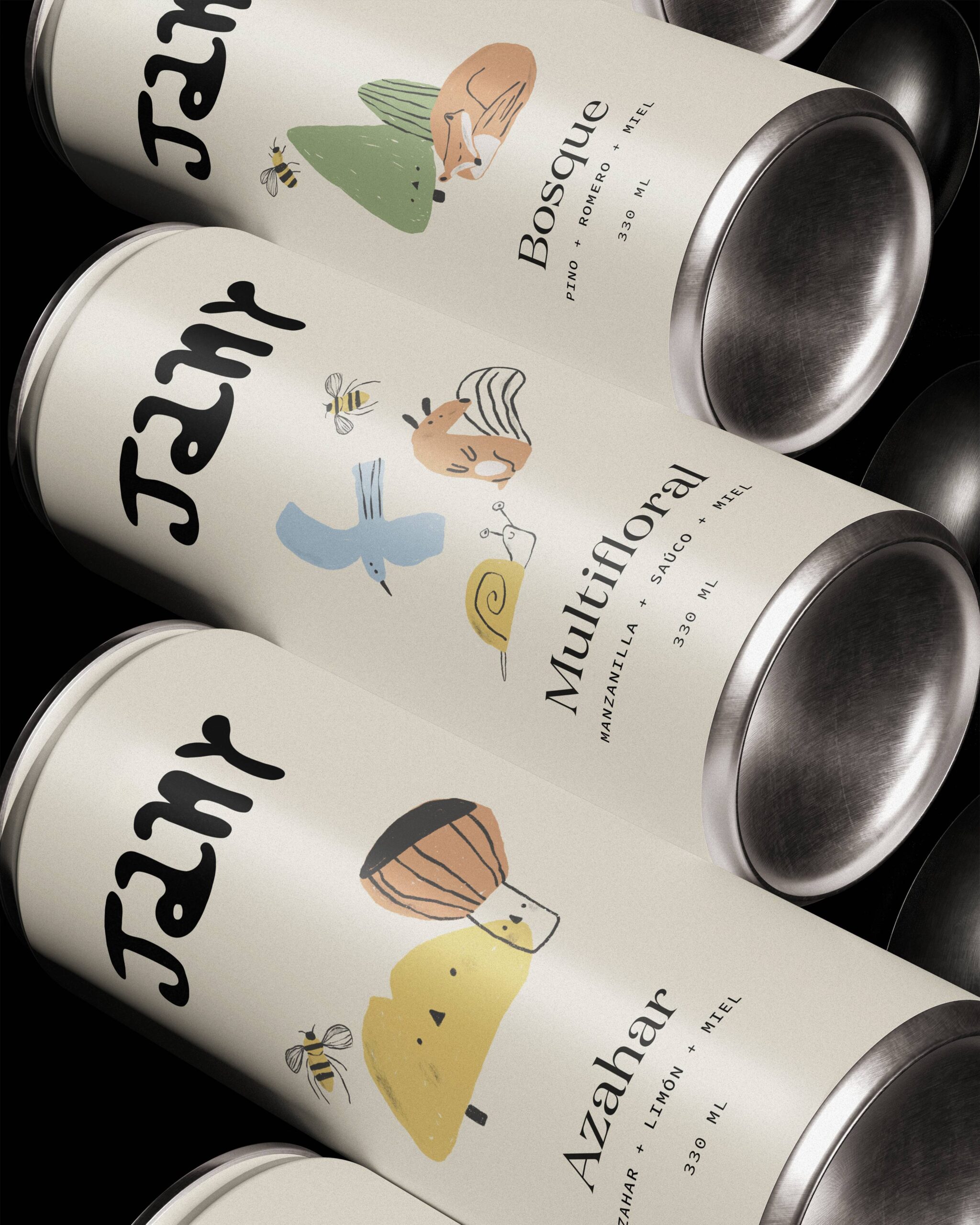
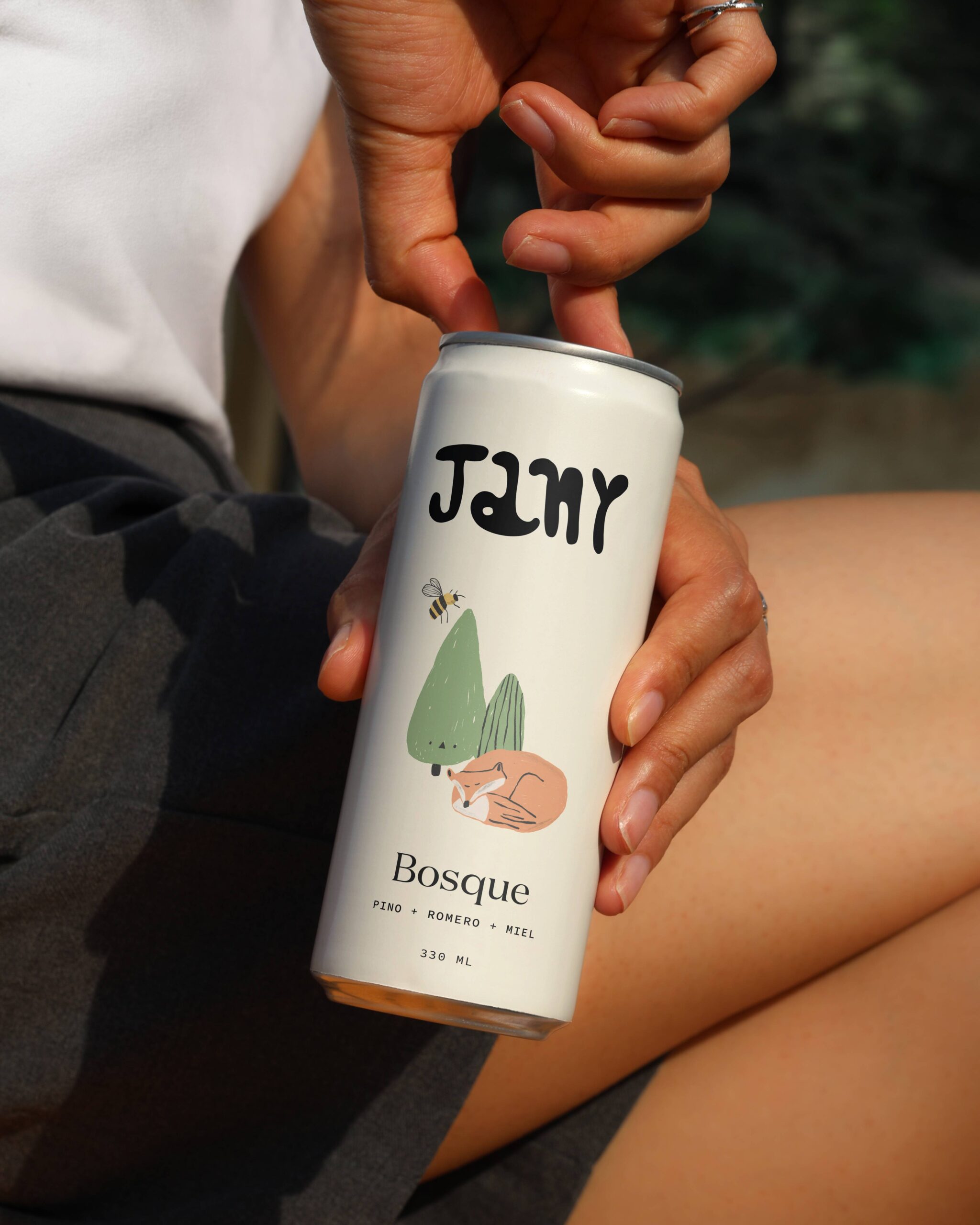
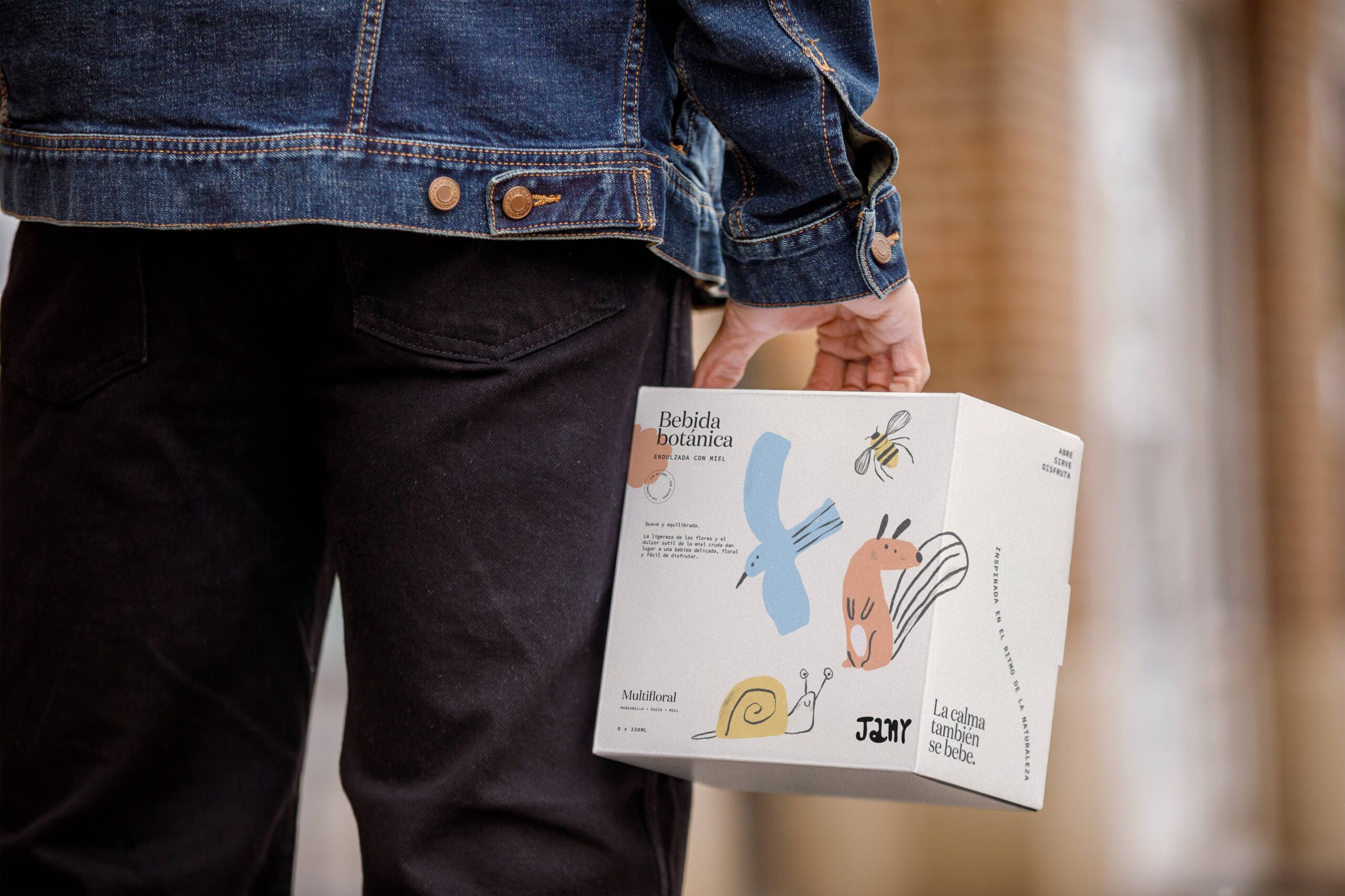
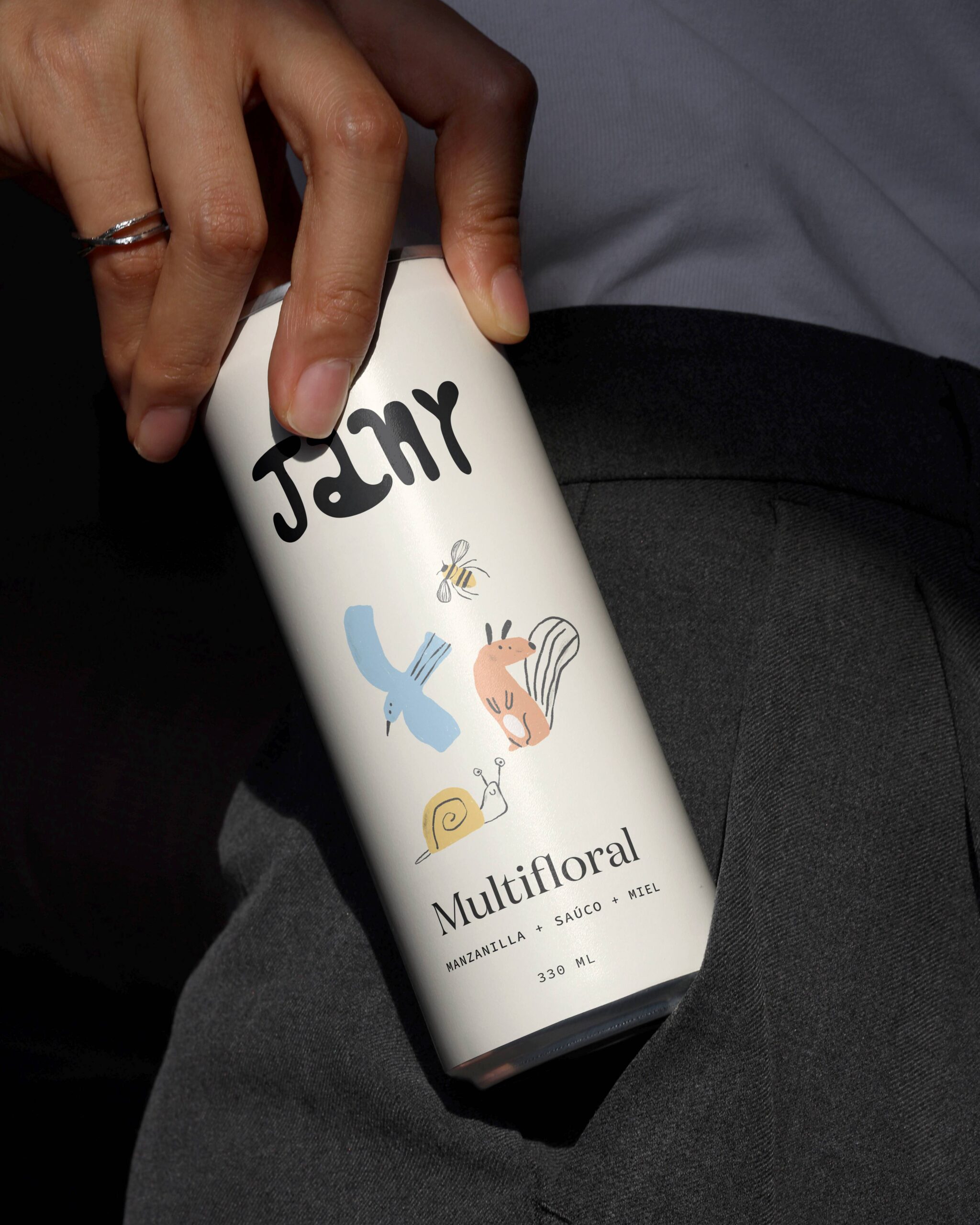
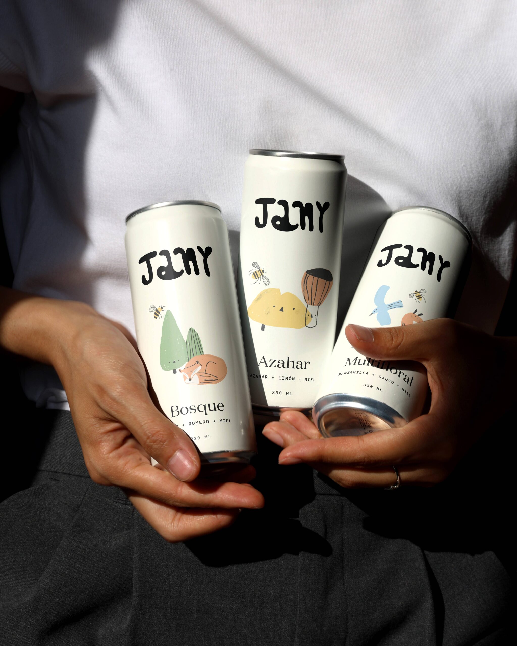
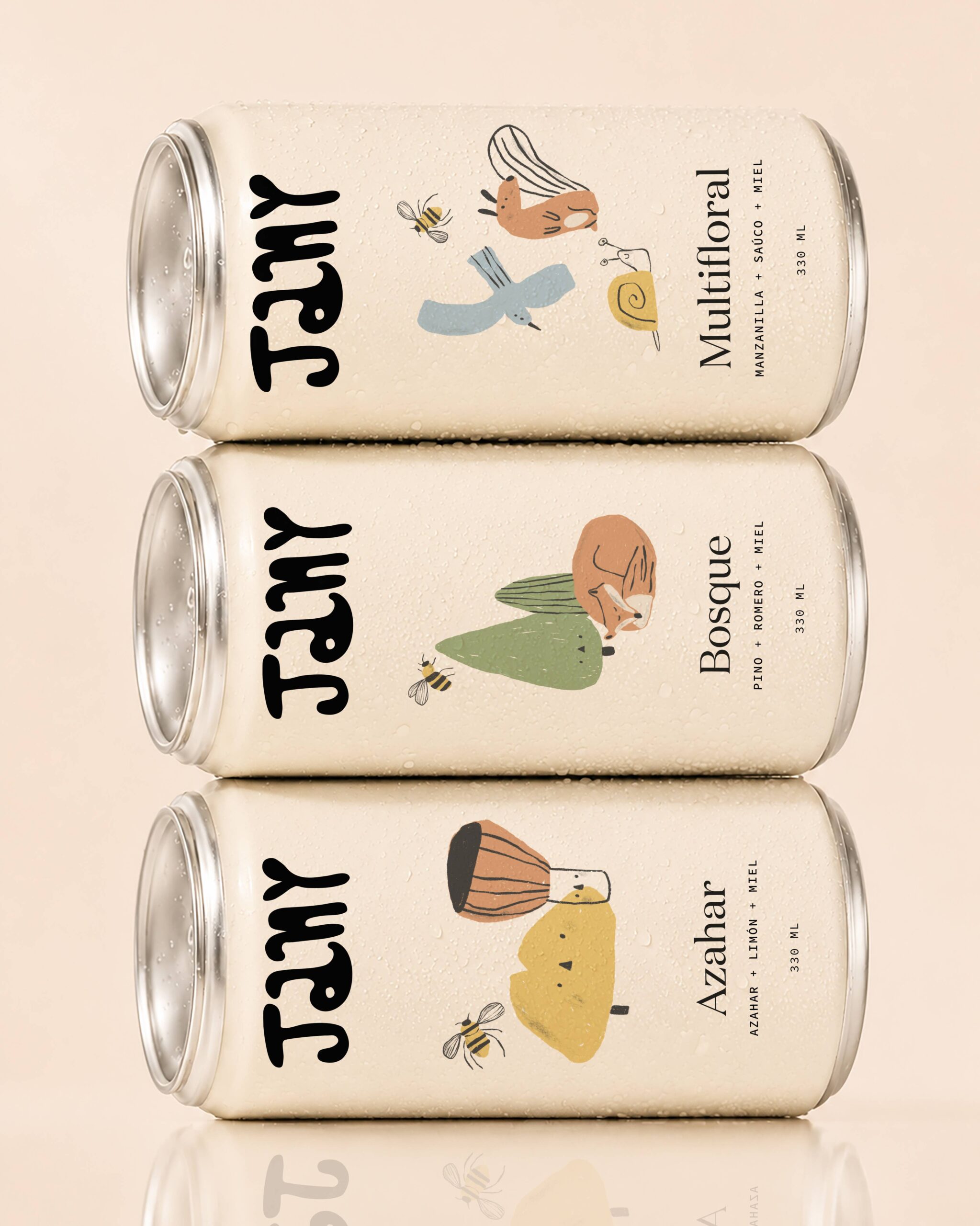
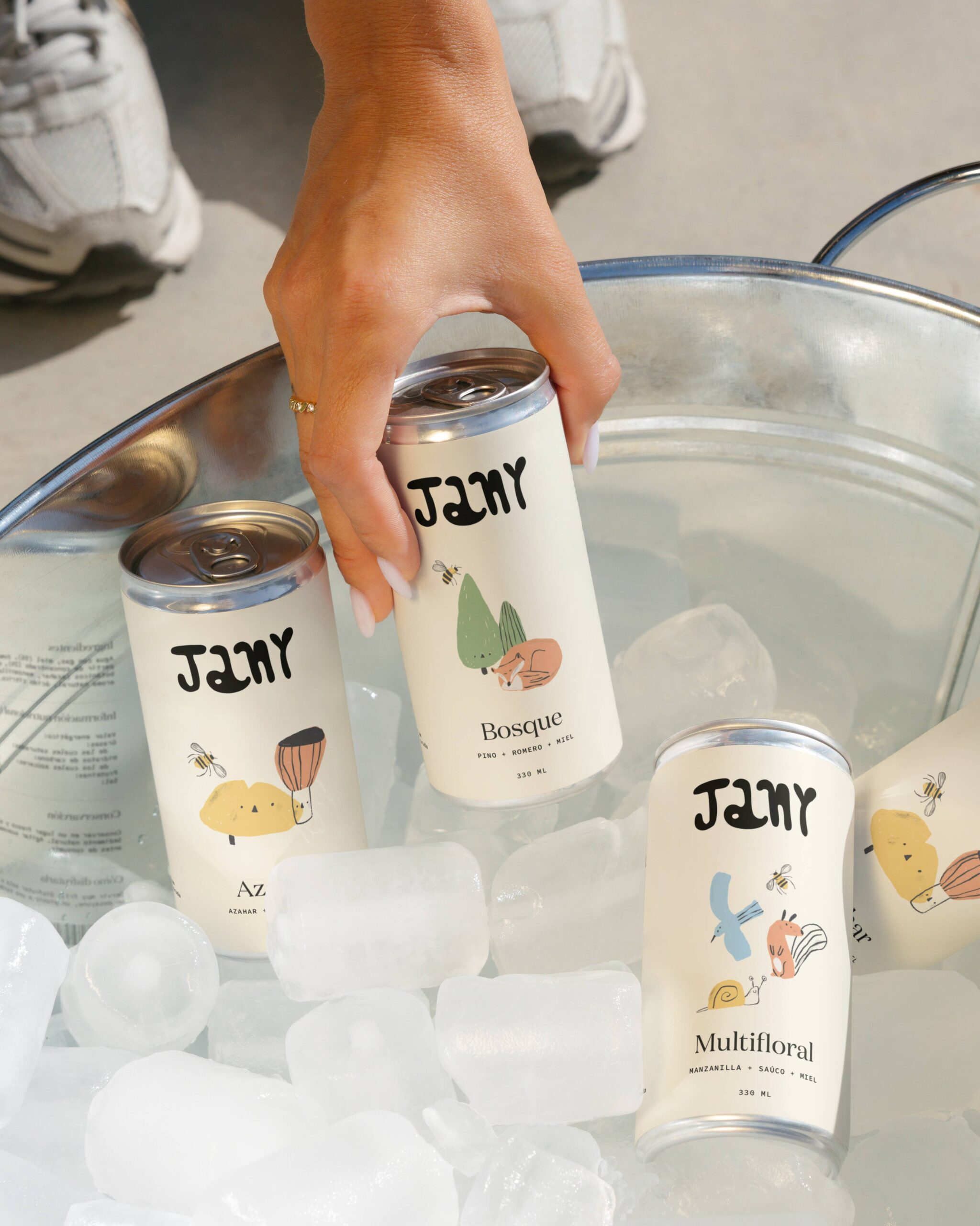
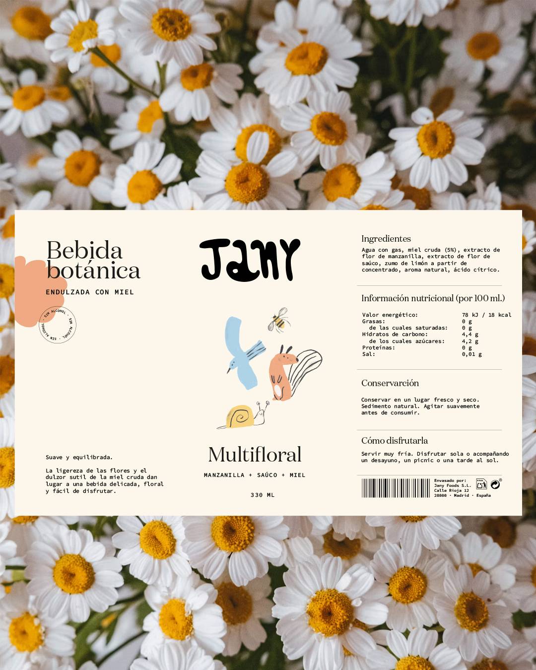
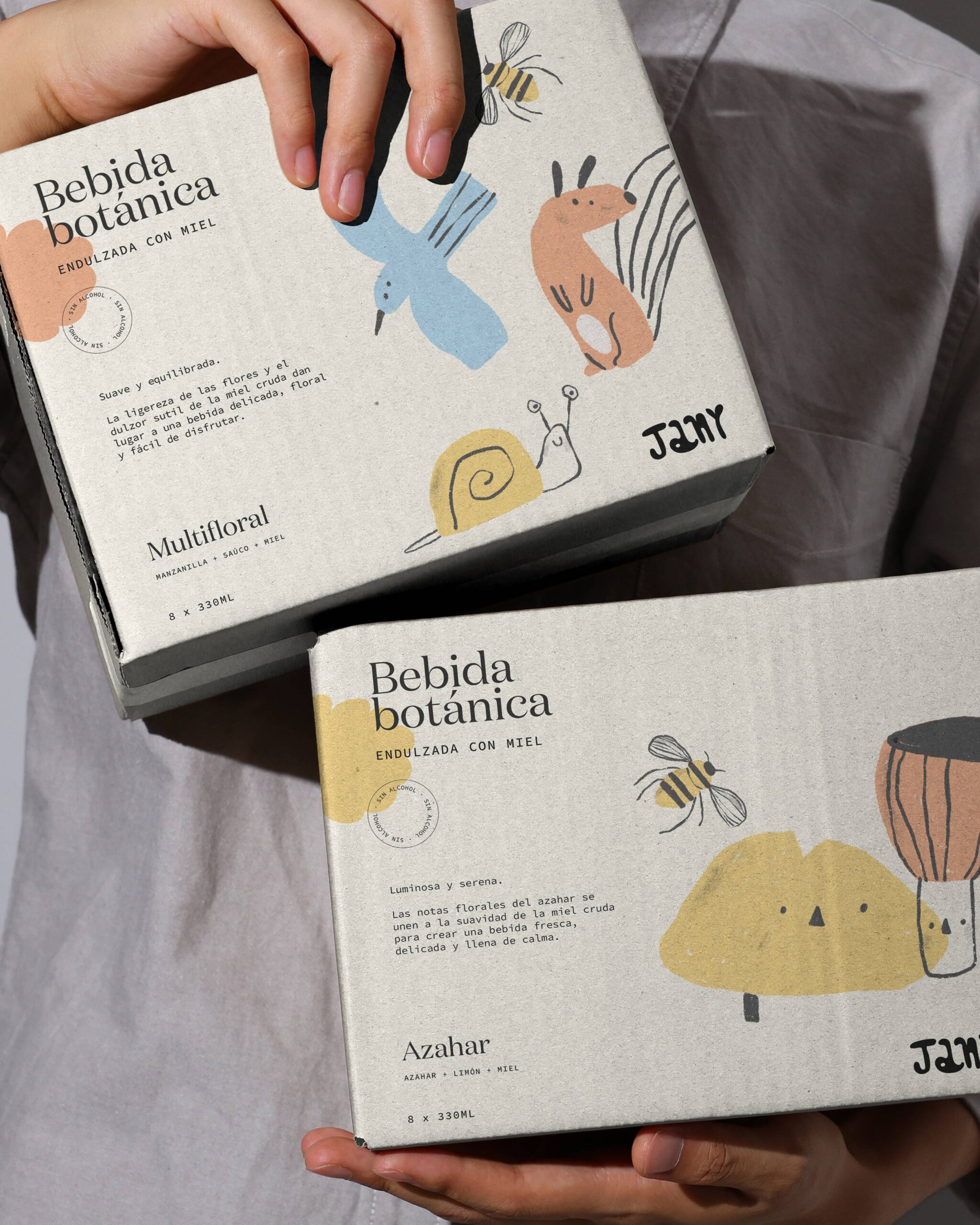
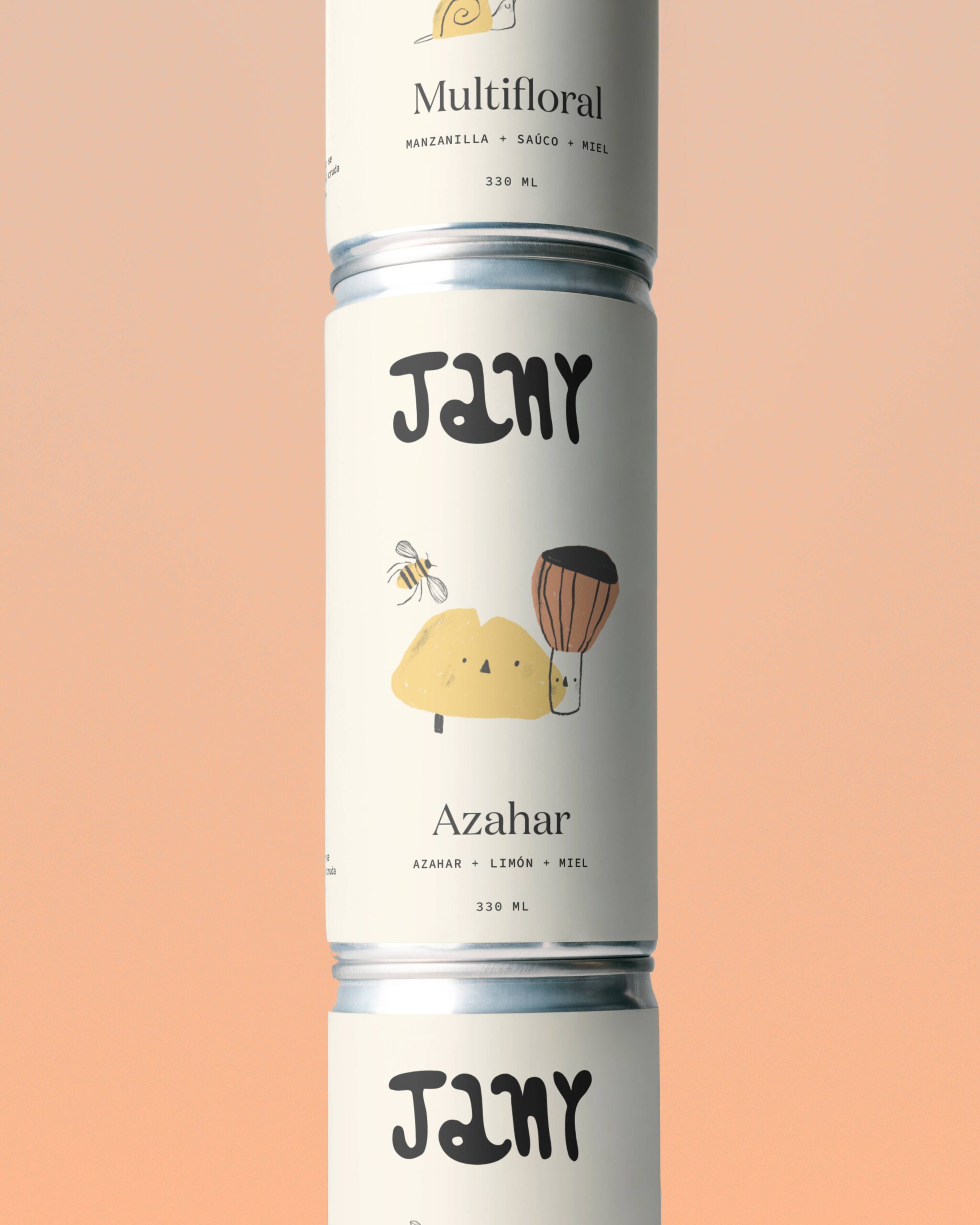
The packaging system retains the essential elements of Jany’s identity to ensure brand recognition across any category.
The illustrations, developed specifically for each variety, bring personality to the range and help identify the different flavors intuitively, while a differentiated color palette makes it easier to navigate the collection. The composition, use of space, and typographic hierarchy preserve the clean and approachable aesthetic present across the rest of the brand’s products.
The result is a cohesive, recognizable, and scalable packaging family, capable of expanding Jany’s universe without compromising visual consistency.