BunFun
- Branding
- Packaging
- Illustration
Visual identity development for BunFun, a burger restaurant with a retro aesthetic and a playful, laid-back spirit.
The goal was to build a playful, dynamic, and approachable brand where the experience goes beyond the food: it’s about having fun, making people smile, and coming back for more.
Concept
BunFun is built around a clear idea: turning the everyday act of eating a burger into a moment of fun.
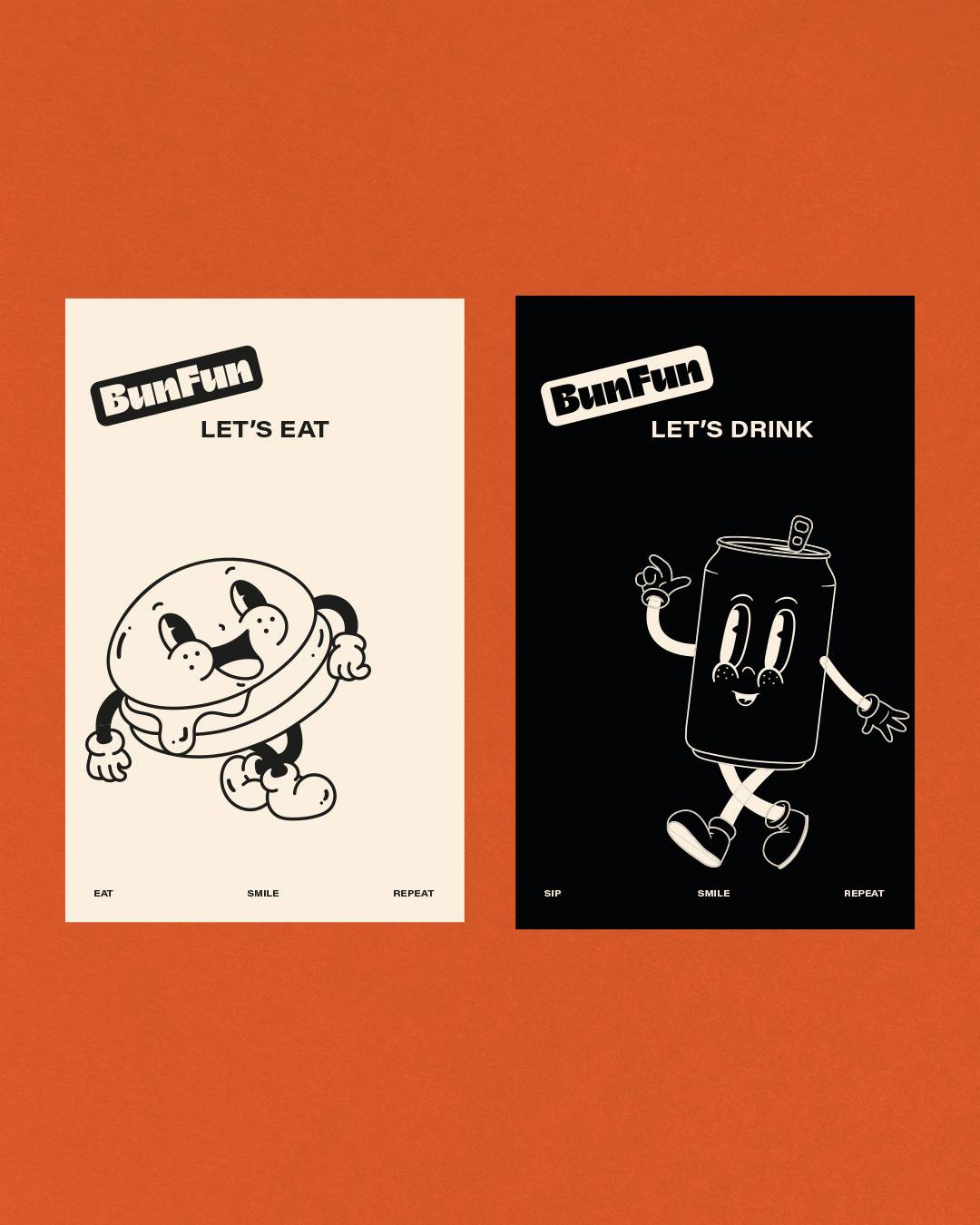
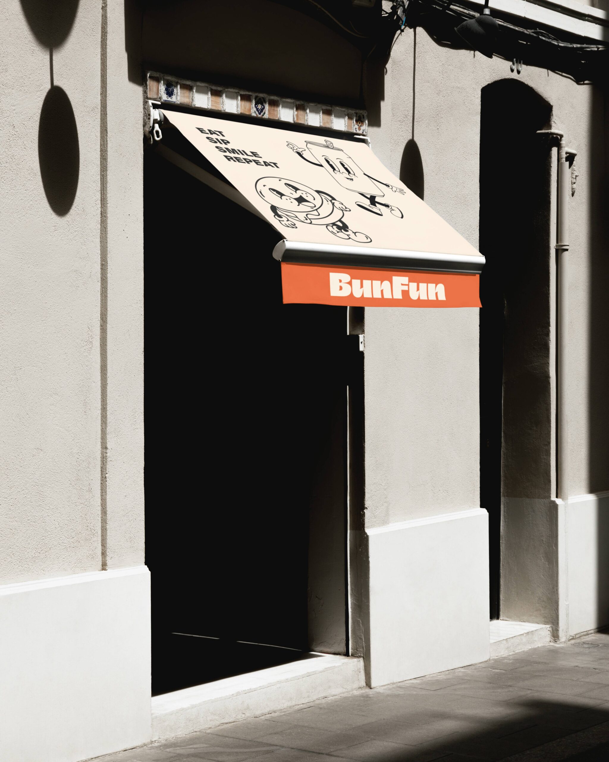
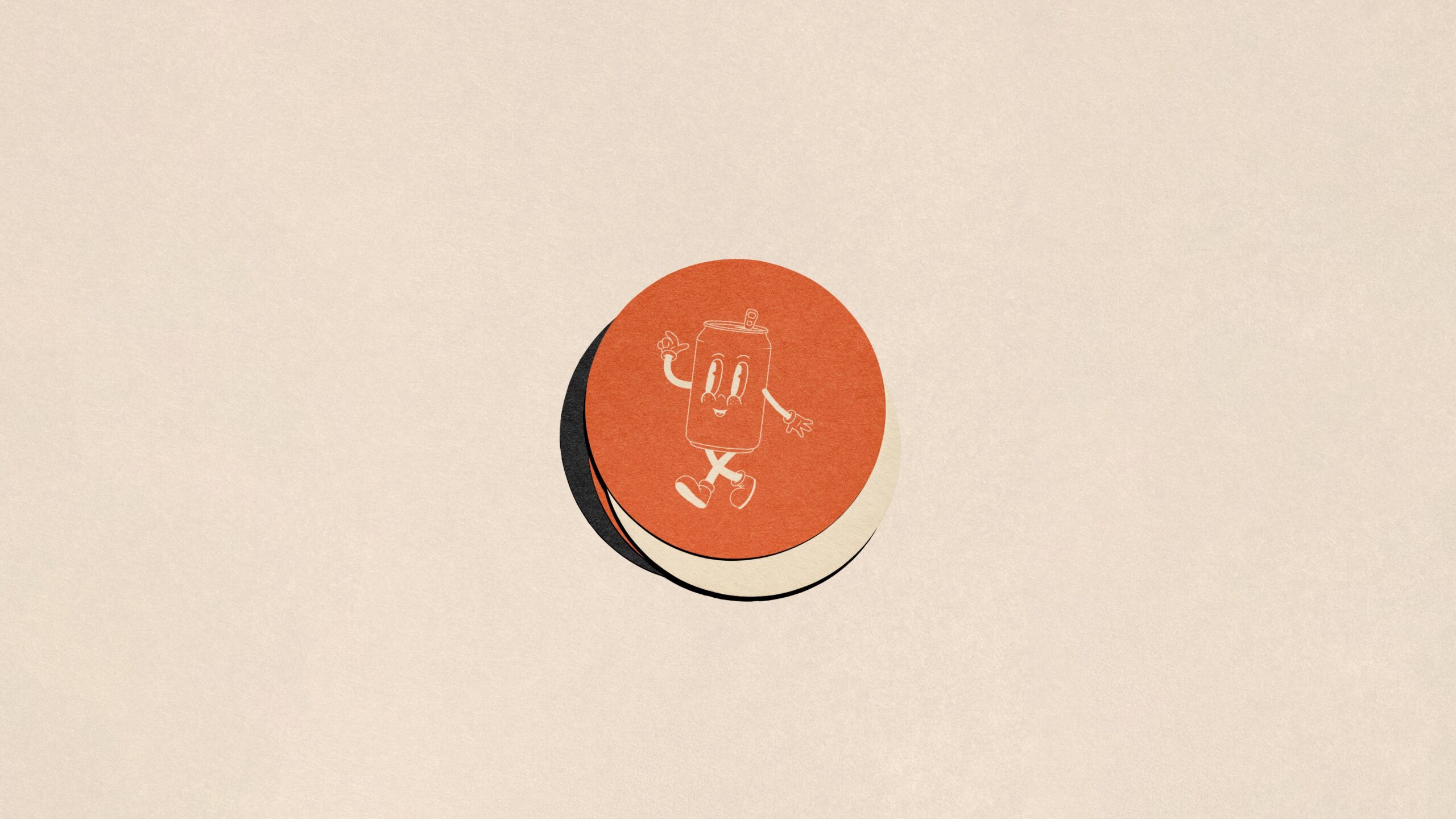
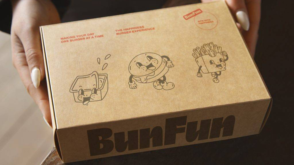
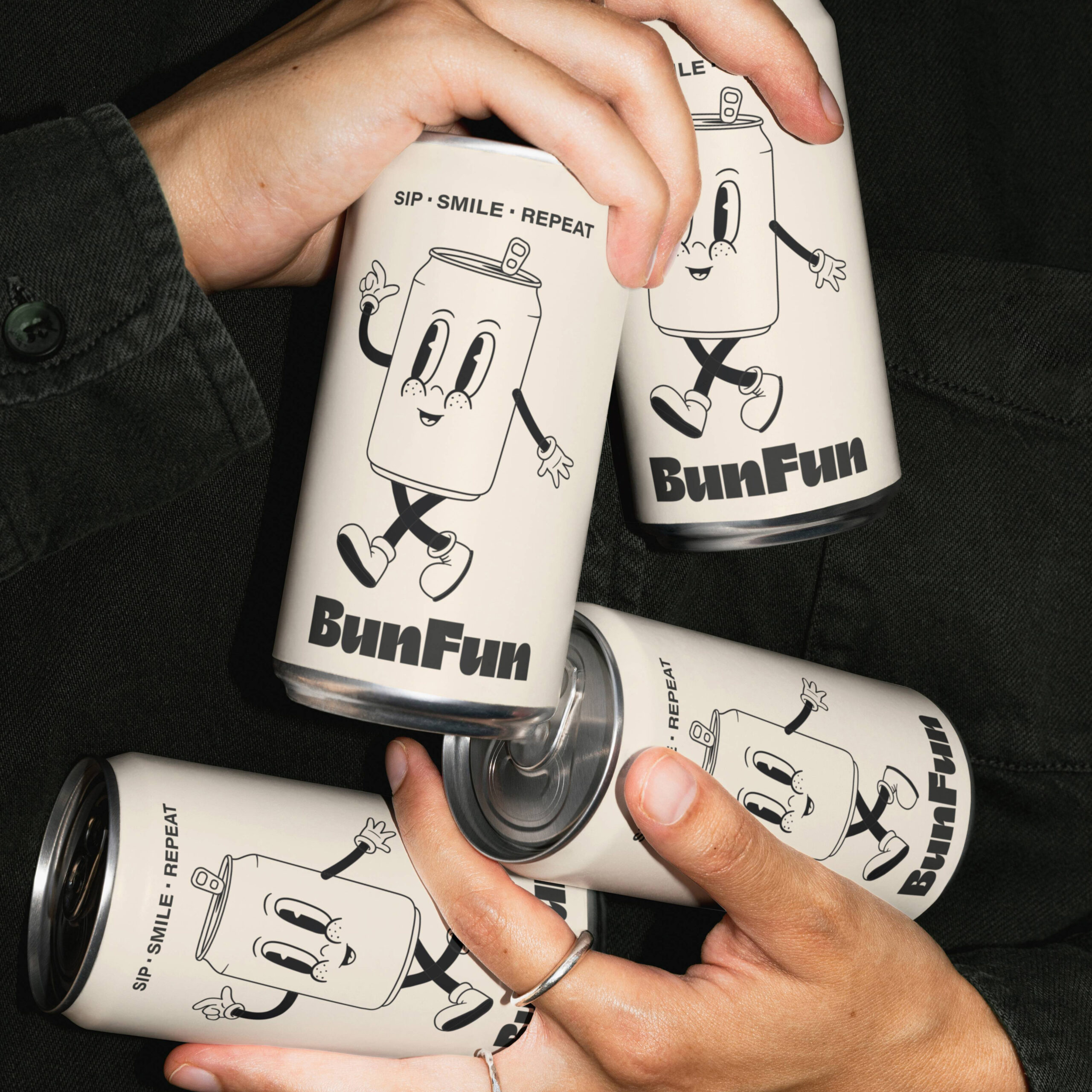
The brand draws on a graphic universe where the products come to life: a burger winking, a soft drink waving hello, fries joining in.
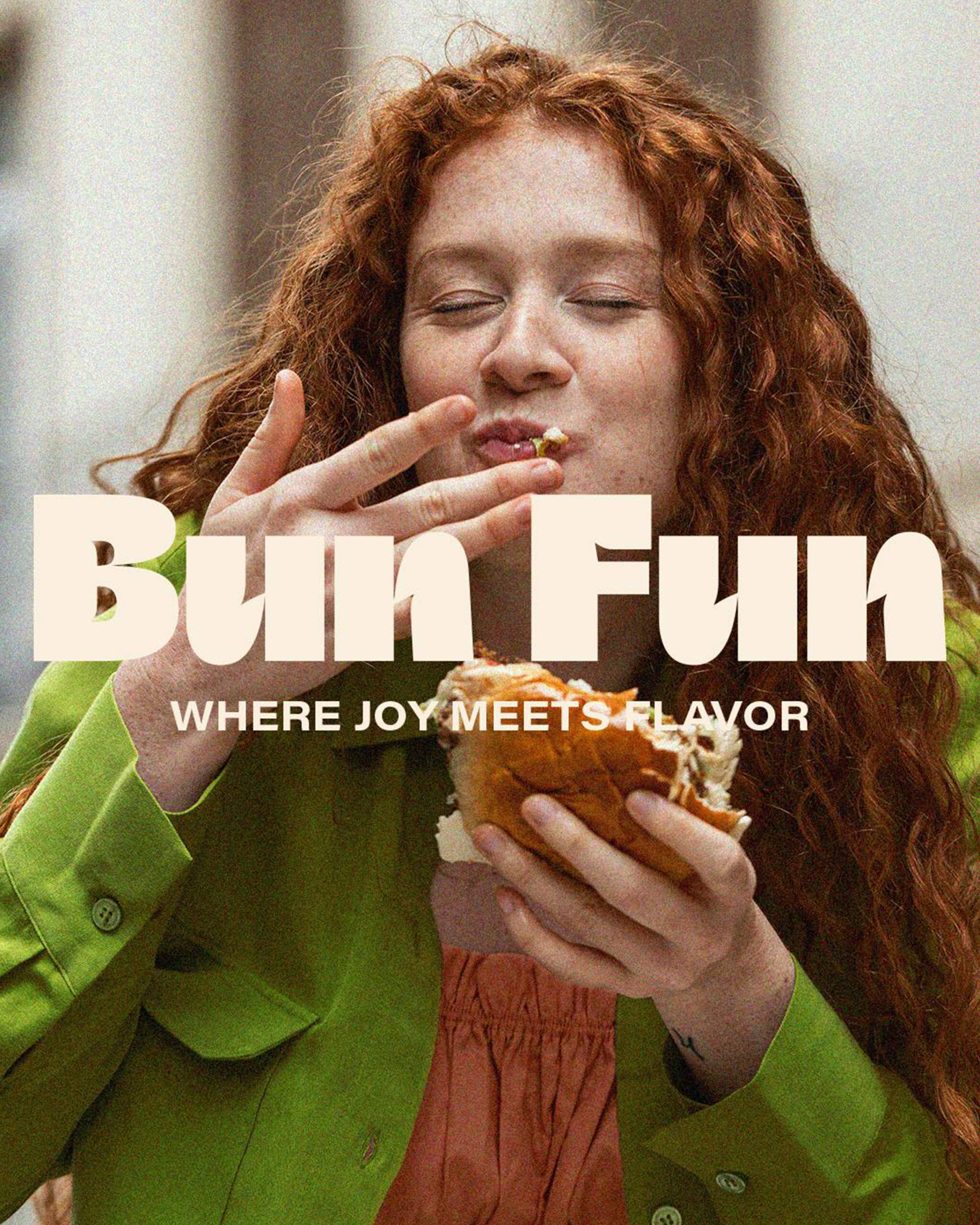
The tone is optimistic, direct, and playful, reinforced by messages such as “Eat. Sip. Smile. Repeat.” or “Where joy meets flavor”.
The experience is rooted in joy and nostalgia, evoking the imagery of retro America through a contemporary lens.
Logo
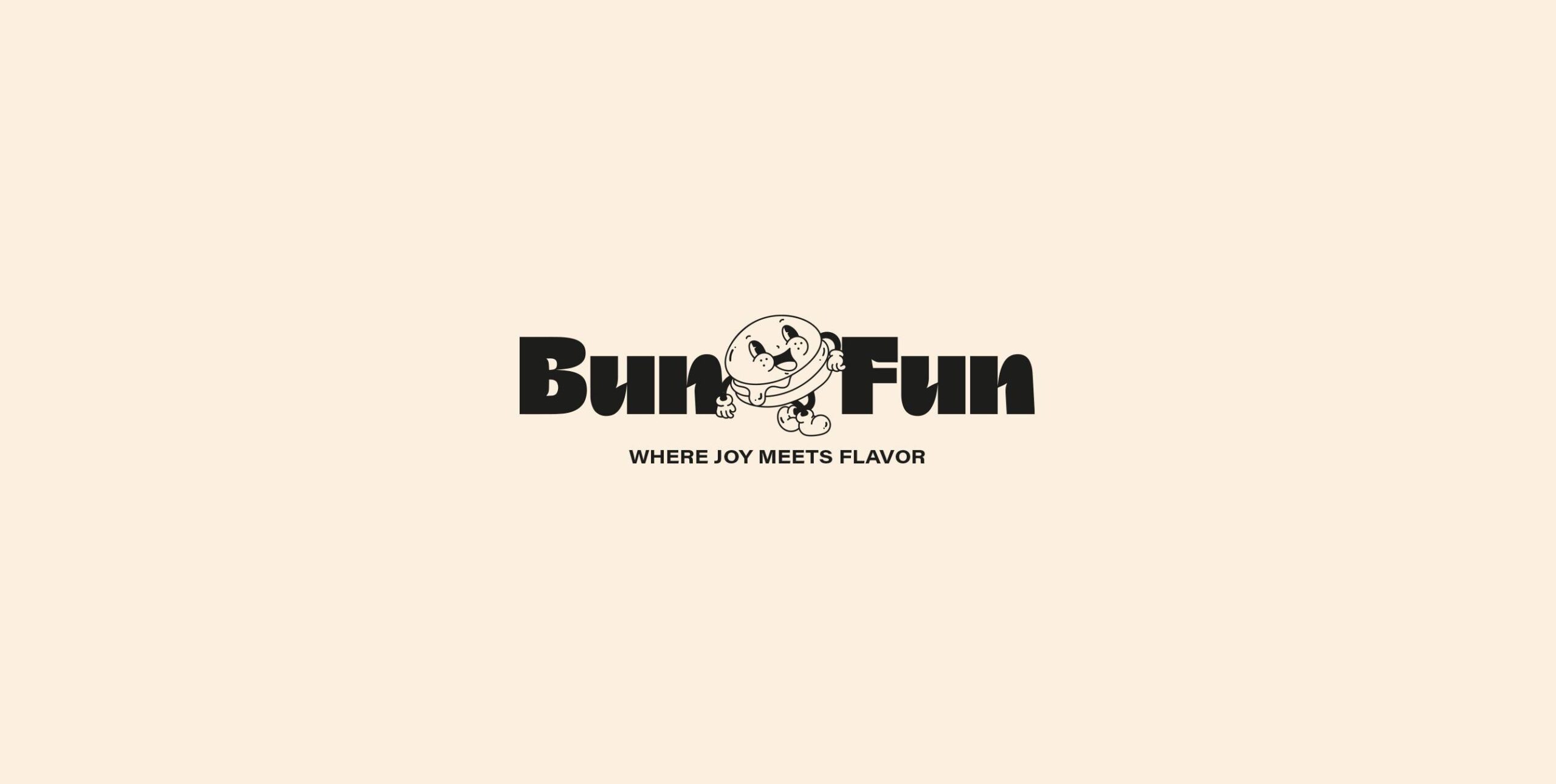
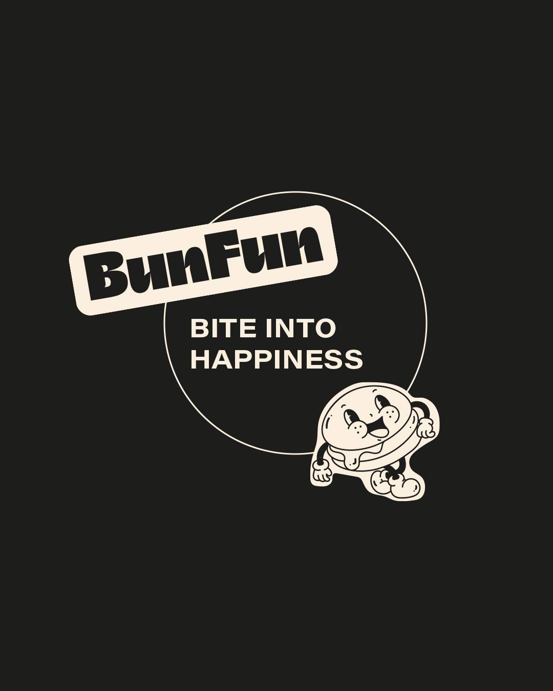
The logo uses a bold, retro-inspired typeface with strong visual weight and a distinctive personality.
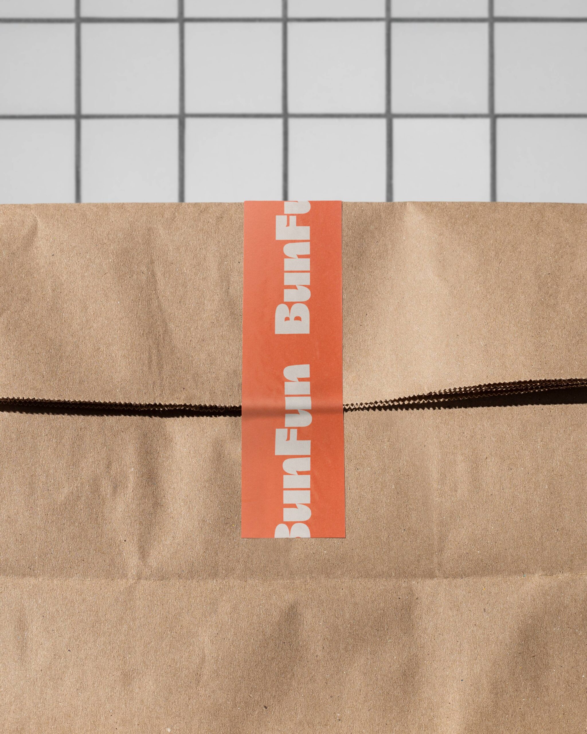
Its compact, impactful construction conveys energy and character, working equally well across physical applications (from storefronts and packaging to merchandise) and digital environments.
The system allows for dynamic variations — tilted, framed, or combined with illustration — reinforcing the brand’s expressive character.
Illustration & Graphic System
Illustration is at the heart of the project.
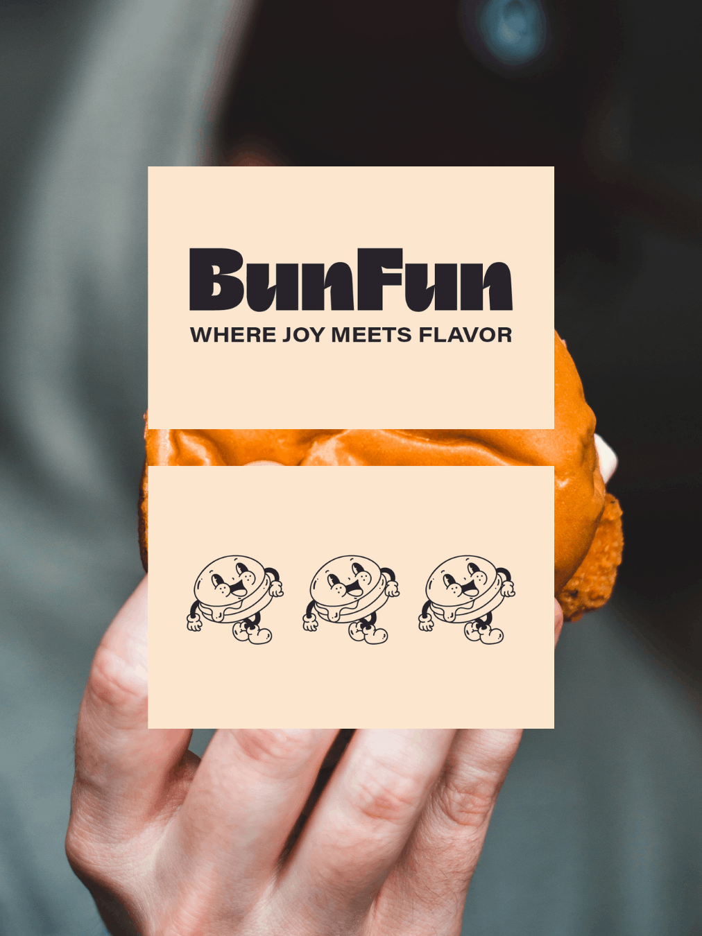
A family of anthropomorphic characters (burgers, soft drinks, fries, and more) was developed in a vintage cartoon style, with simple, expressive lines.
This approach gives the brand a distinctive identity, helping it stand out while creating a strong emotional connection.
The graphic system combines:
Hero characters
Direct, recurring messages
Clean, high-contrast compositions
Strategic use of negative space
Everything is designed to be recognizable, repeatable, and versatile.
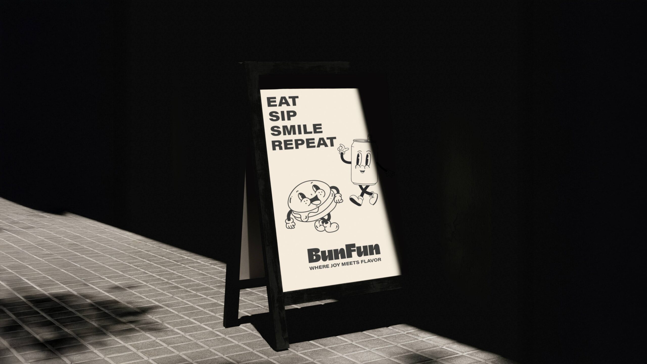
Illustration & Graphic System
Illustration is at the heart of the project.
A family of anthropomorphic characters (burgers, soft drinks, fries, and more) was developed in a vintage cartoon style, with simple, expressive lines.
This approach gives the brand a distinctive identity, helping it stand out while creating a strong emotional connection.
The graphic system combines:
- Hero characters
- Direct, recurring messages
- Clean, high-contrast compositions
- Strategic use of negative space
Everything is designed to be recognizable, repeatable, and versatile.
Color & Visual Tone
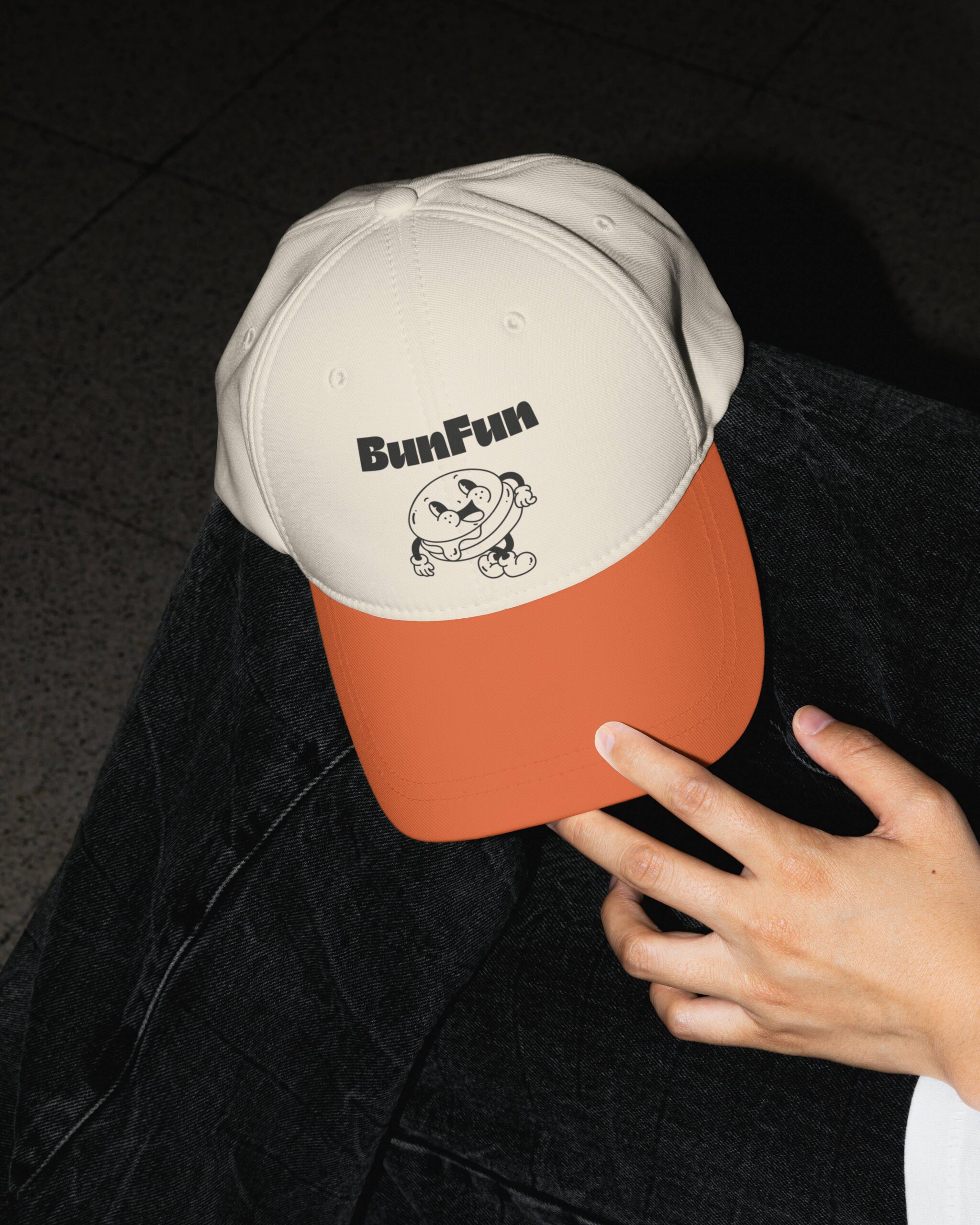
The palette is built around a neutral base of cream and black, combined with a vibrant orange that brings energy and visual appetite.
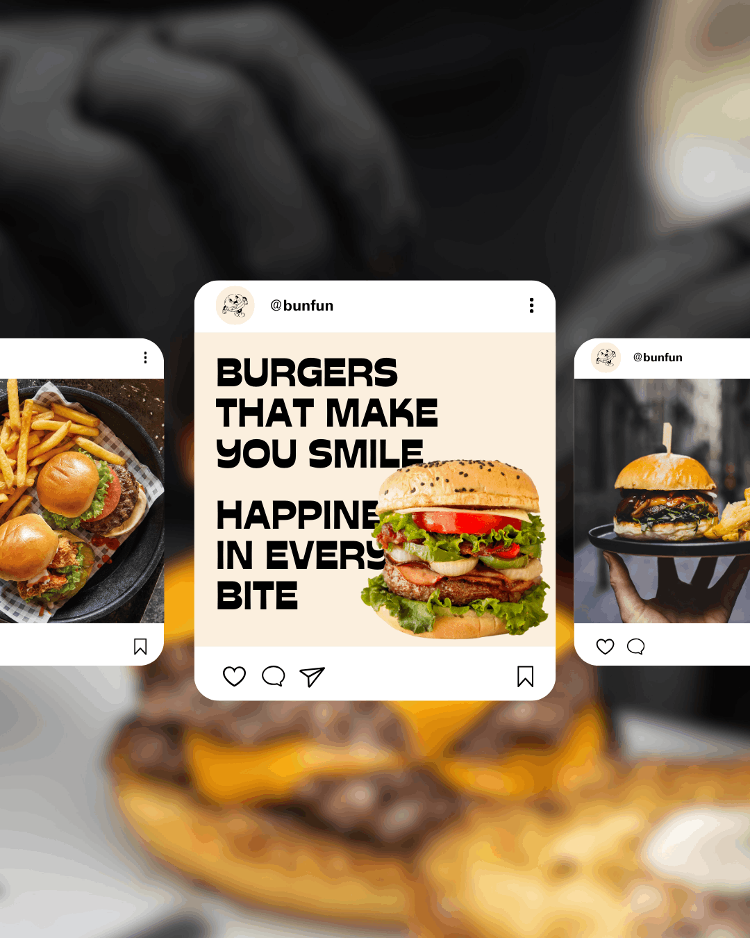
The high contrast reinforces legibility and impact, while the consistent use of color across packaging, signage, and social media creates a cohesive brand presence.
Photography and applications maintain a warm, urban art direction, aligned with the welcoming and dynamic character of the space.