Tesela 40
- Branding
- Packaging
- Illustration
- Social Media
Visual identity development for Tesela 40, a brand that creates and curates unique, sensory pieces — ceramics, fragrances, flowers, textiles, and flavors — through carefully curated editions.
The goal: to translate its emotional and artisanal universe into a cohesive, symbolic, and contemporary visual system.
Concept
The starting point was the name itself. A tesela is a small, unique, imperfect piece that only finds meaning when joined with others. This metaphor — building beauty from fragments — became the conceptual core of the project.
The identity is conceived as a mosaic: each element forms part of a larger system, where the individual and the collective coexist in balance.
The “40” reinforces the symbolic narrative: cycles, maturity, transformation, and rebirth.
Logo
The logo is built as a fragmented, handcrafted, and poetic mosaic.
The cuts and interruptions in the lettering represent the individual pieces coming together to form a purposeful whole.
The stencil structure bridges tradition and contemporary design, bringing character and personality to the identity.
Monogram
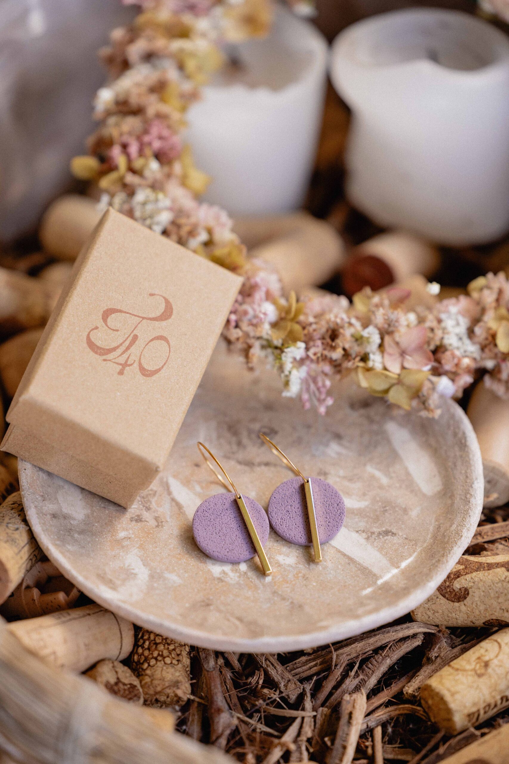
The calligraphic monogram introduces an emotional gesture.
It is the most human element of the system: an intimate stroke that evokes craftsmanship, calm, and imperfect beauty.
It acts as an organic counterpoint to the structural construction of the logo.
Monogram
The calligraphic monogram introduces an emotional gesture.
It is the most human element of the system: an intimate stroke that evokes craftsmanship, calm, and imperfect beauty.
It acts as an organic counterpoint to the structural construction of the logo.
Color & Materiality
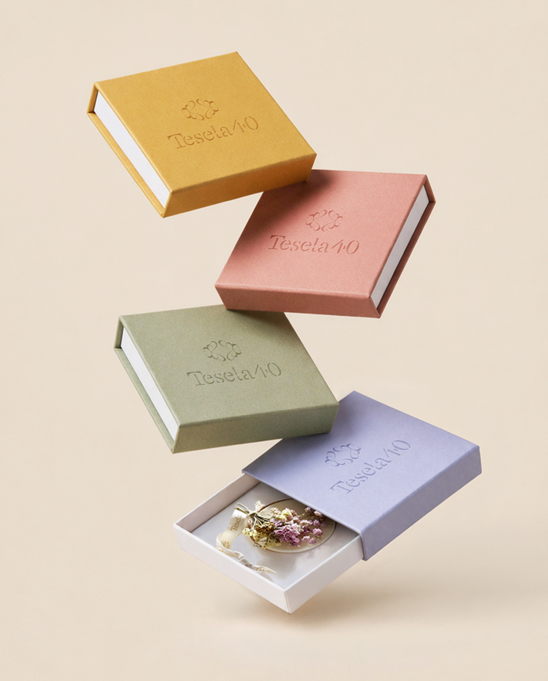
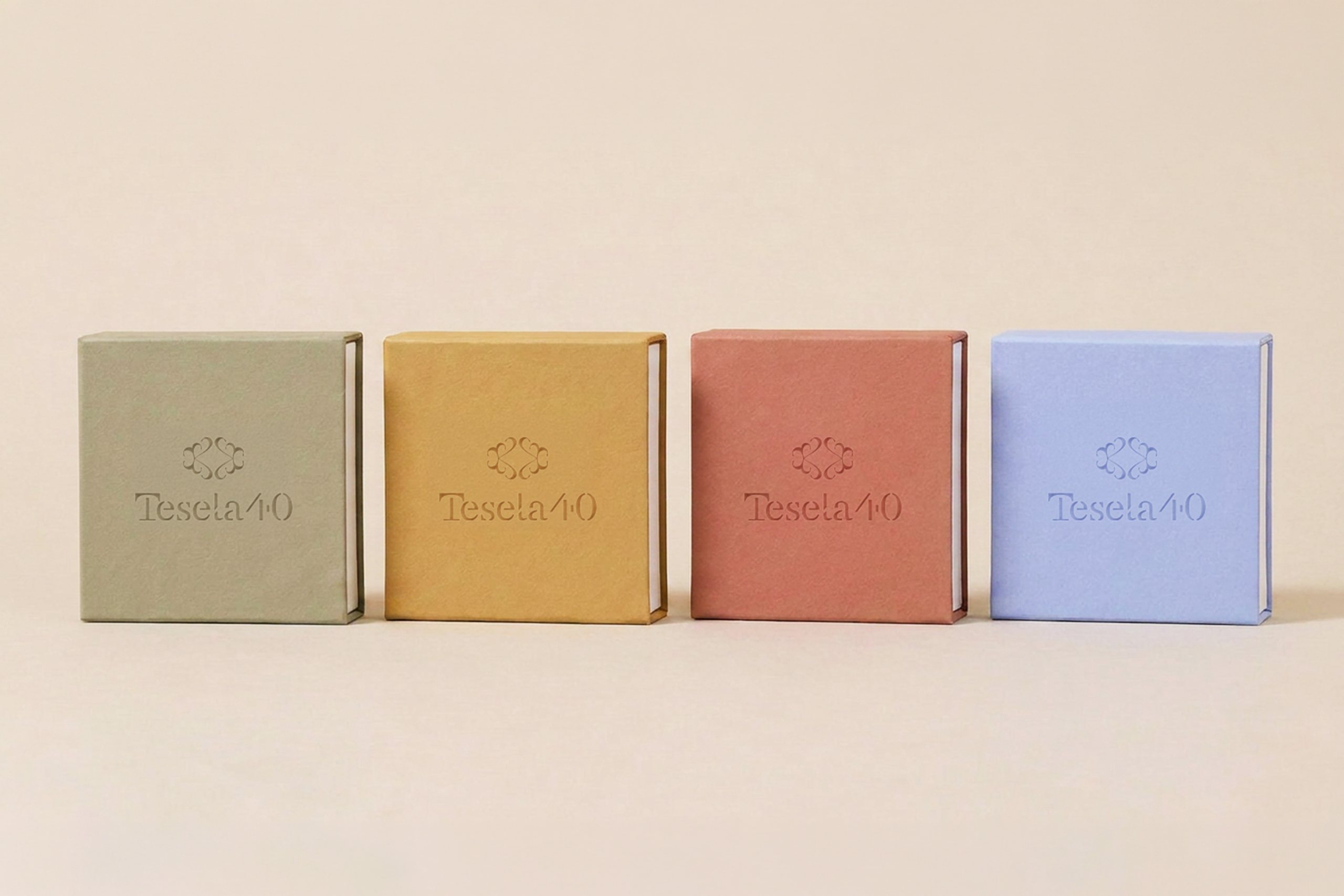
The palette is warm and enveloping, connected to natural materials and organic textures.
It conveys timelessness, sensitivity, and a sense of understated sophistication.
Color & Materiality
The palette is warm and enveloping, connected to natural materials and organic textures.
It conveys timelessness, sensitivity, and a sense of understated sophistication.
Packaging
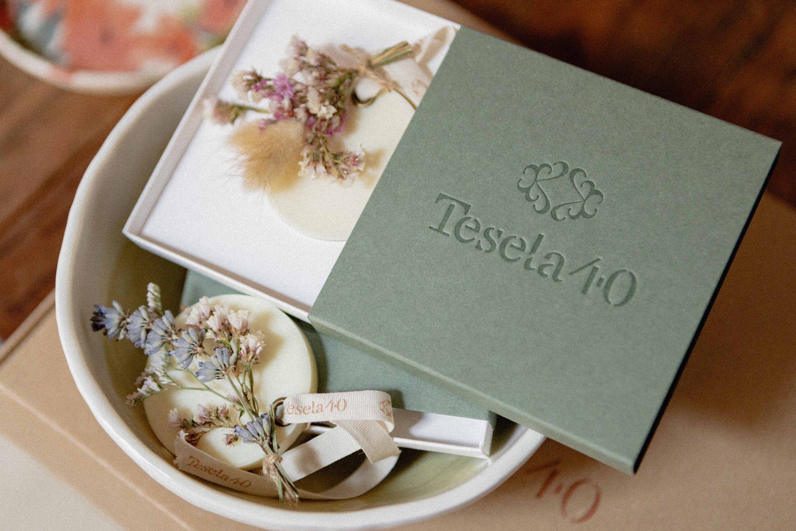
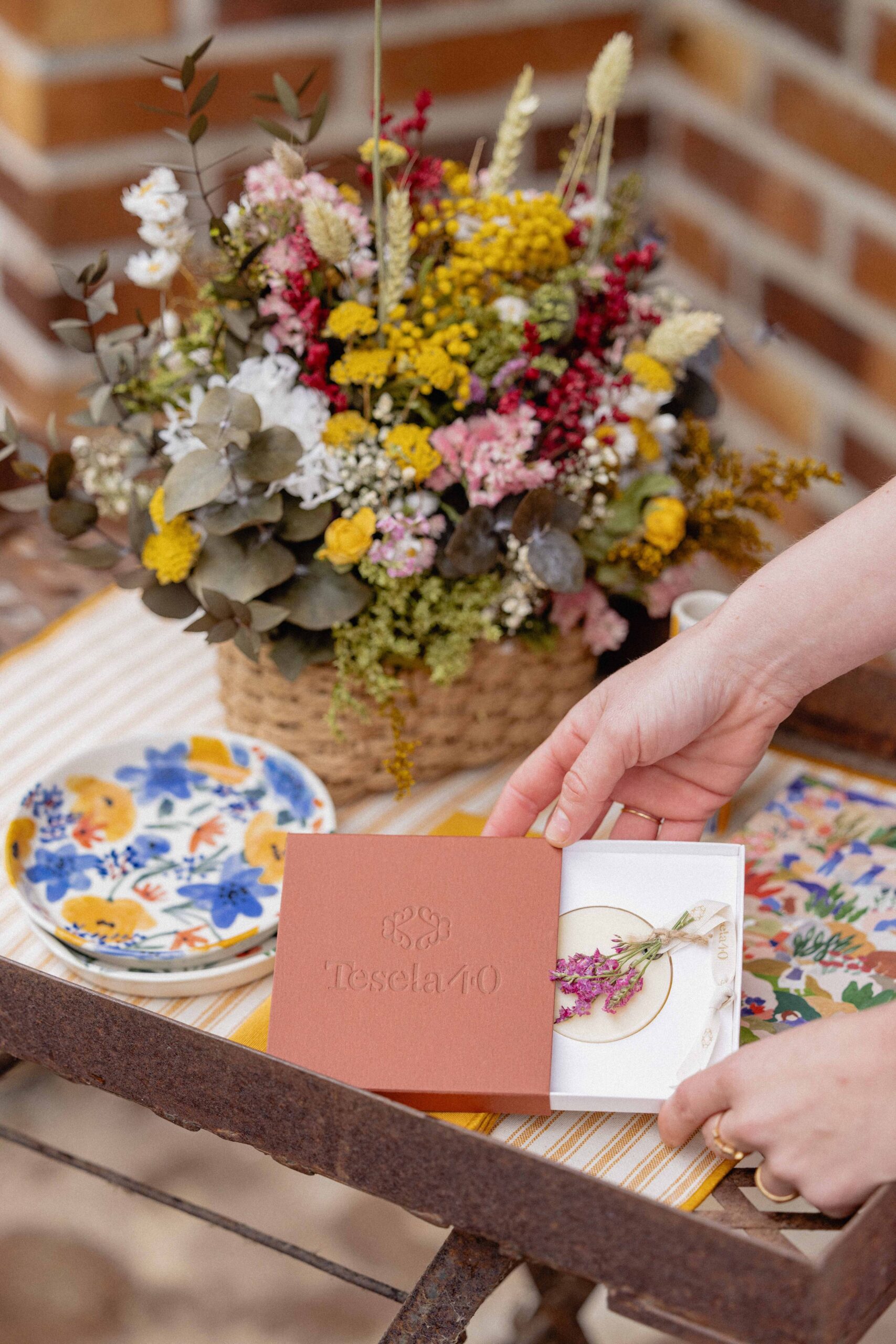
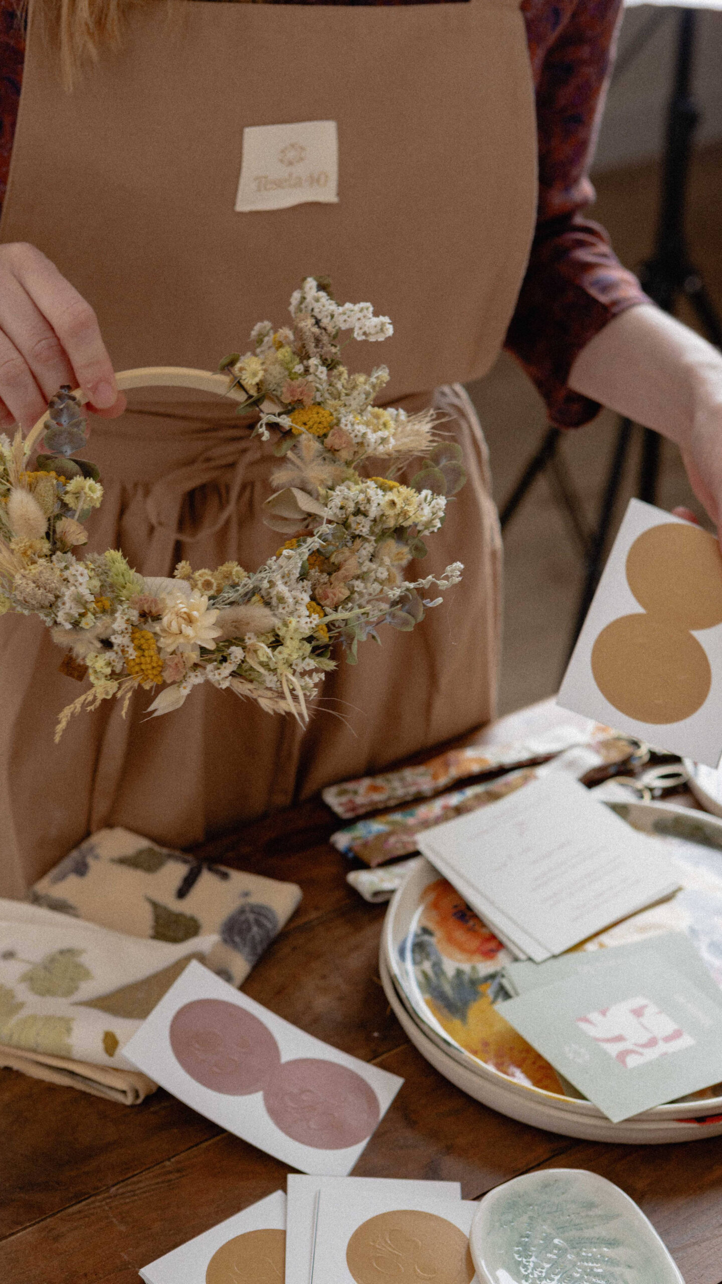
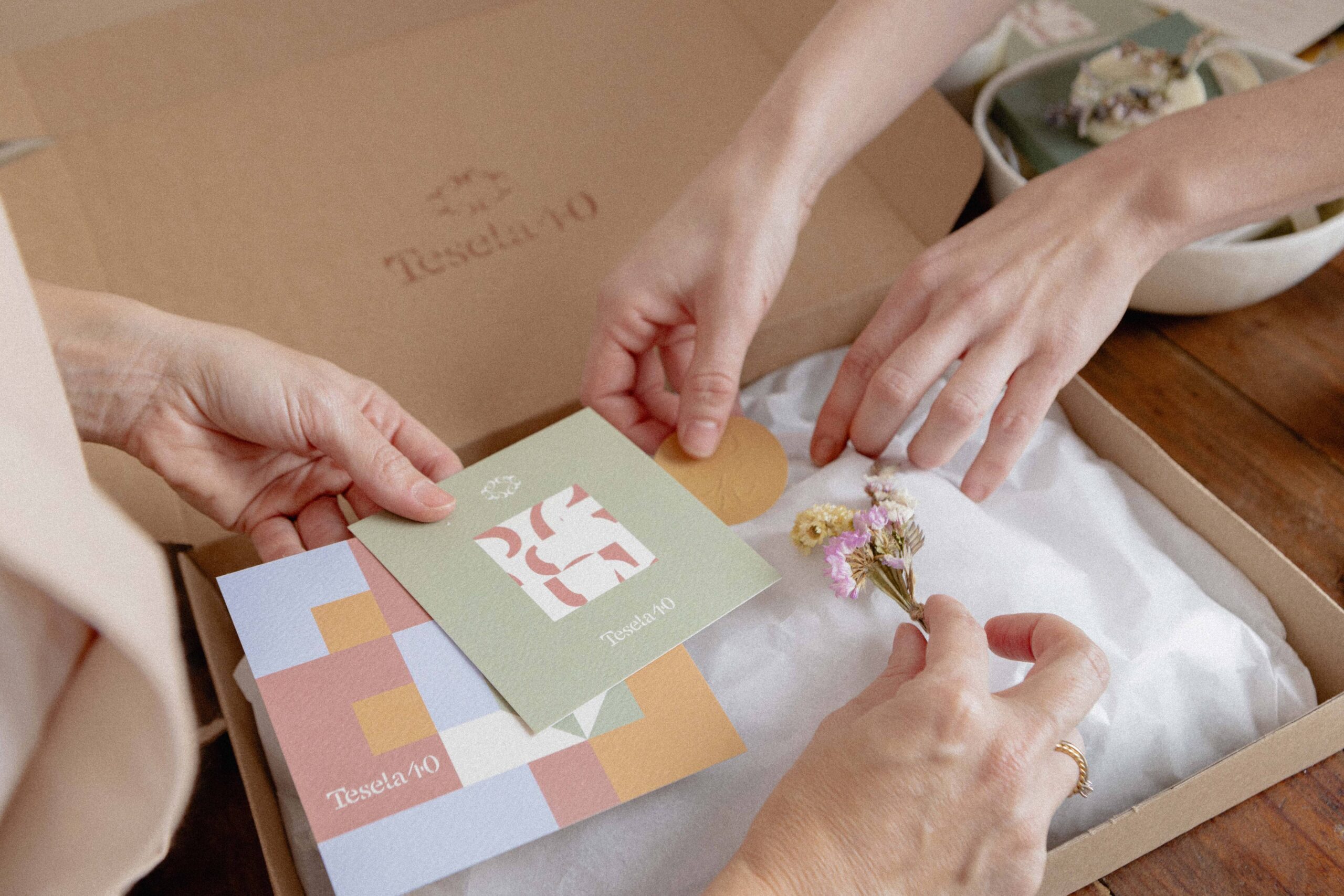
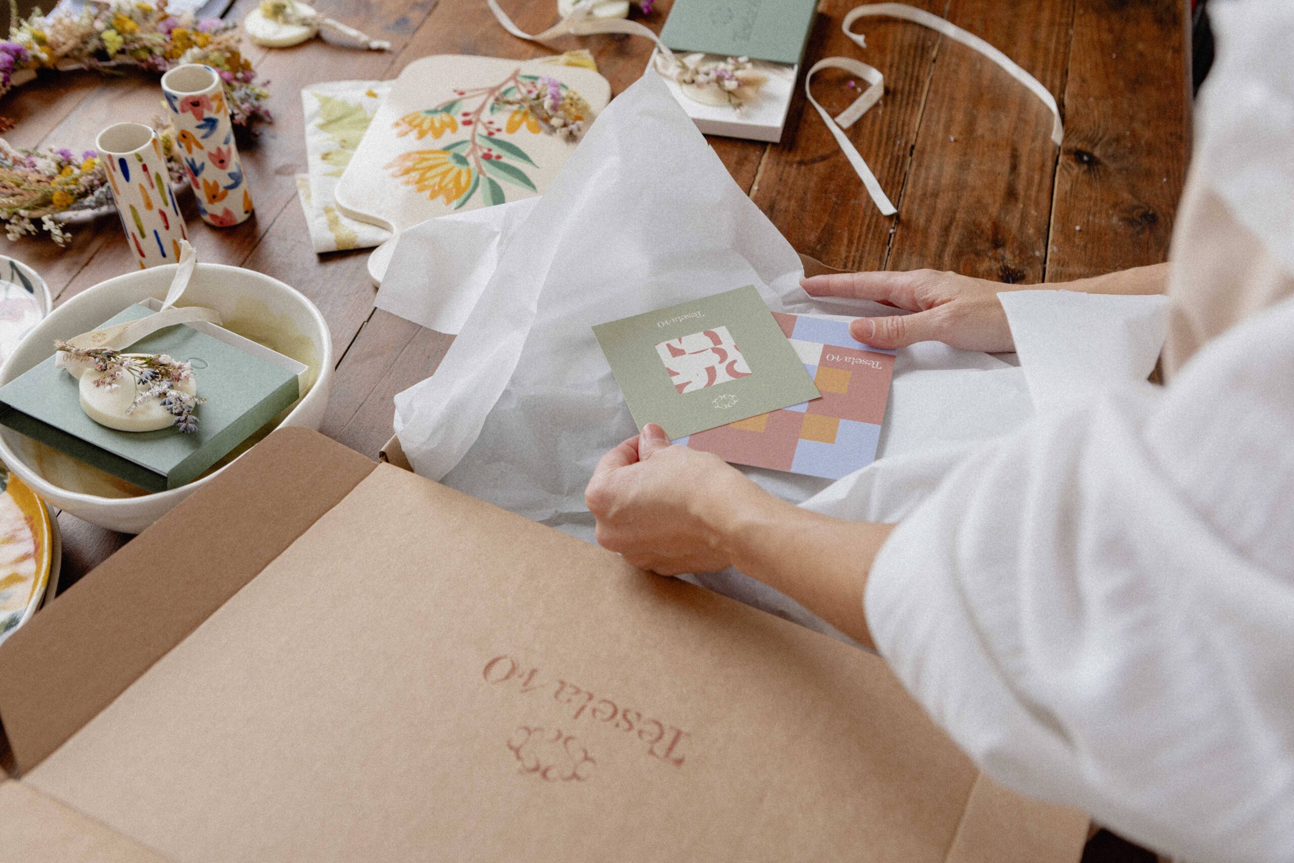
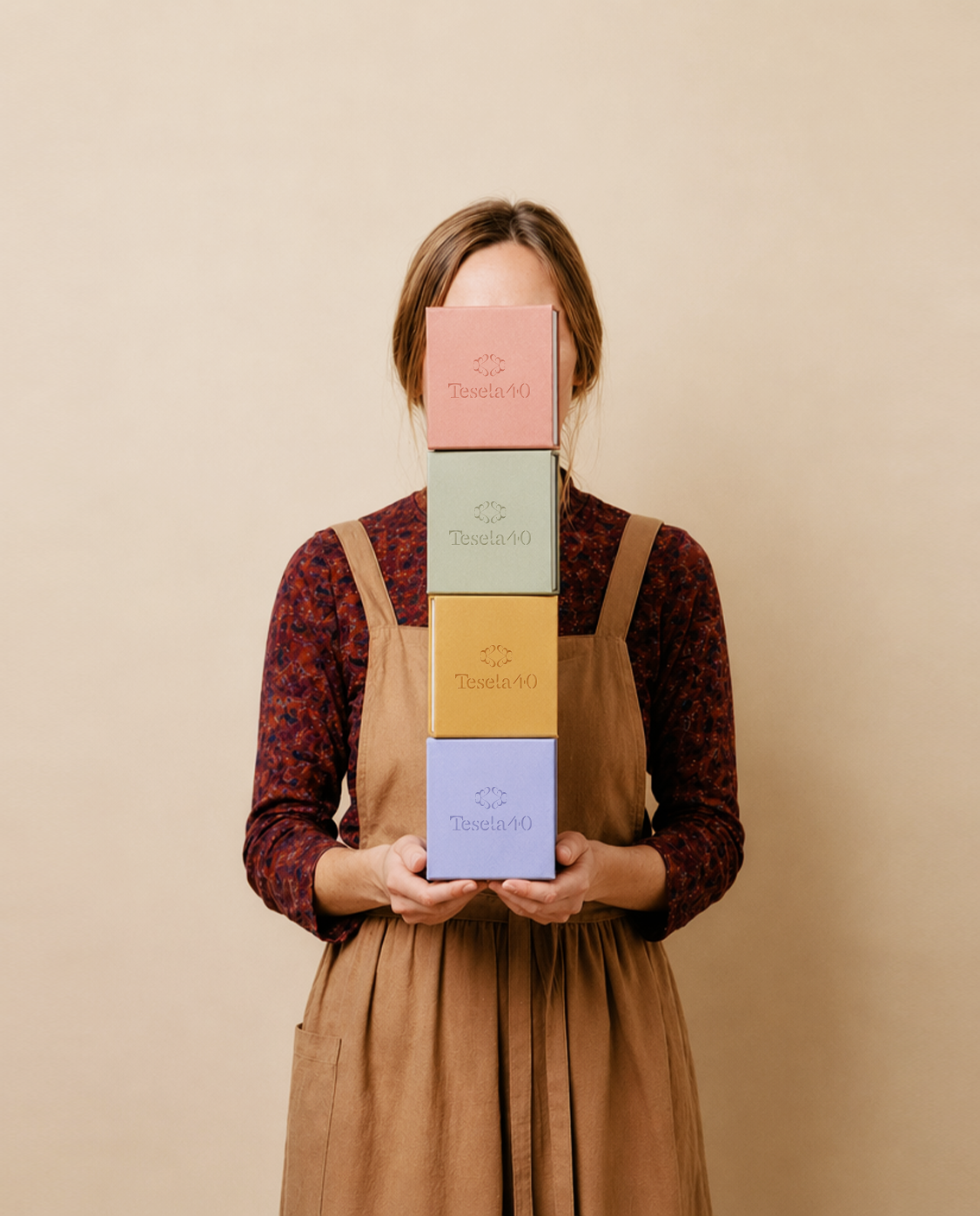
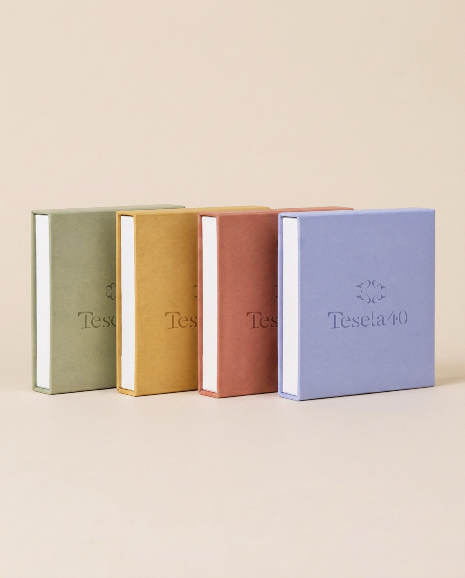
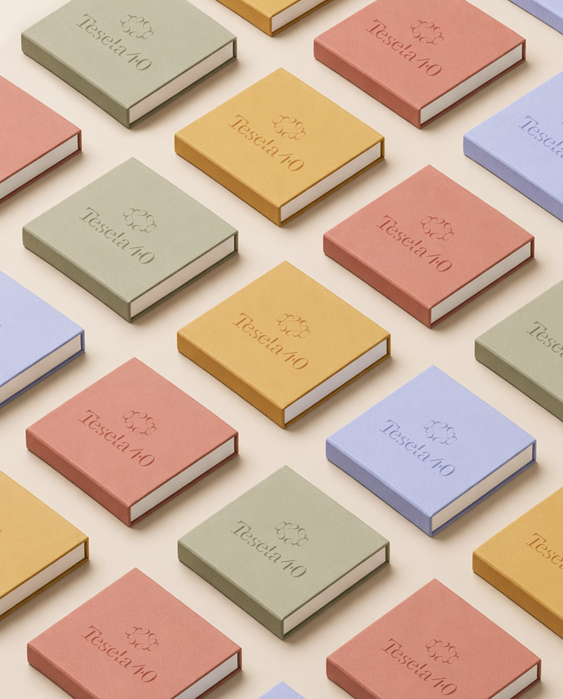
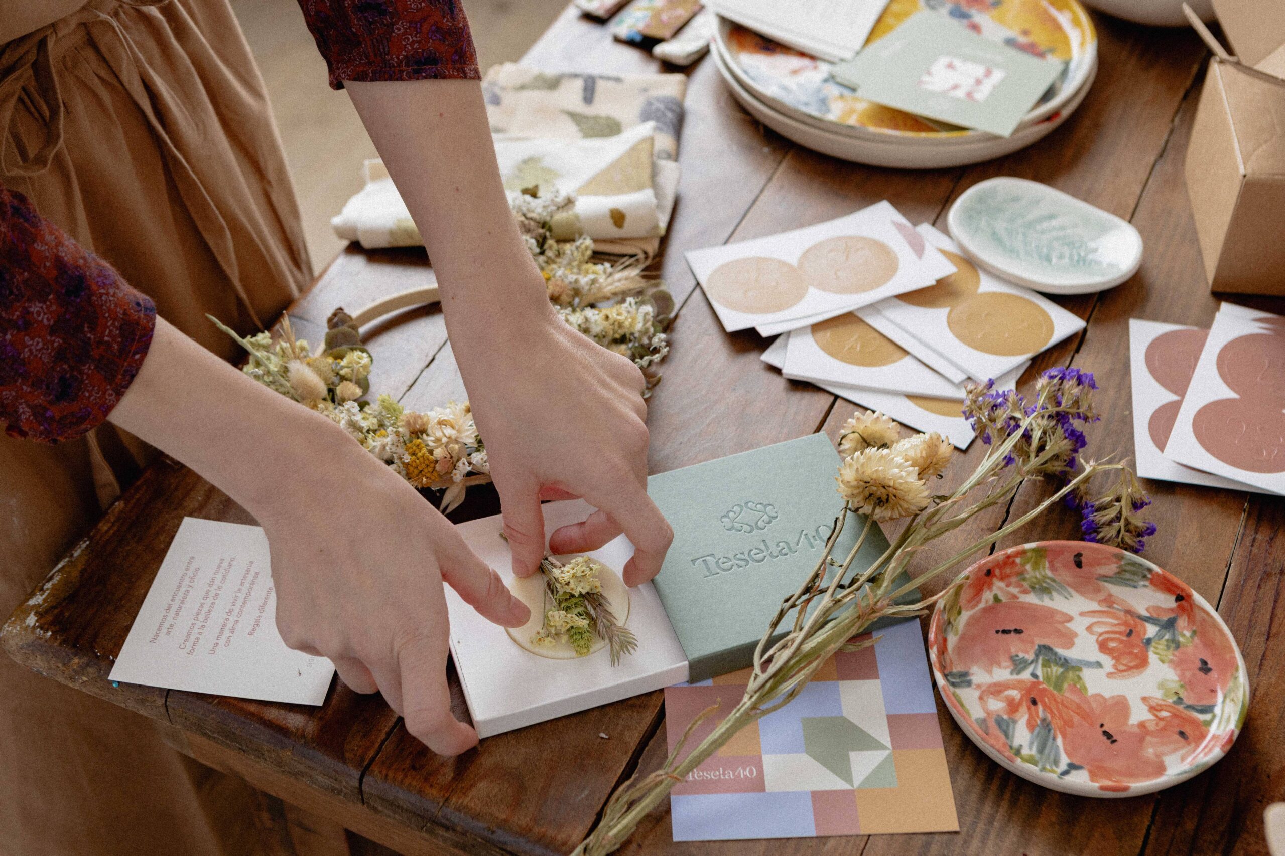
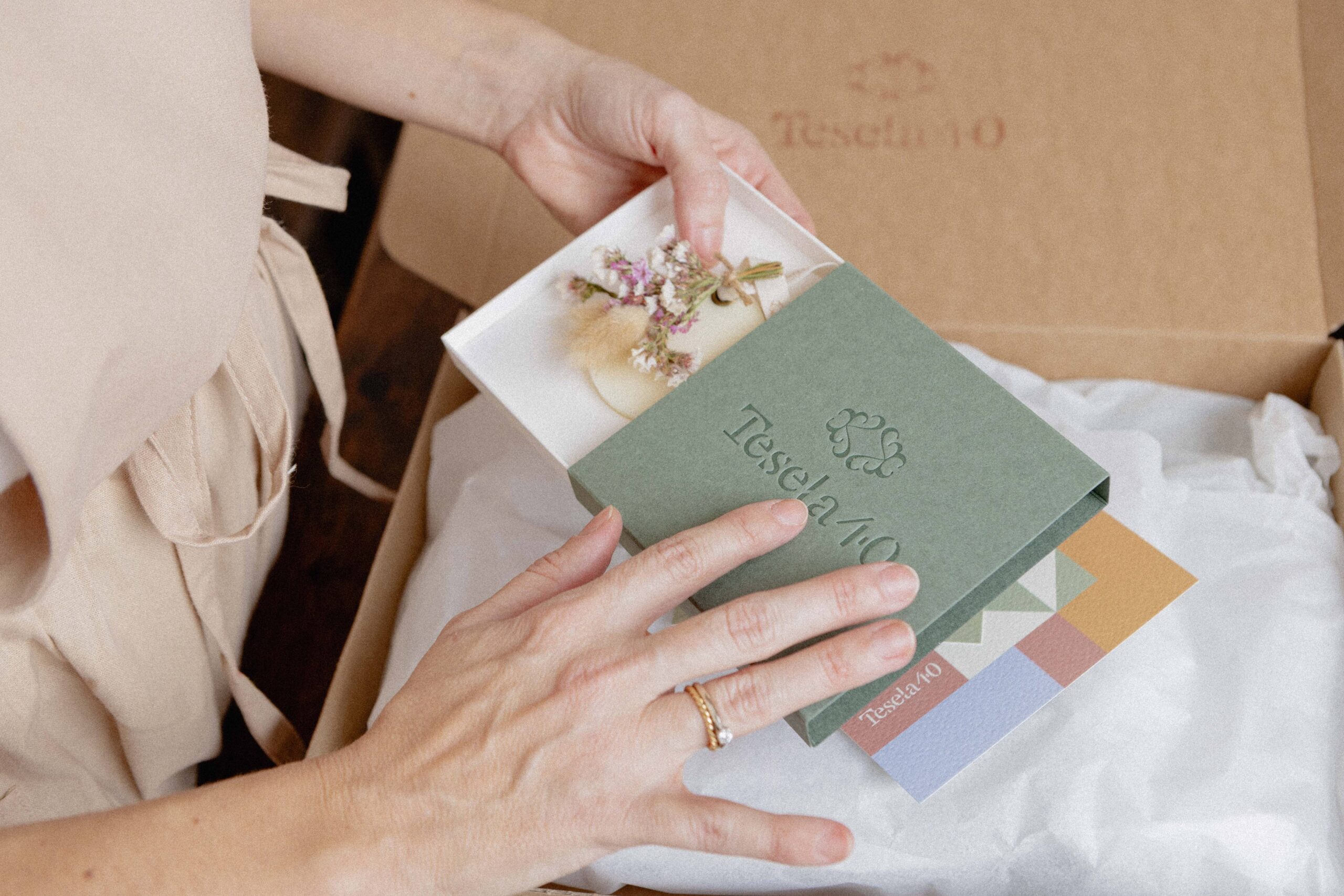
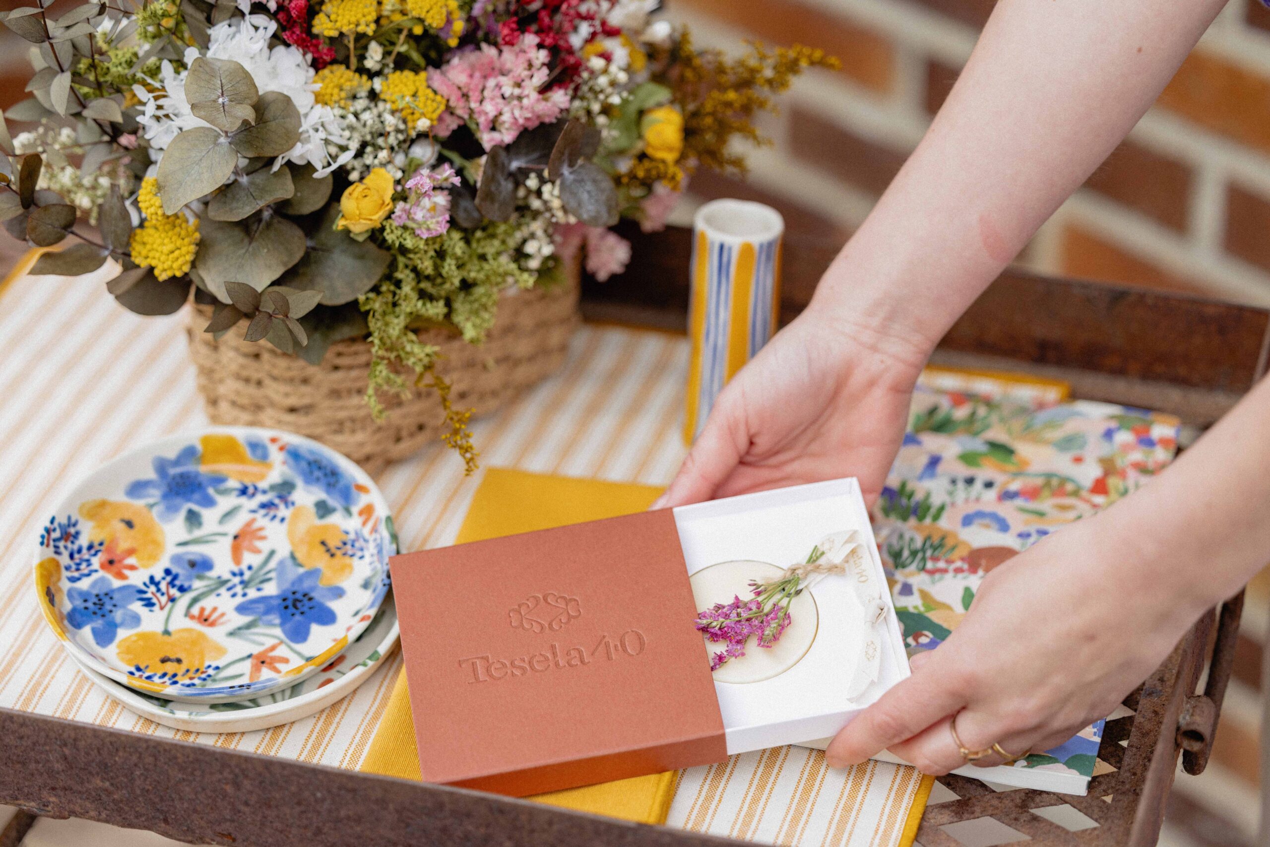
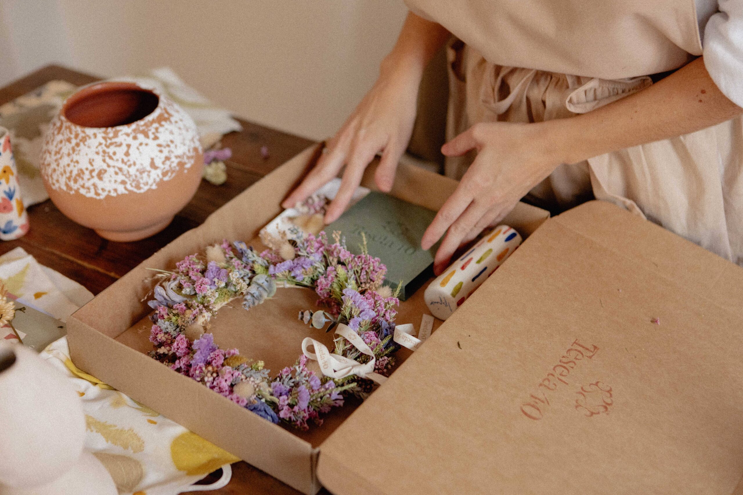
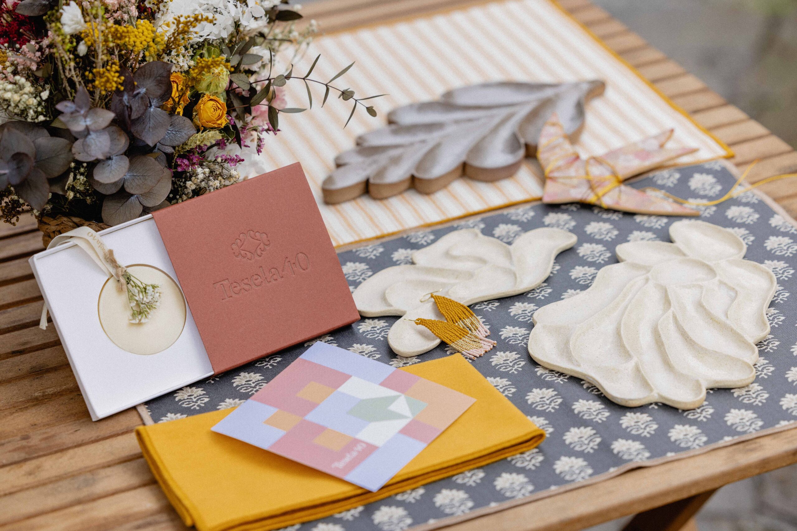
We developed the packaging and stationery as a natural extension of the brand identity. Custom-designed boxes for its solid air fresheners, cards included with each order, and stickers featuring the monogram in blind embossing, all designed to bring texture, care, and consistency to every detail.
Visual universe
A visual system inspired by nature, modernism, and stillness was developed.
Organic forms, balanced compositions, and a serene aesthetic reinforce the idea of pieces designed to accompany and endure.
Visual universe
A visual system inspired by nature, modernism, and stillness was developed.
Organic forms, balanced compositions, and a serene aesthetic reinforce the idea of pieces designed to accompany and endure.