Projects |La vie est Chouette

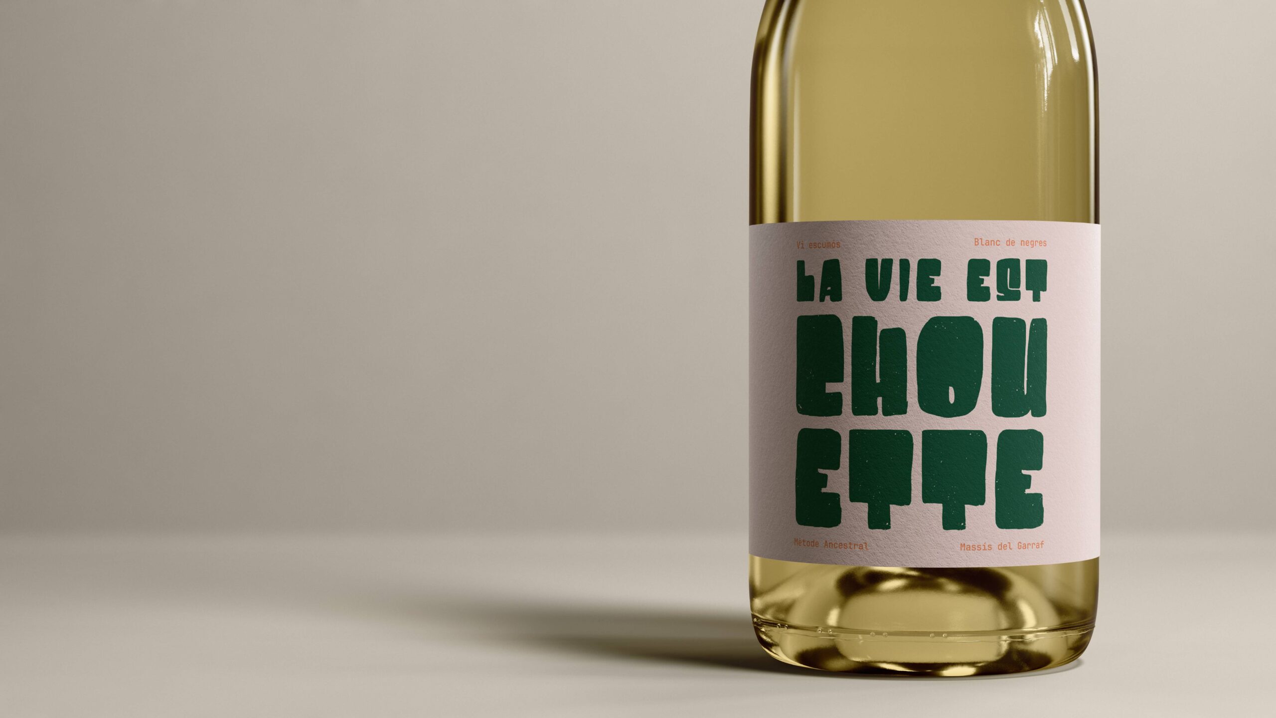
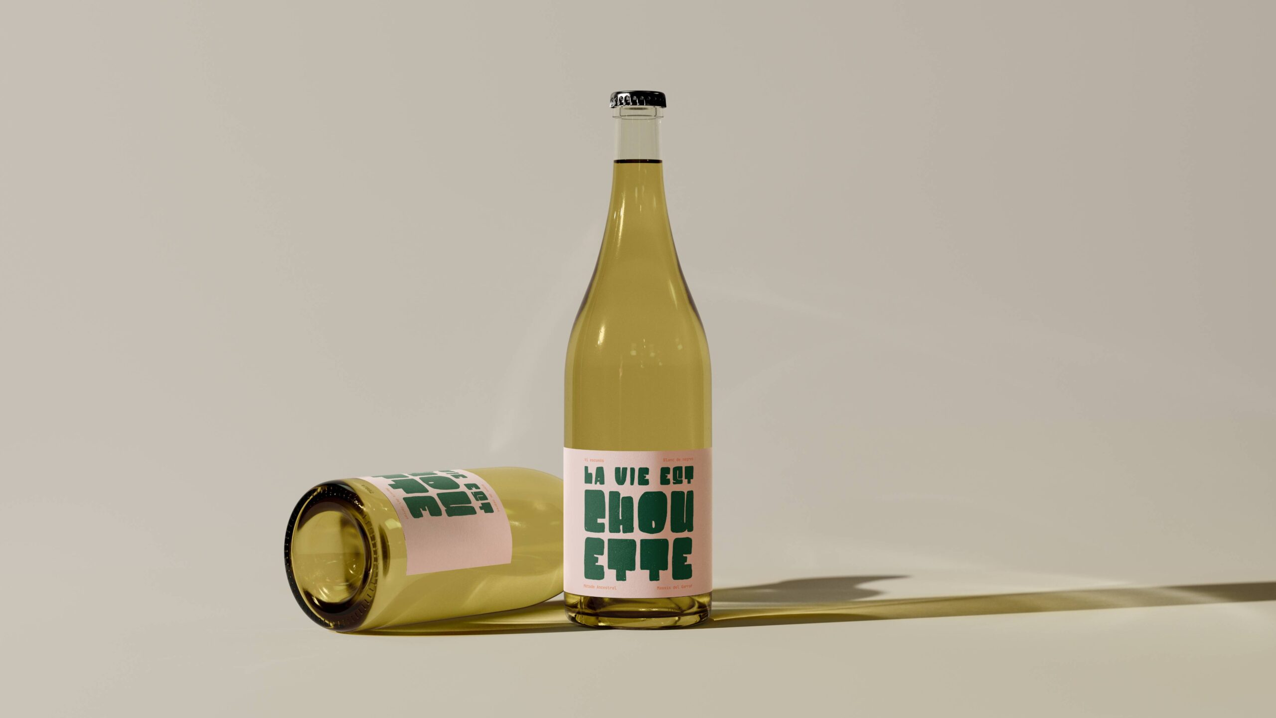
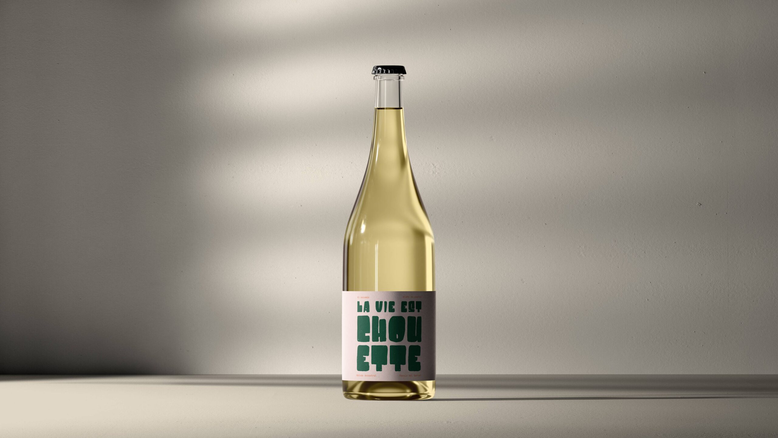
Botella de vino espumoso La Vie Est Chouette con diseño de etiqueta tipográfica minimalista y fondo neutro.

La vie est Chouette

Label design for the house wine of HiBoU Sitges whose identity was also developed by our studio. The goal was to translate the essence of the restaurant (warmth and sophistication, the Mediterranean and France, craftsmanship and freshness) into a small yet highly expressive piece.

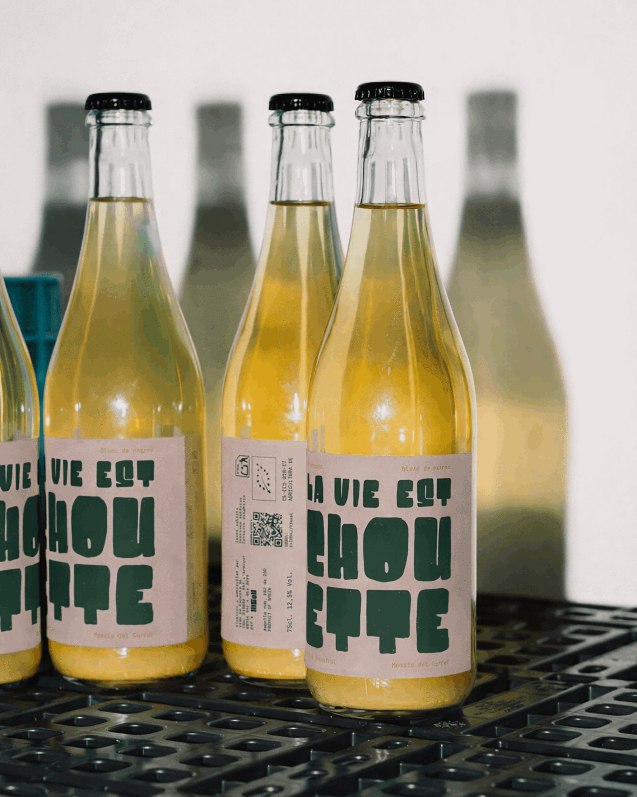
Botellas de vino La Vie Est Chouette en línea de producción con branding y packaging editorial.
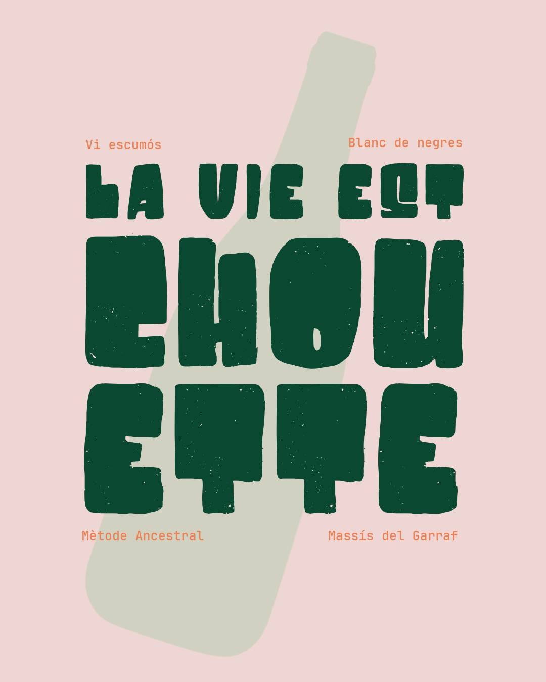
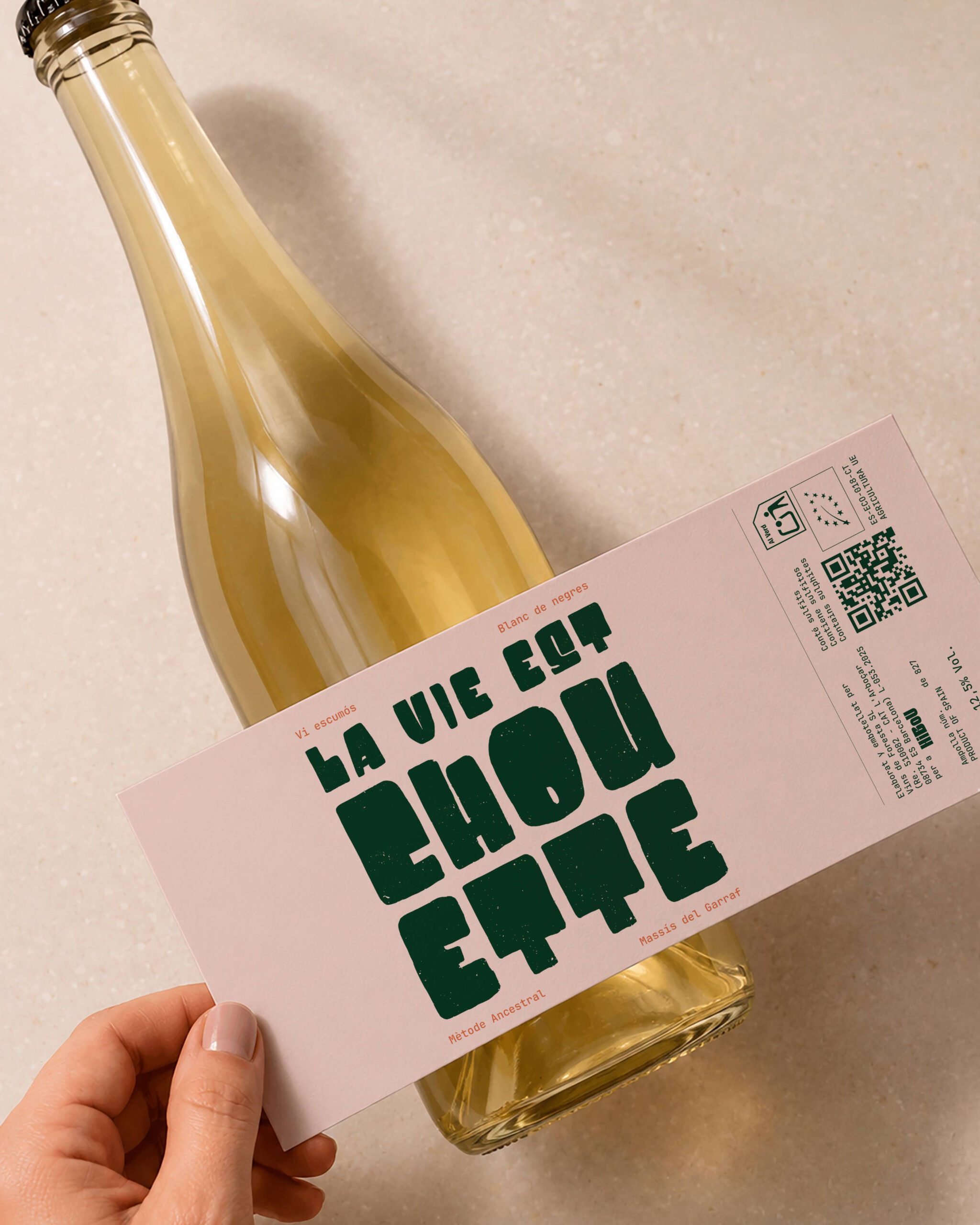
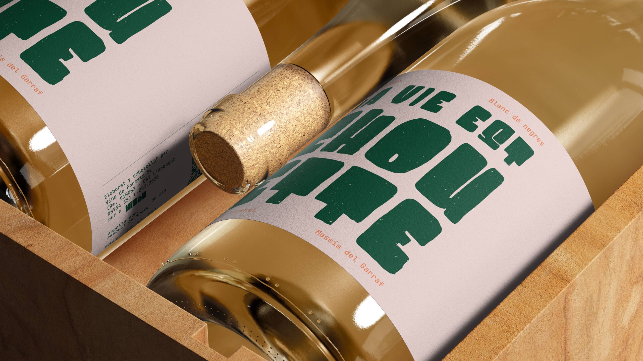
Diseño gráfico de etiqueta para vino natural La Vie Est Chouette con tipografía bold y estética retro.
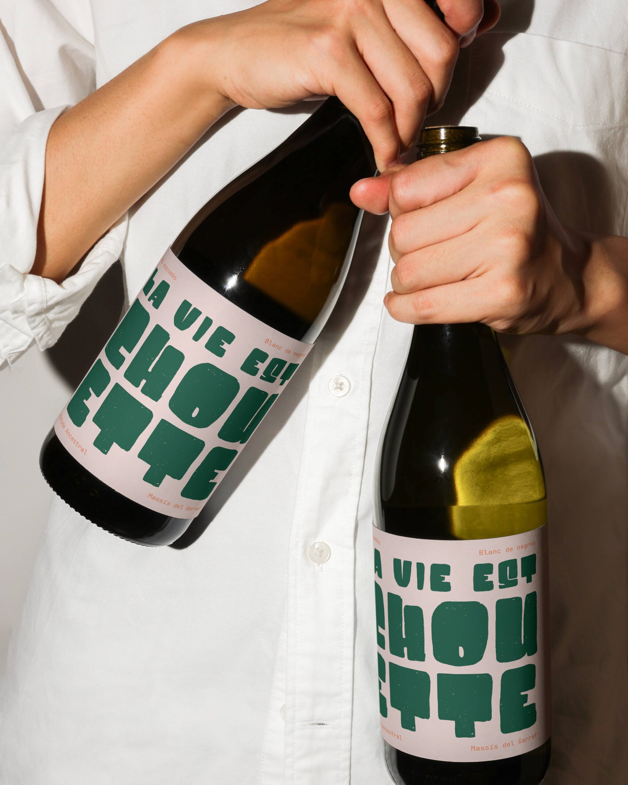
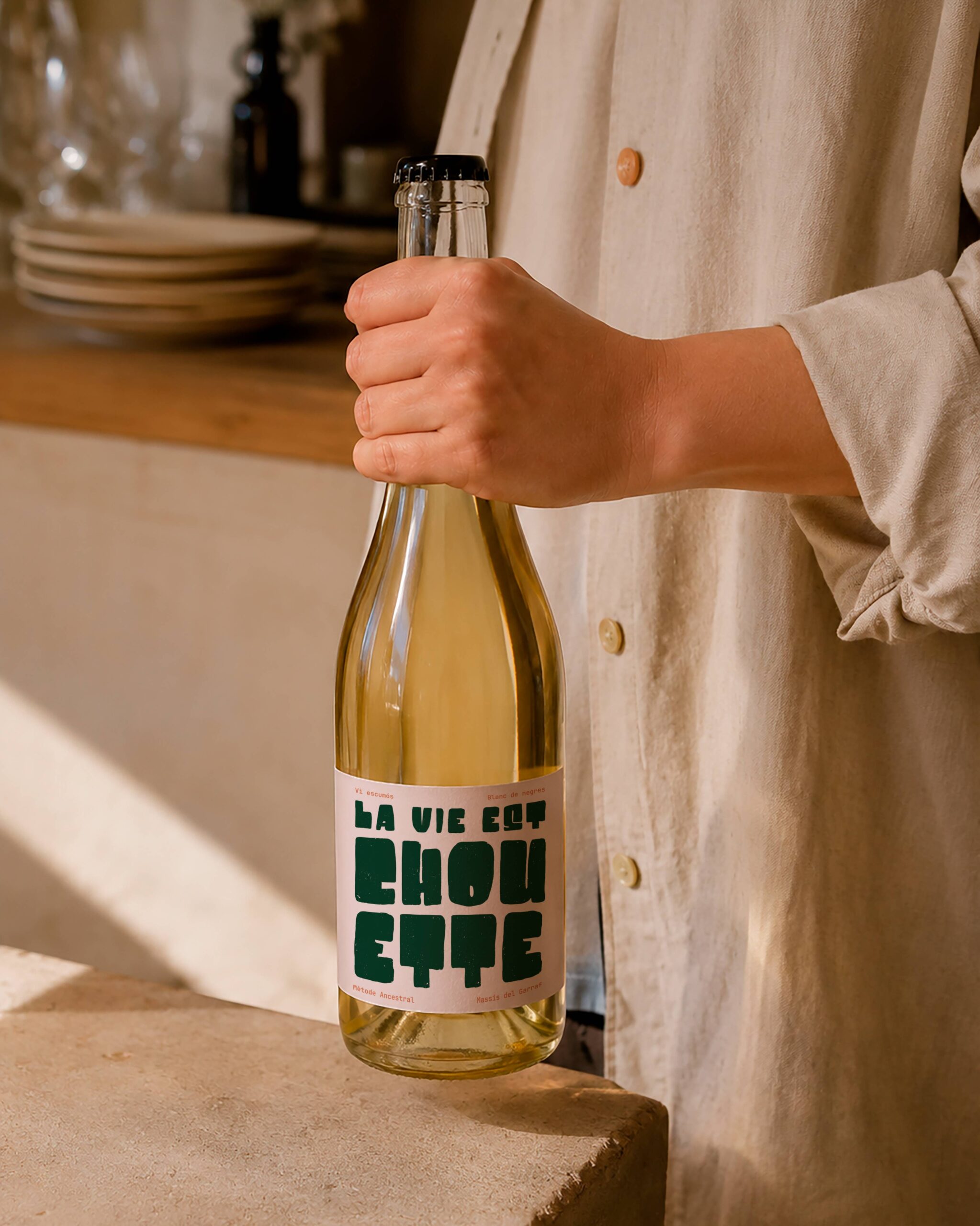
Persona sosteniendo botellas de vino La Vie Est Chouette con diseño de packaging tipográfico contemporáneo.

Concept

La Vie est Chouette is more than a name; it is an attitude. In French, “chouette” means owl, but it can also mean “great” or “cool.” The wine was meant to convey that cheerful, honest, and unpretentious outlook on life.

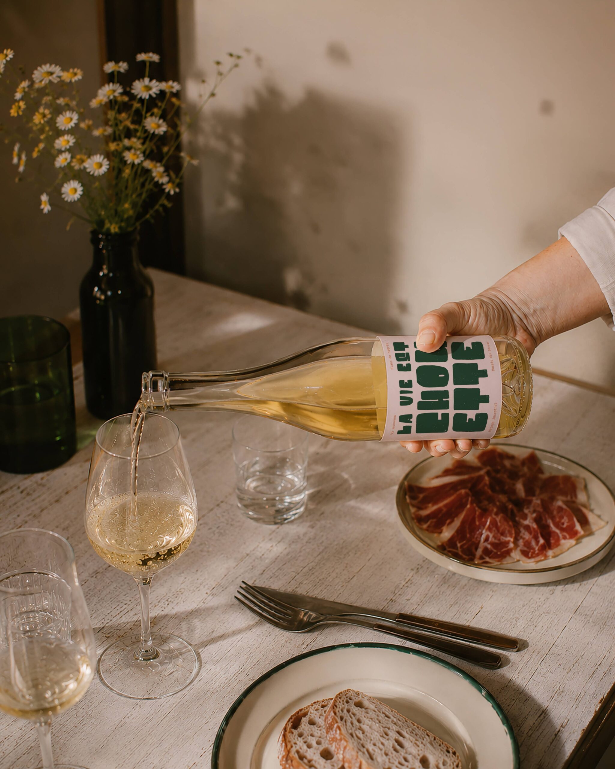
It is a pale rosé, almost a blanc de noir, delicate and luminous. This subtlety of color became the conceptual starting point for the design: creating harmony between what is seen and what is experienced when the wine is poured.

Composición de botellas de vino La Vie Est Chouette sobre fondo minimalista con iluminación cálida.
Botellas de vino La Vie Est Chouette con identidad gráfica tipográfica en gran formato

Typography

Typography takes center stage, almost functioning as an illustration in its own right. A bold, organic, and subtly imperfect typeface was chosen to reflect HiBoU’s artisanal and laid-back character.


The modular composition creates a solid and expressive block, where the visual weight of each word generates rhythm and personality.

Typography

Typography takes center stage, almost functioning as an illustration in its own right. A bold, organic, and subtly imperfect typeface was chosen to reflect HiBoU’s artisanal and laid-back character.

The modular composition creates a solid and expressive block, where the visual weight of each word generates rhythm and personality.

Botella de vino natural La Vie Est Chouette con etiqueta tipográfica en estudio fotográfico.

Color

The dusty pink background captures the delicacy of the wine and reinforces the sensory coherence of the overall design.

It is paired with a deep green drawn from the restaurant’s visual universe, adding contrast, character, and a sophisticated sense of naturalness.

Without relying on the logo, the label maintains a direct connection to the brand identity.

Botella de vino La Vie est Chouette con etiqueta tipográfica de gran formato