Gelatissim
- Branding
- Packaging
- Social Media
Rebranding for Gelatissim, an artisan ice cream brand based in Oliva, Valencia, with more than three generations of family tradition in the sector.
The project focused on updating the visual identity to support the company’s evolution, strengthening its positioning as an honest, high-quality artisan brand without losing its connection to its heritage.
Concept & Positioning
Gelatissim is built on three clear foundations: family heritage, closeness and trust. With three generations dedicated to making artisan ice cream, the brand has a strong legacy that now exists alongside a young team in constant evolution and learning.
The rebranding began with the need to express this balance between heritage and the present. The new identity needed to communicate in-house production, the use of natural and locally sourced ingredients, and a strong commitment to quality. All of this through an honest, unembellished narrative that reinforces authenticity and establishes Gelatissim as a contemporary artisan brand.
Concept & Positioning
Gelatissim is built on three clear foundations: family heritage, closeness and trust. With three generations dedicated to making artisan ice cream, the brand has a strong legacy that now exists alongside a young team in constant evolution and learning.
The rebranding began with the need to express this balance between heritage and the present. The new identity needed to communicate in-house production, the use of natural and locally sourced ingredients, and a strong commitment to quality. All of this through an honest, unembellished narrative that reinforces authenticity and establishes Gelatissim as a contemporary artisan brand.
Brand identity system
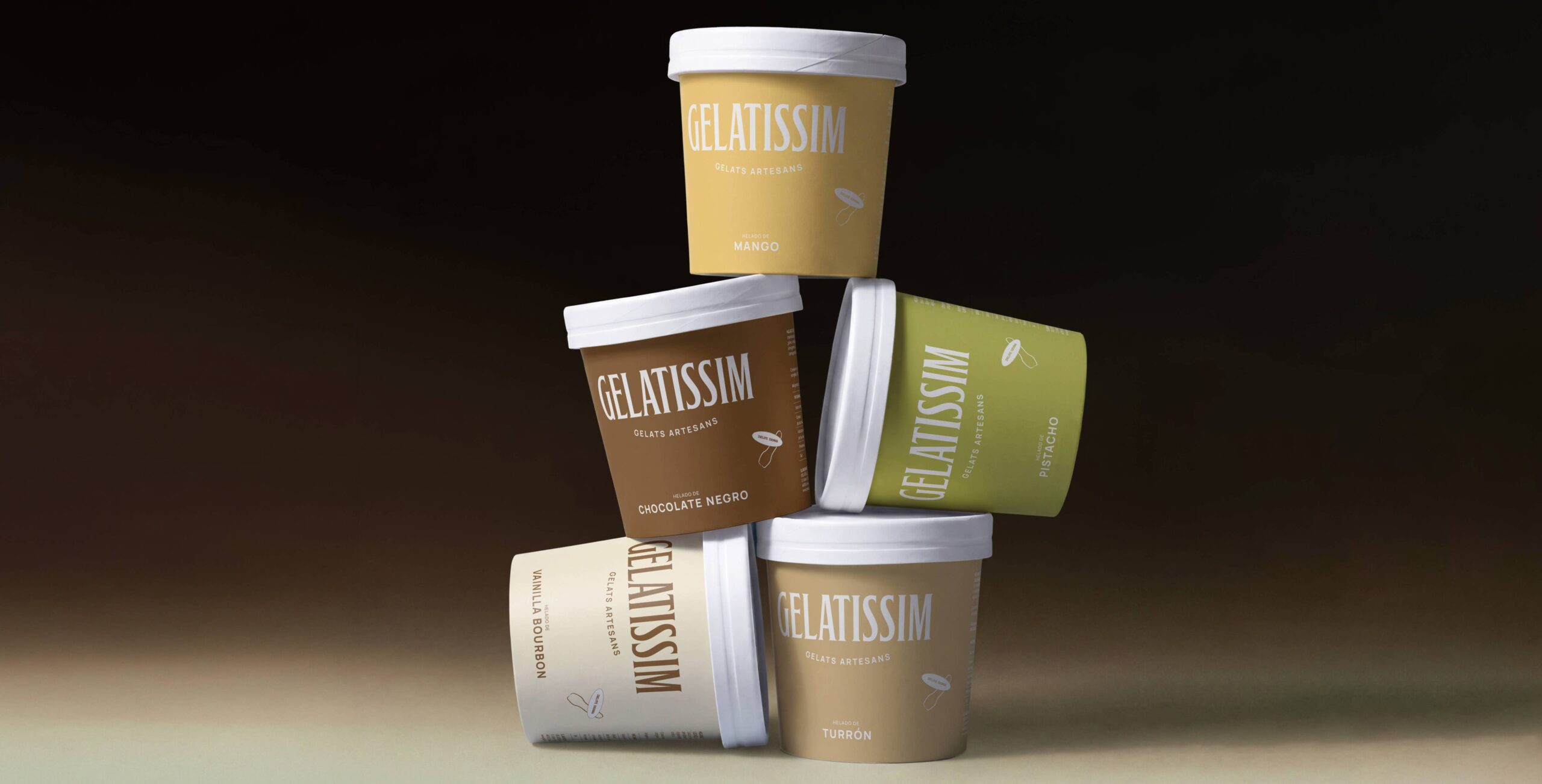
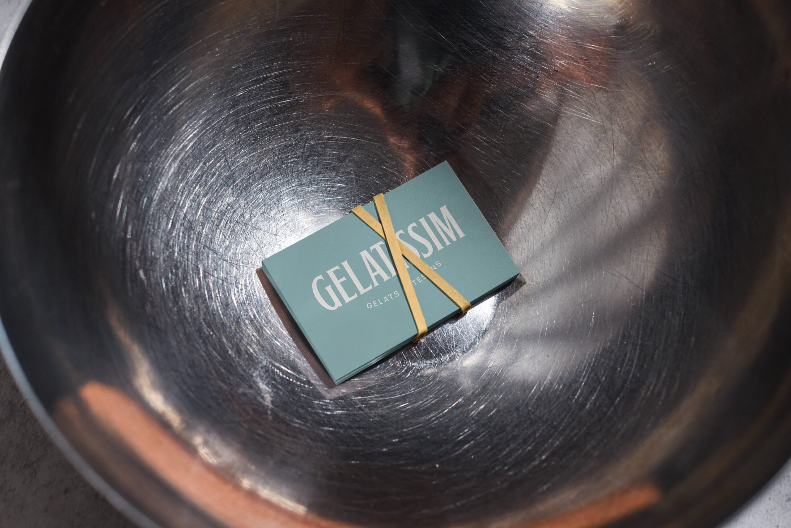
The logo was developed using a condensed serif typeface, elegant in character, with subtle serifs that evoke tradition and craftsmanship. This choice reinforces the brand’s heritage and adds a restrained sophistication aligned with its positioning.
The typographic construction conveys authority and timelessness without losing its sense of approachability, striking a balance between heritage and contemporaneity. The result is a strong, recognizable identity that projects trust, quality, and consistency across every touchpoint.
Brand identity system
The logo was developed using a condensed serif typeface, elegant in character, with subtle serifs that evoke tradition and craftsmanship. This choice reinforces the brand’s heritage and adds a restrained sophistication aligned with its positioning.
The typographic construction conveys authority and timelessness without losing its sense of approachability, striking a balance between heritage and contemporaneity. The result is a strong, recognizable identity that projects trust, quality, and consistency across every touchpoint.
Packaging & Graphic System
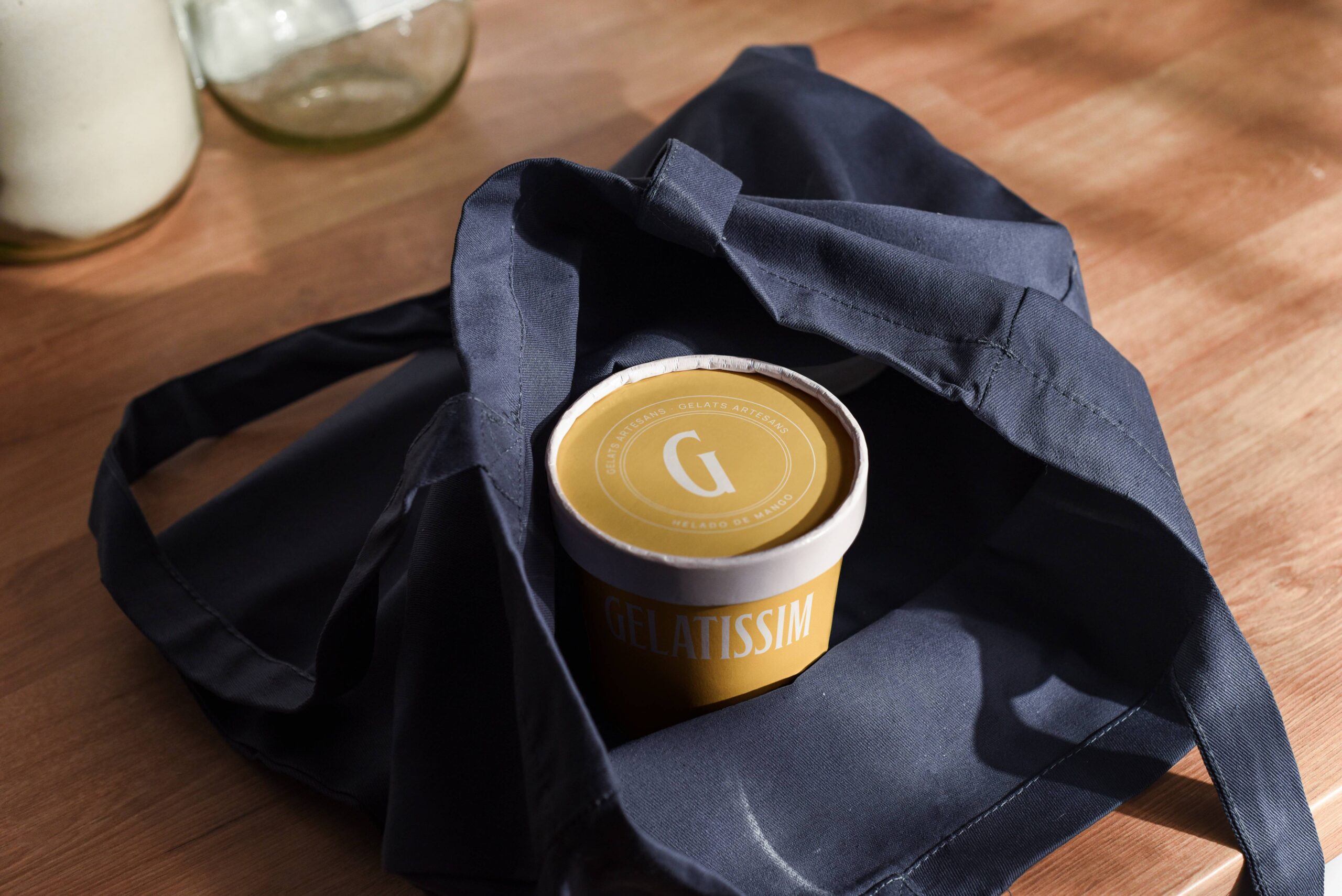
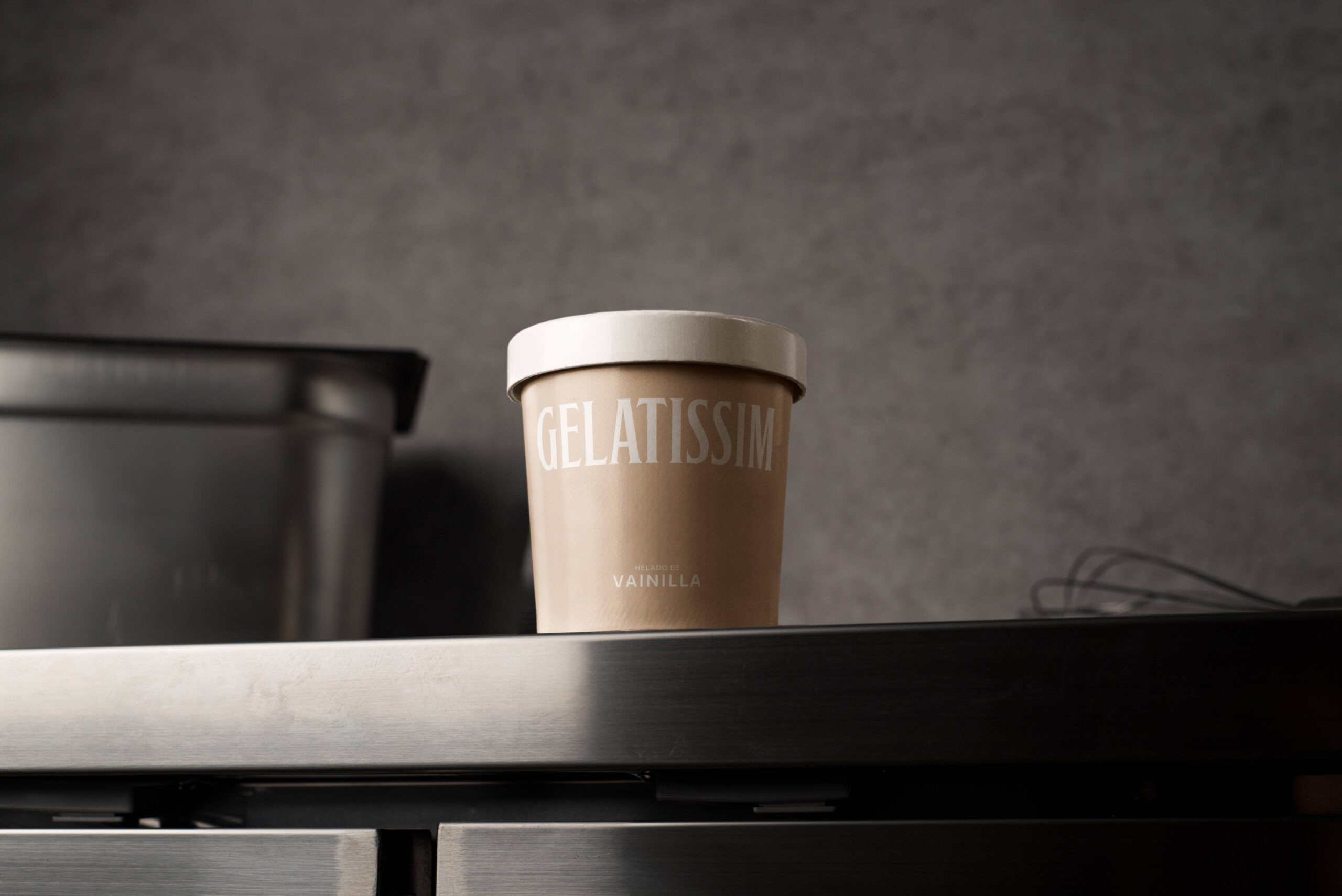
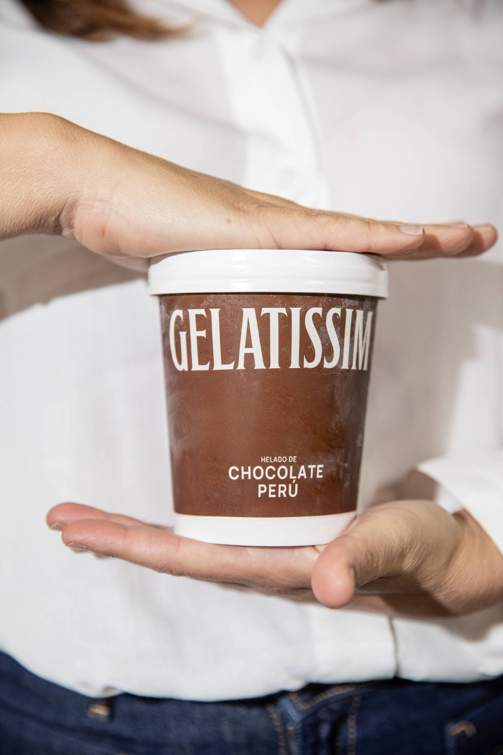
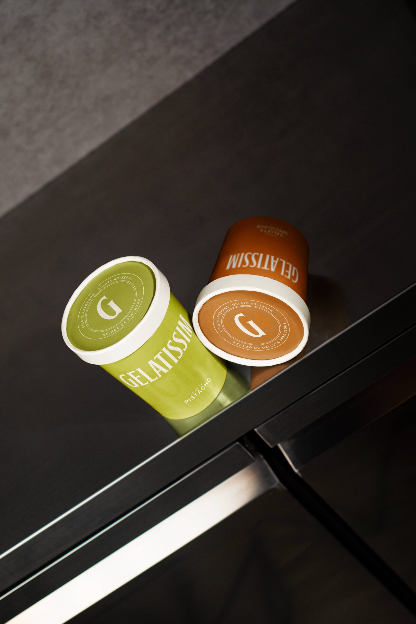
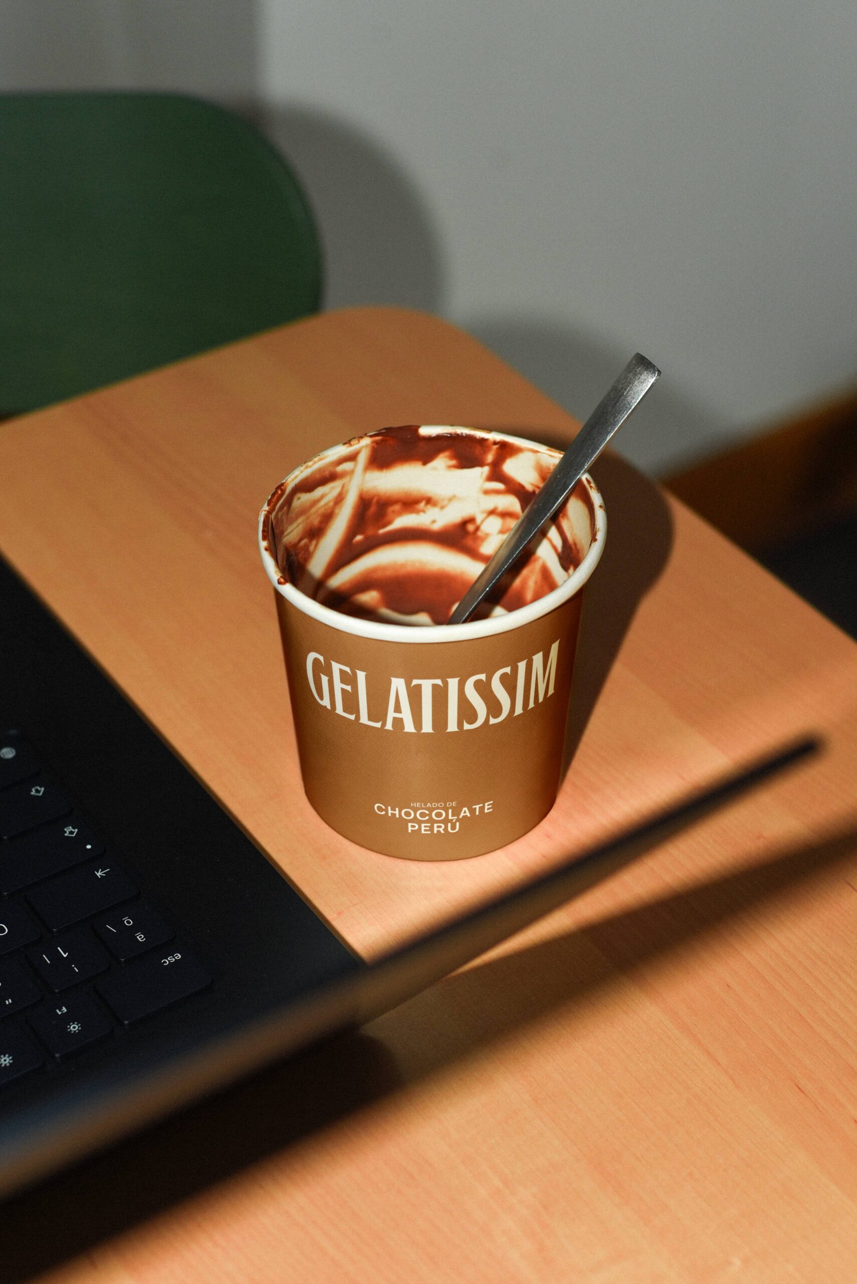
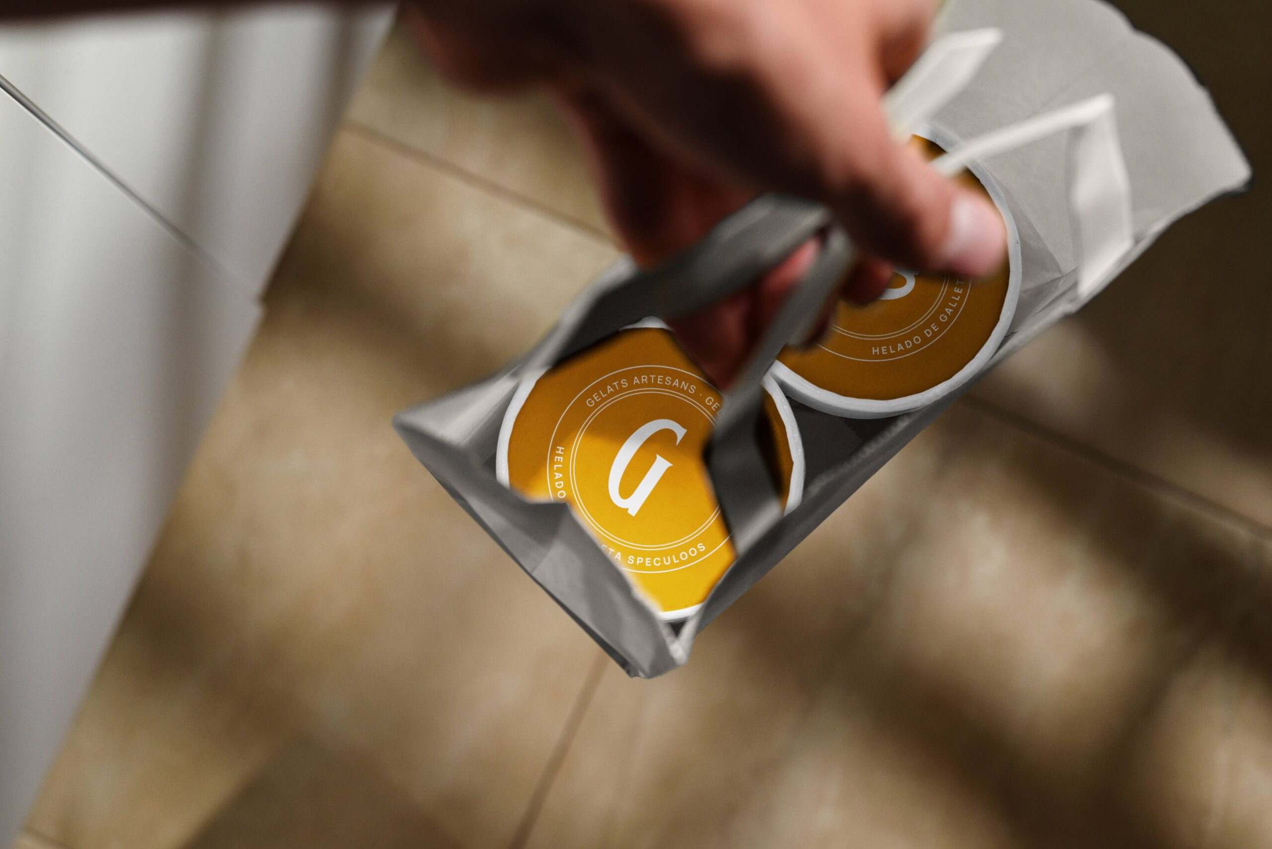
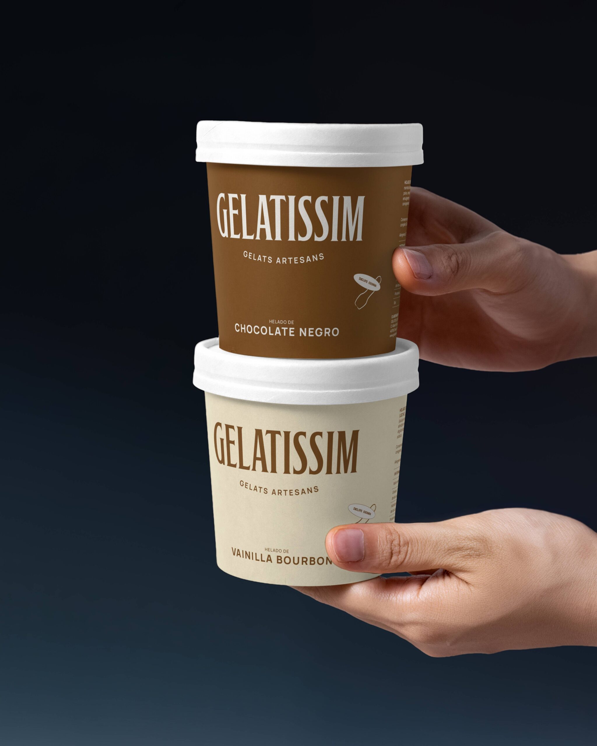
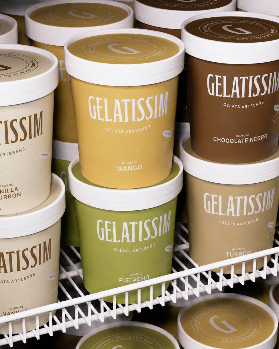
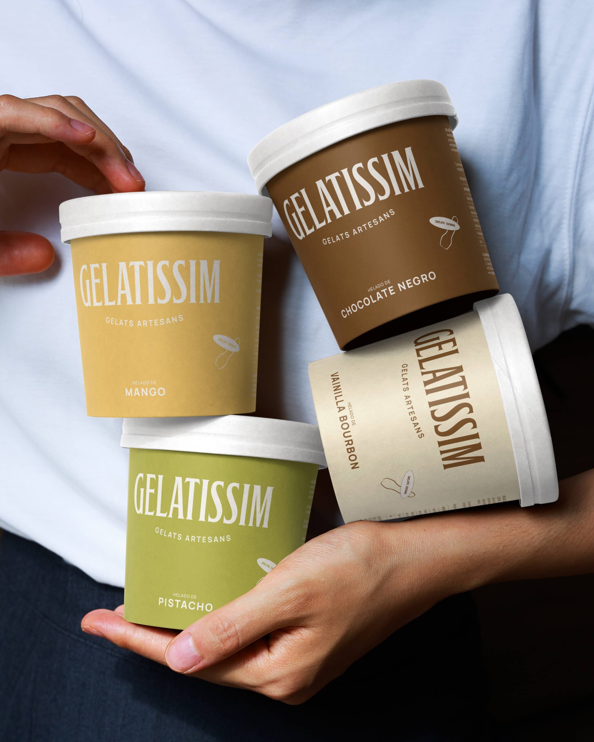
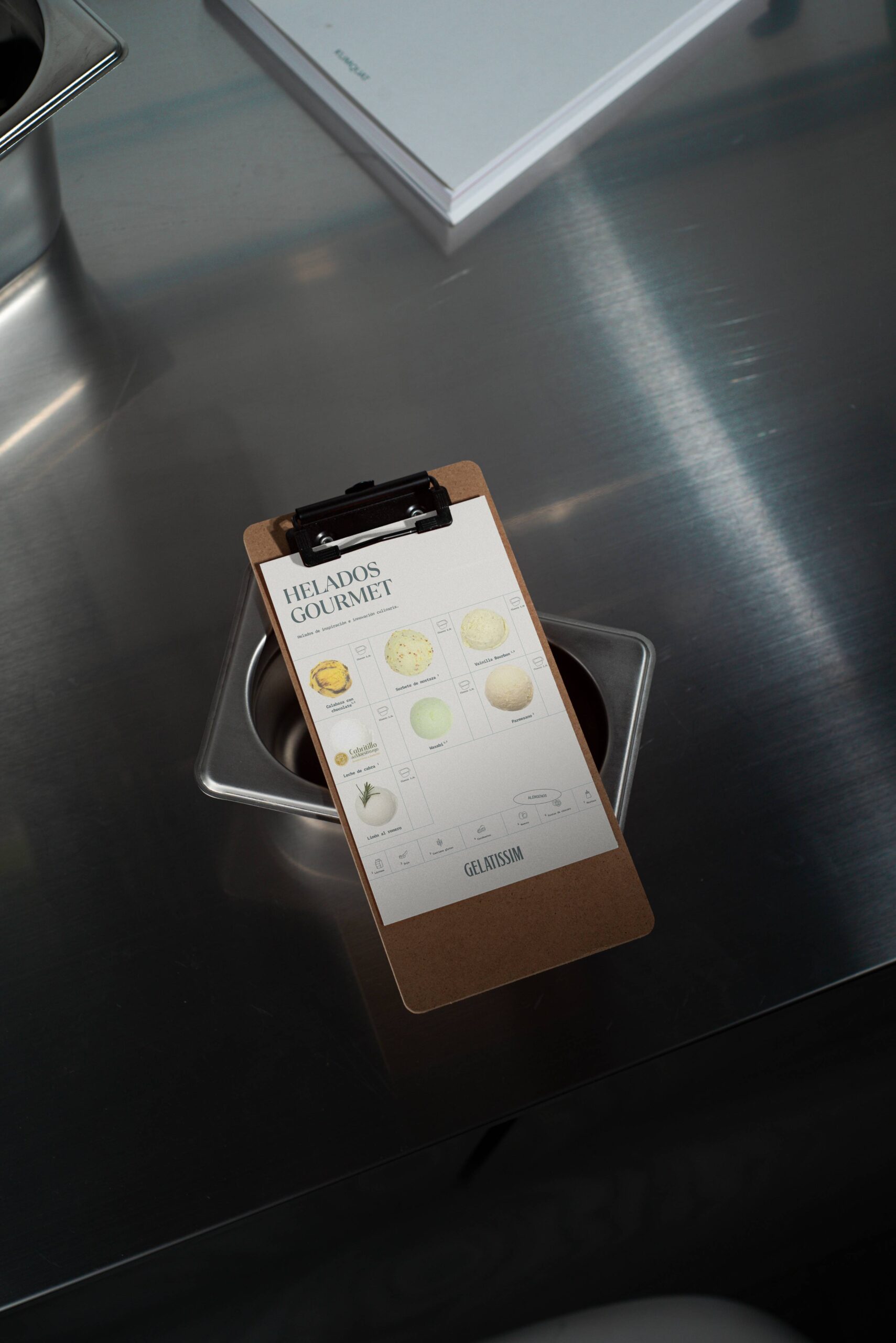
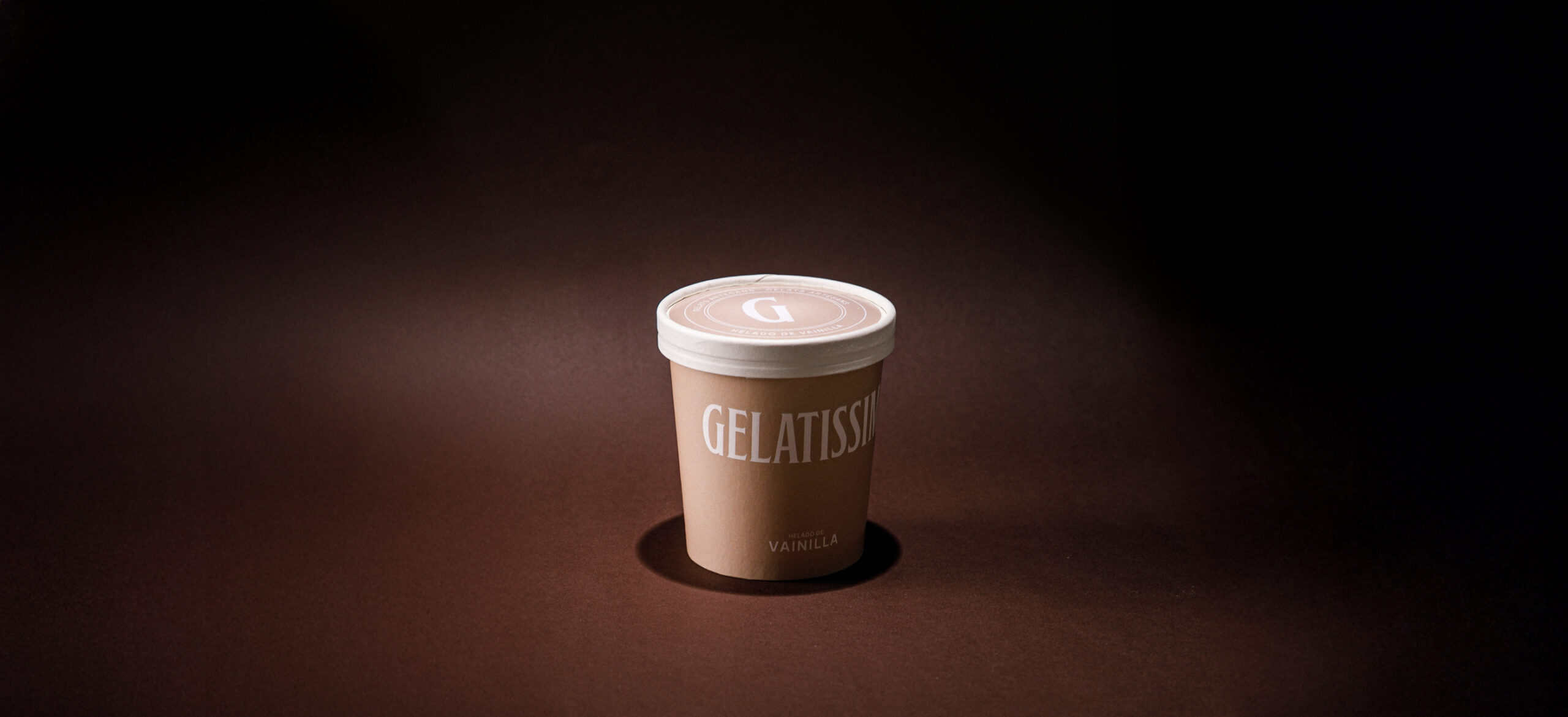
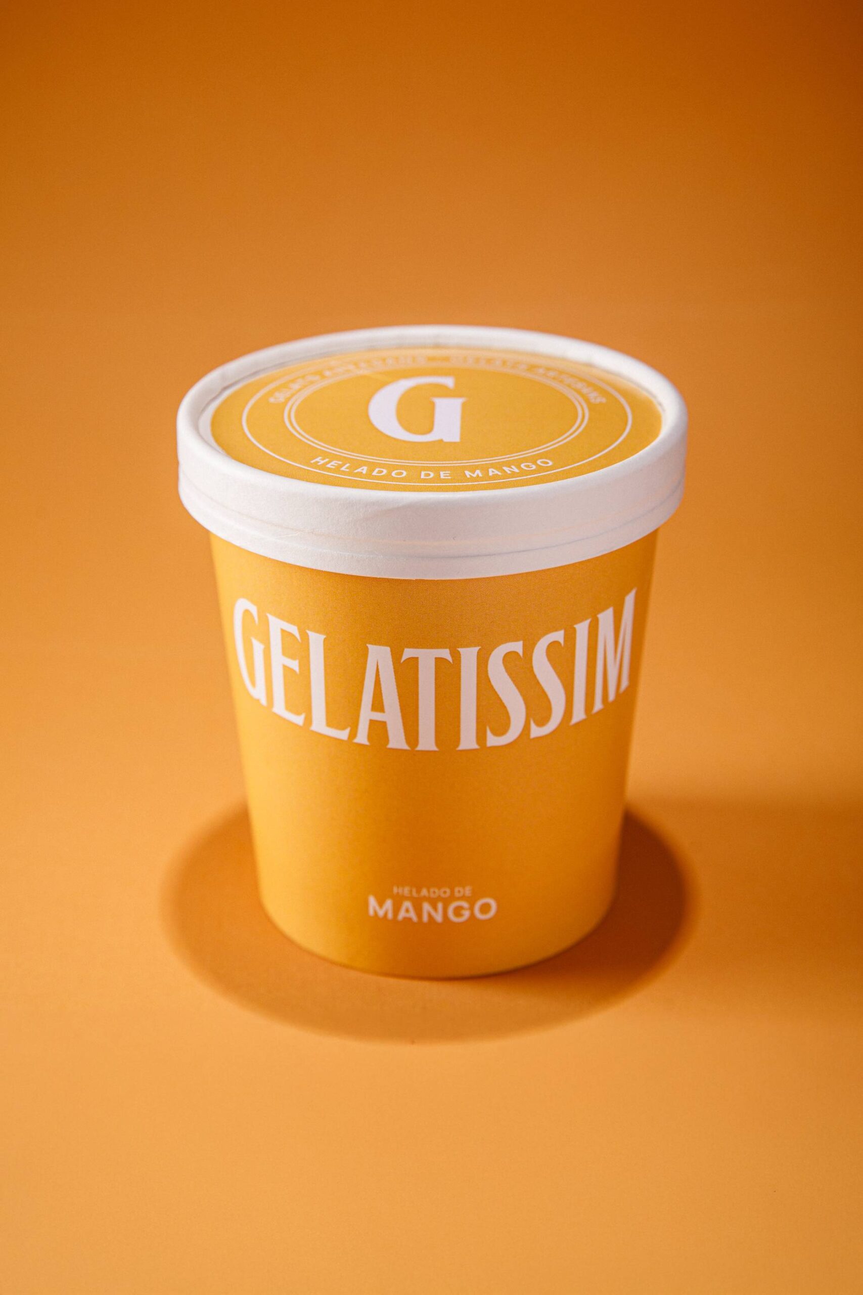
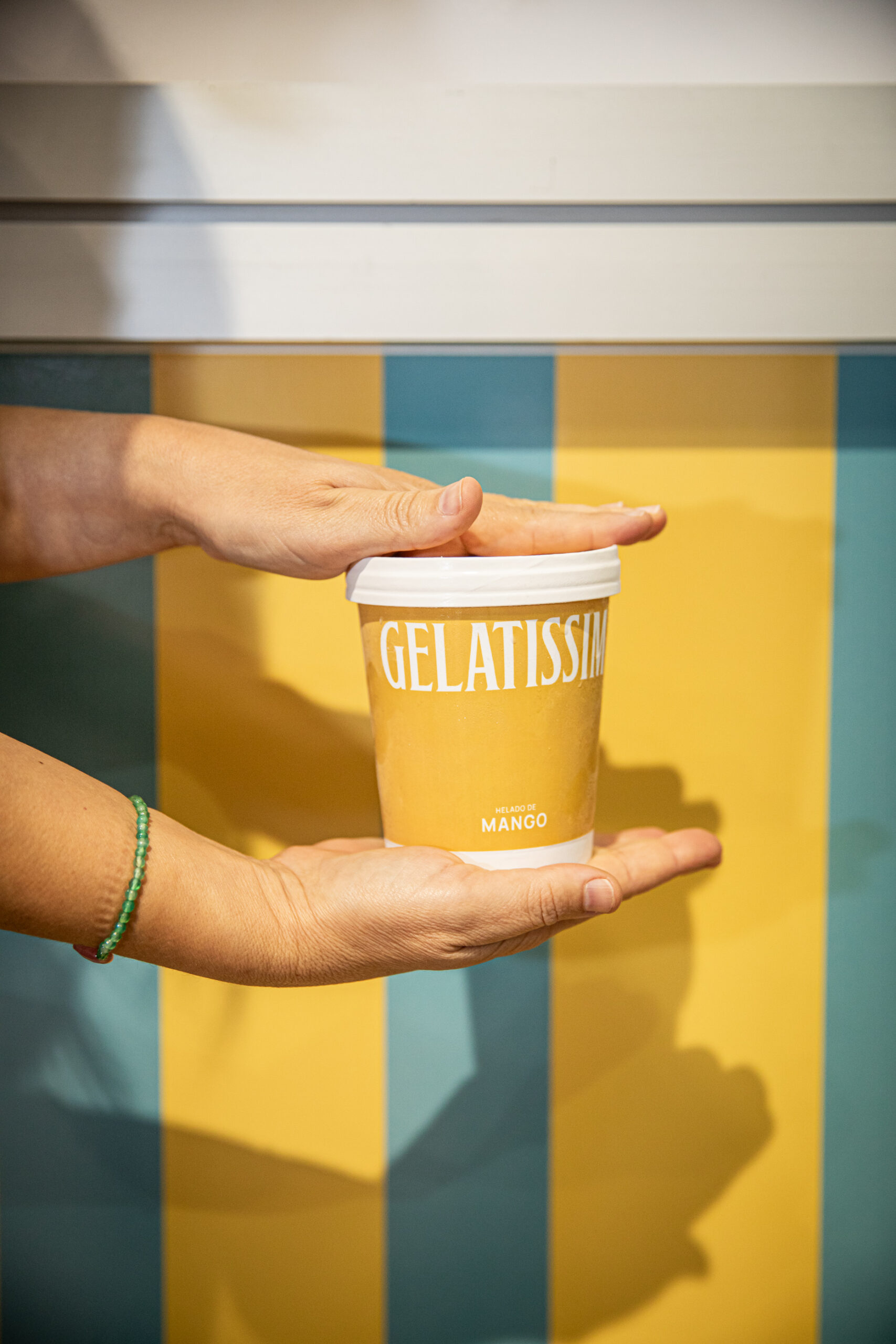
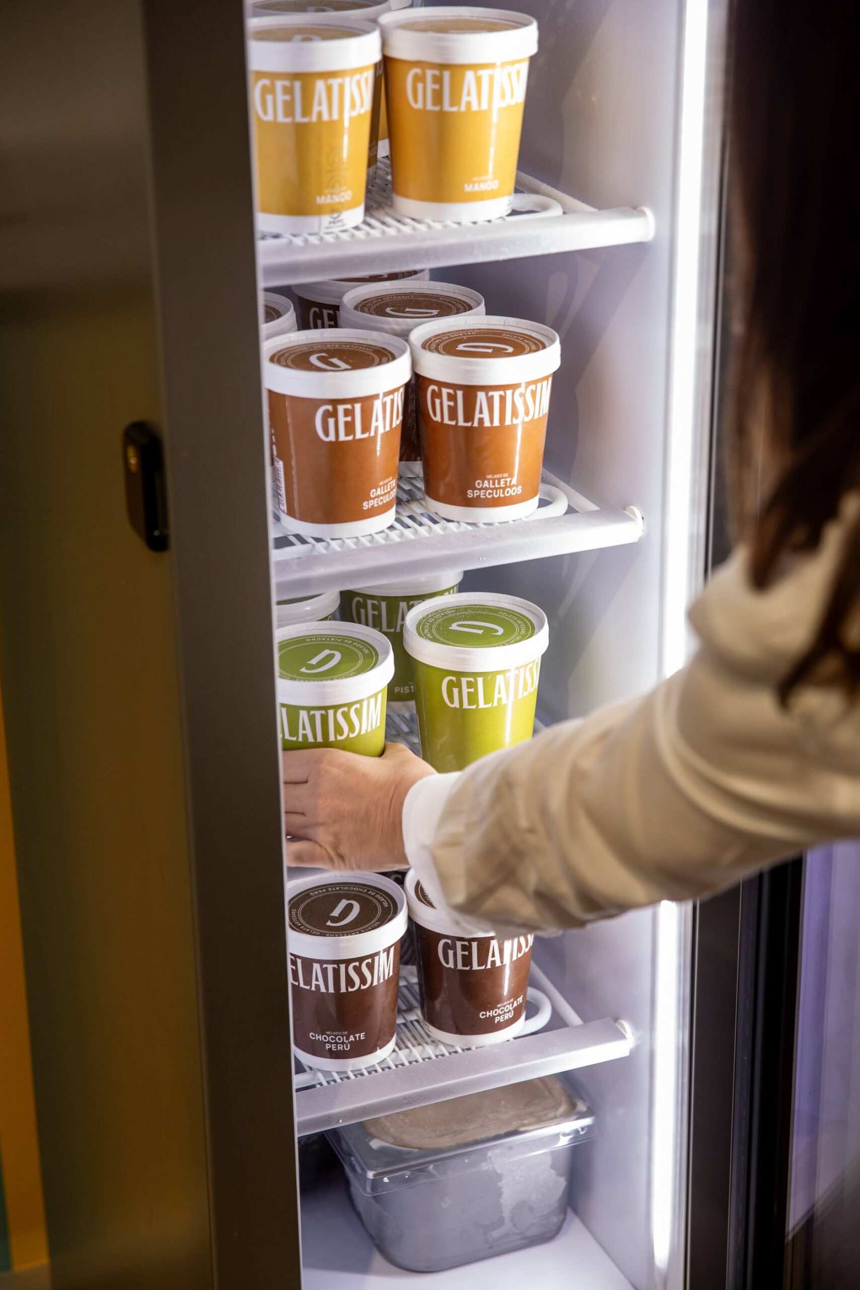
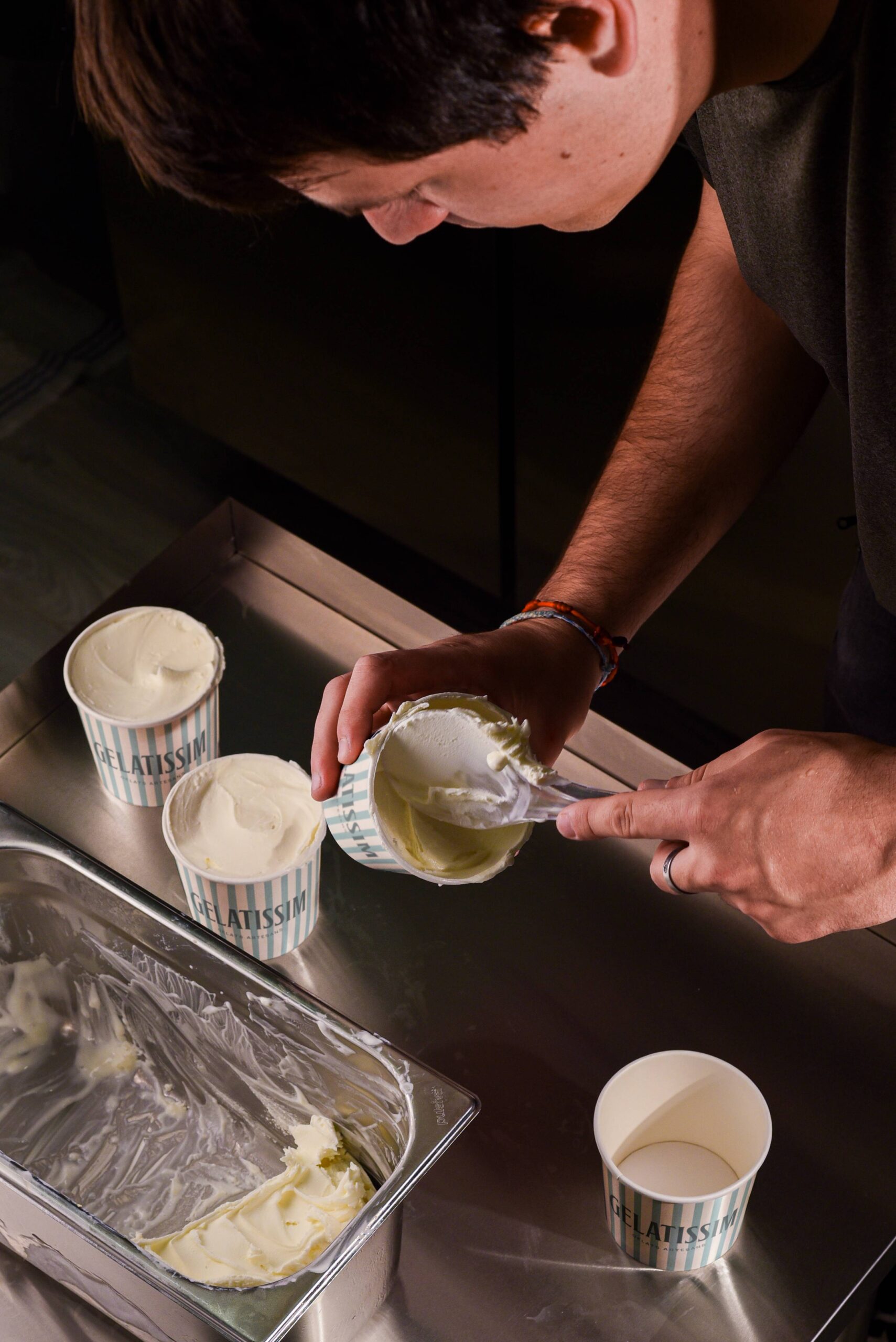
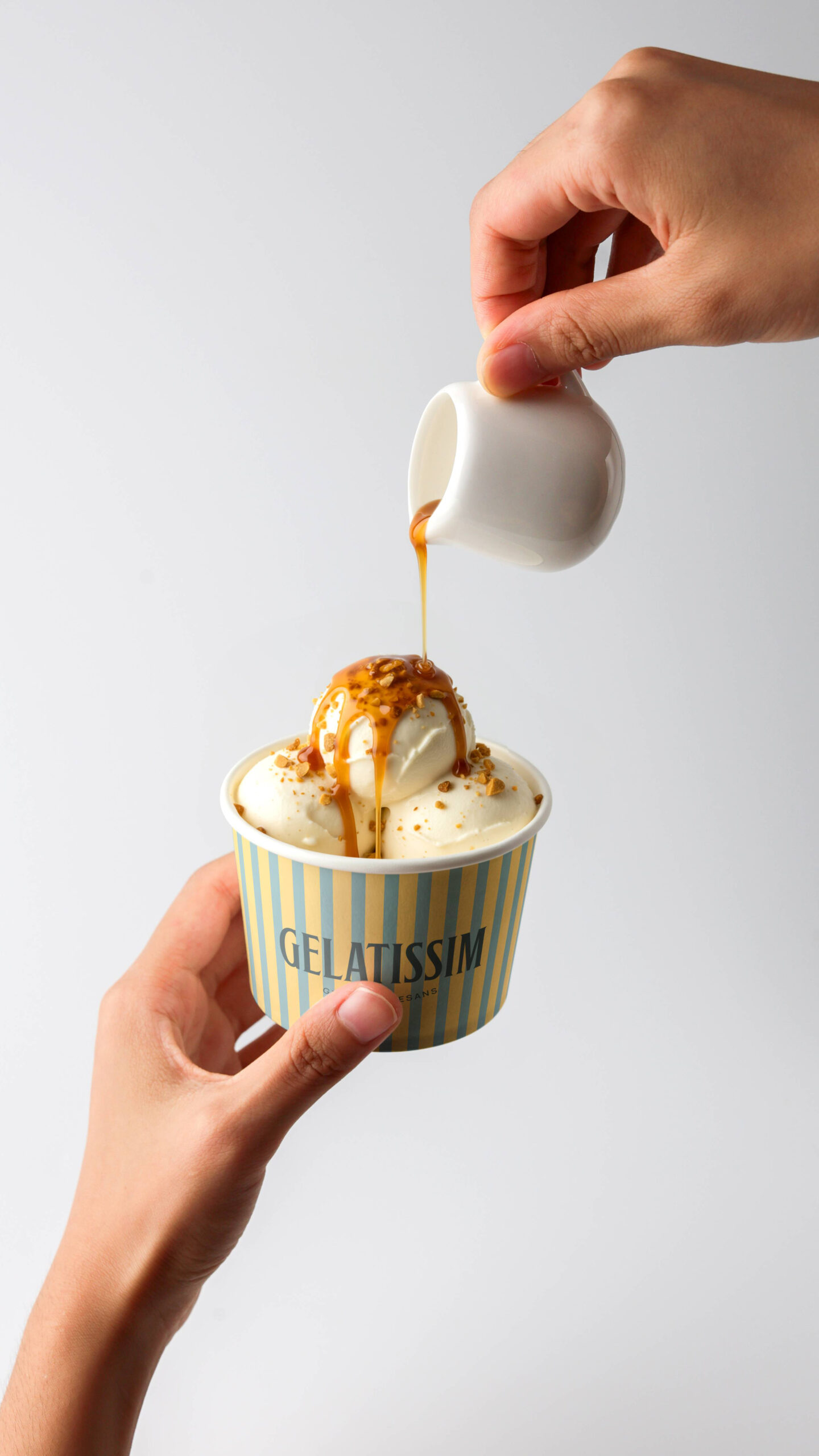
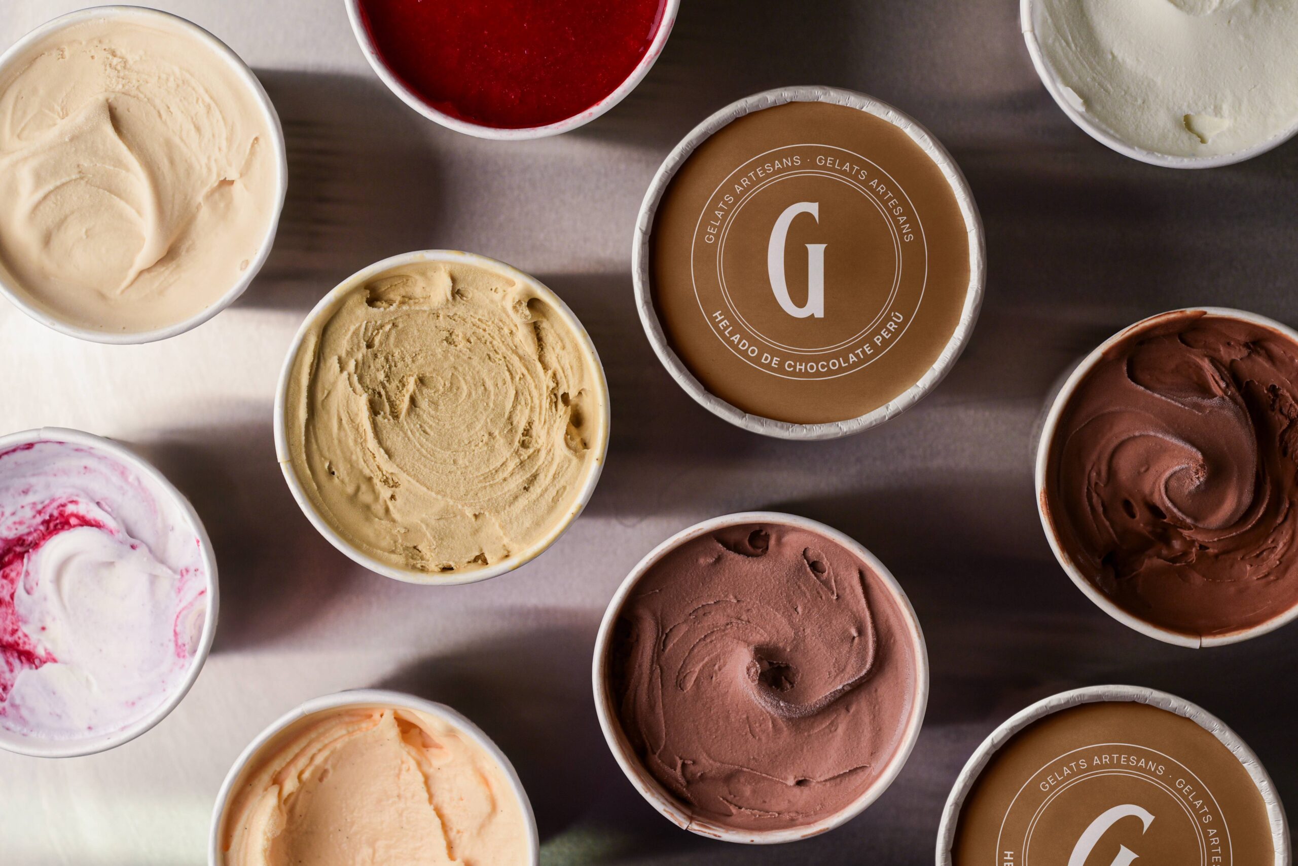
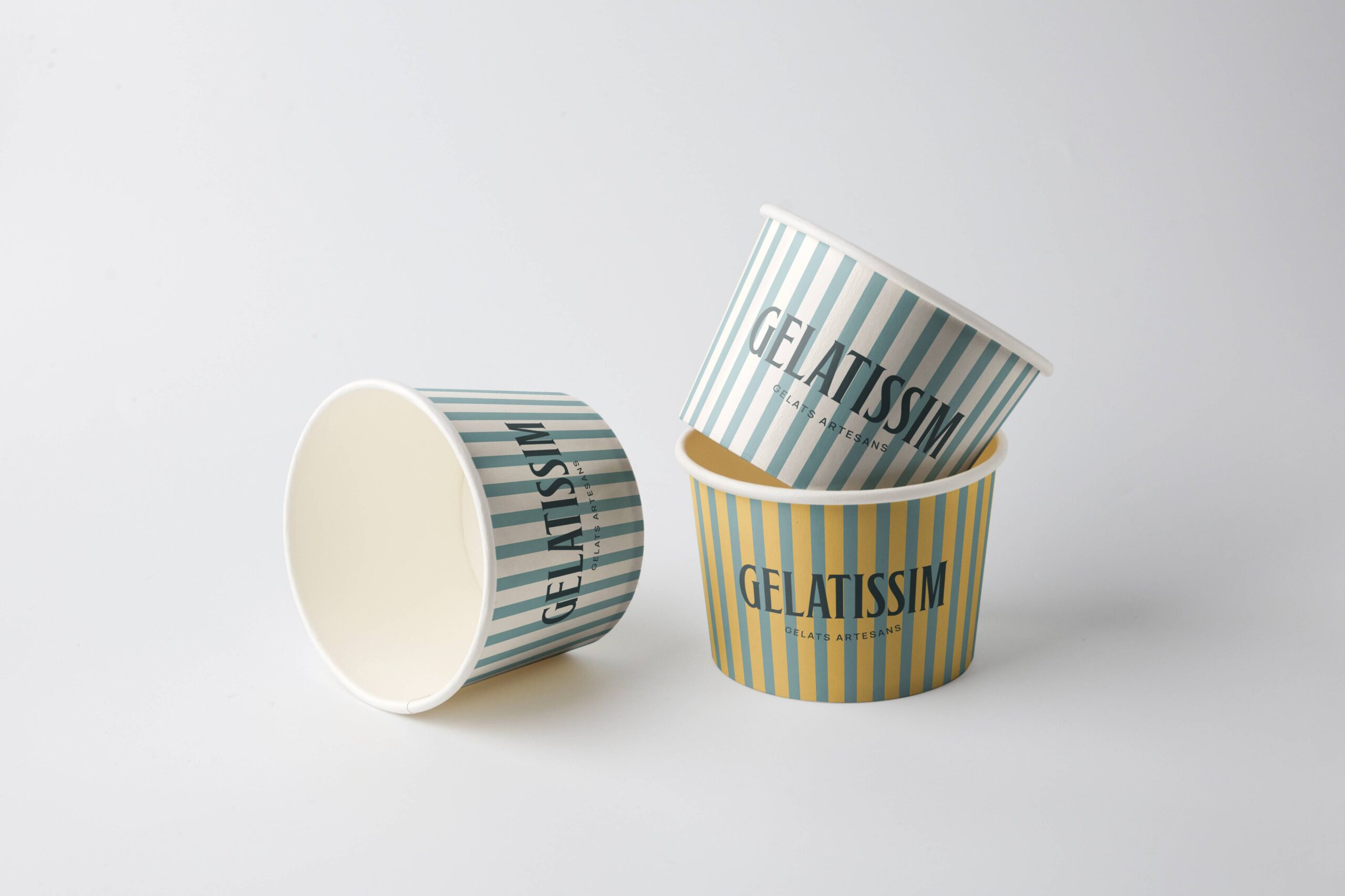
The packaging system was conceived around typographic minimalism, giving absolute prominence to the logo, composition and colour palette.
Unnecessary illustrations and decorative elements were removed to communicate transparency and let the real product take centre stage.
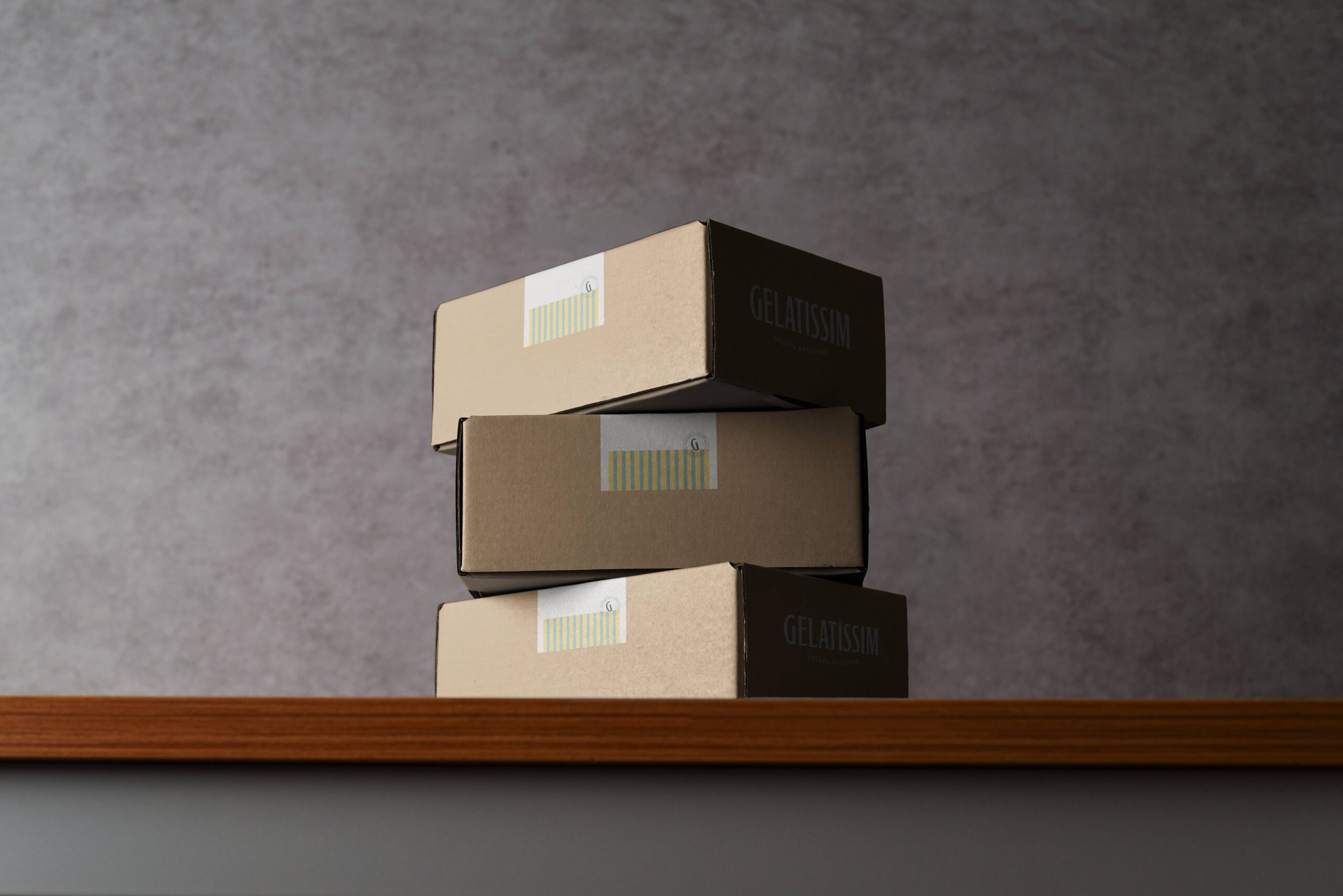
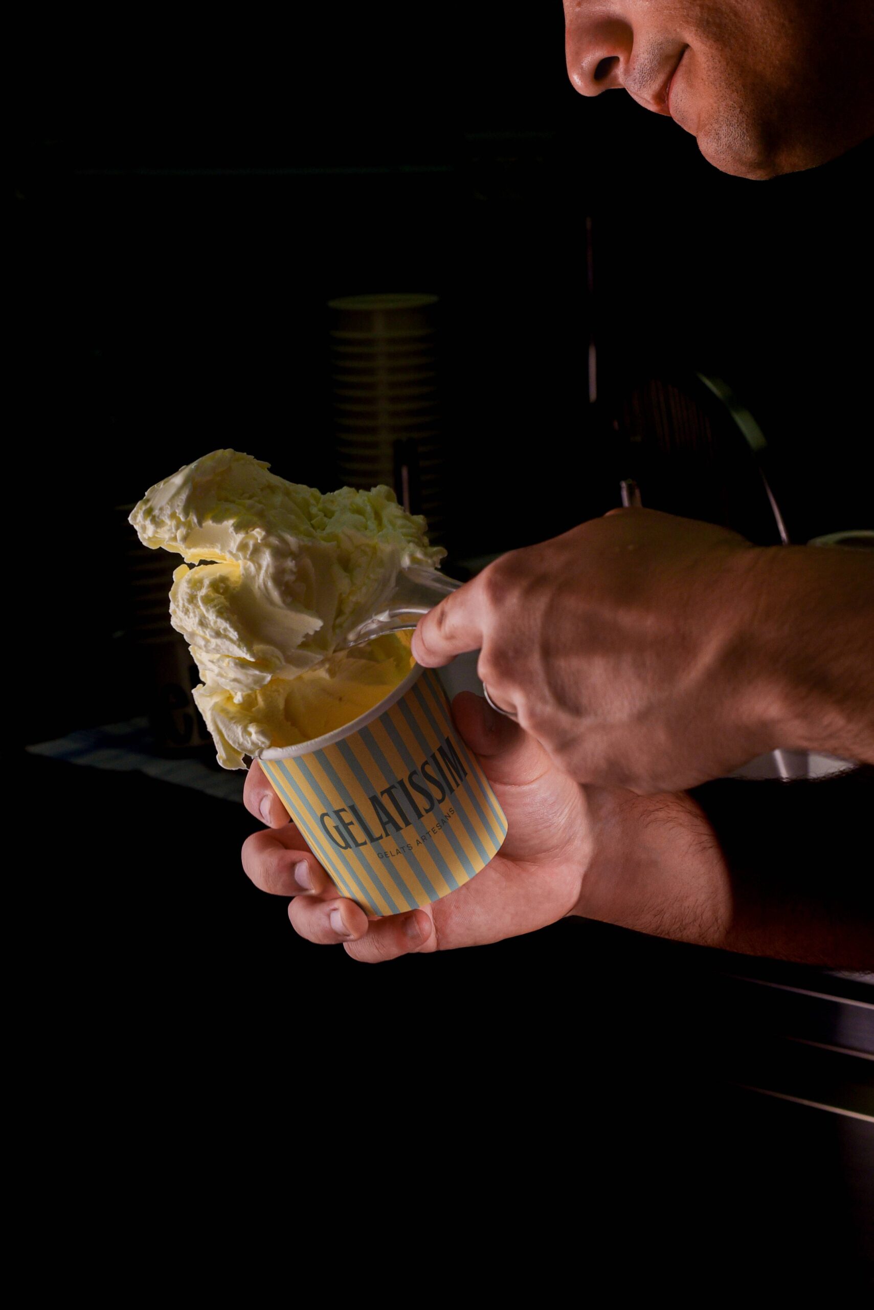
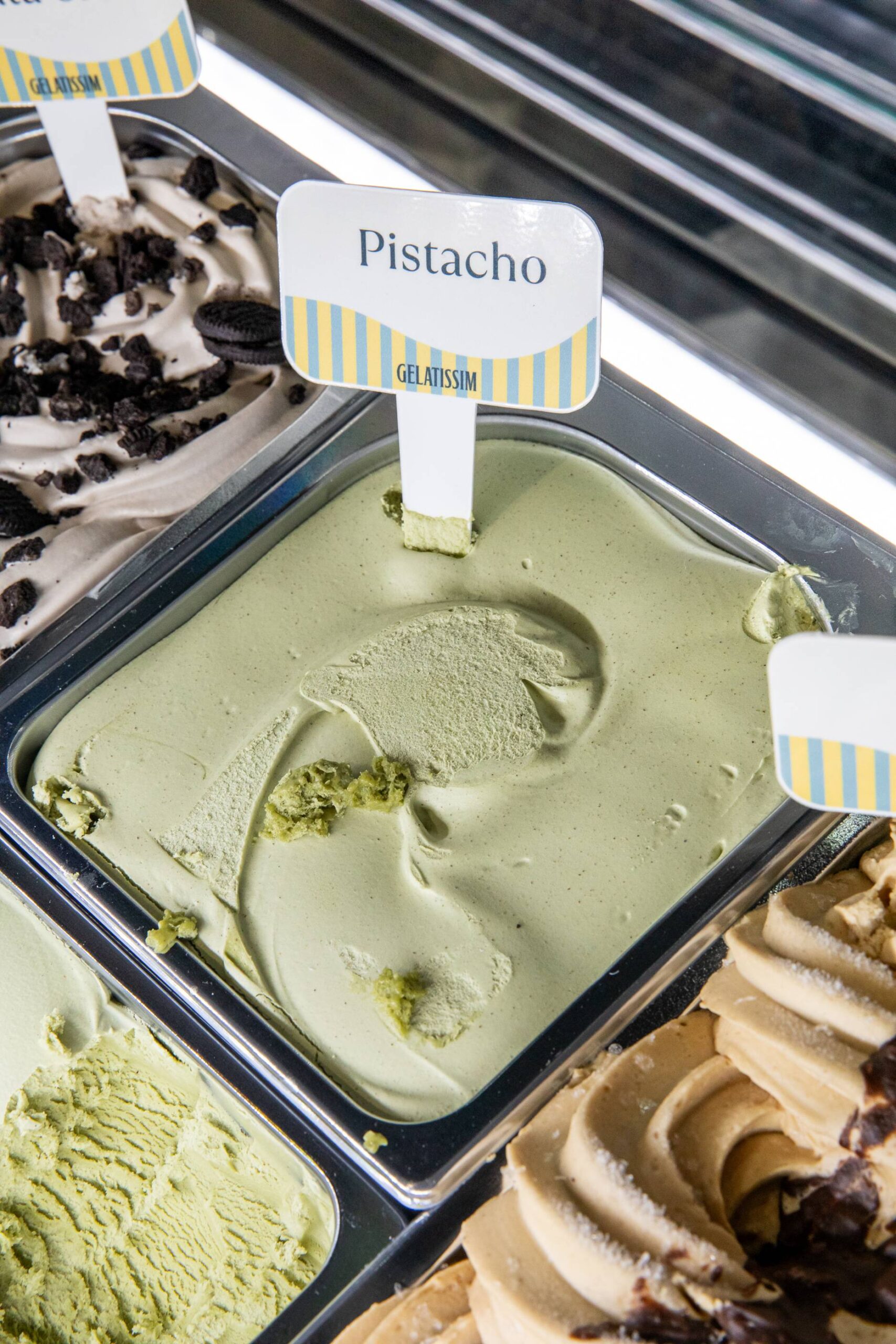
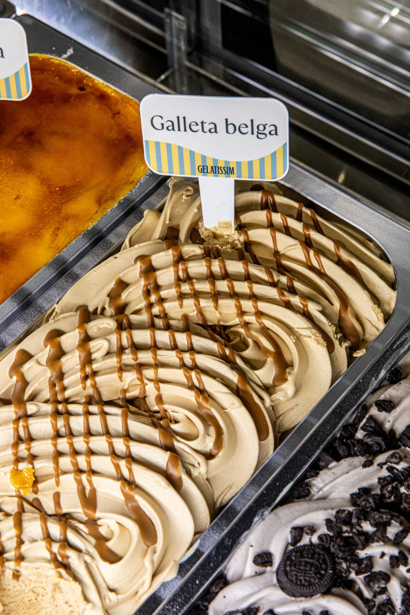
As a nod to ice cream-making traditions, vertical stripe patterns were introduced across cups, cones and sticks, reinterpreting familiar codes from a contemporary perspective. This device connects with collective memory while reinforcing the artisan story.
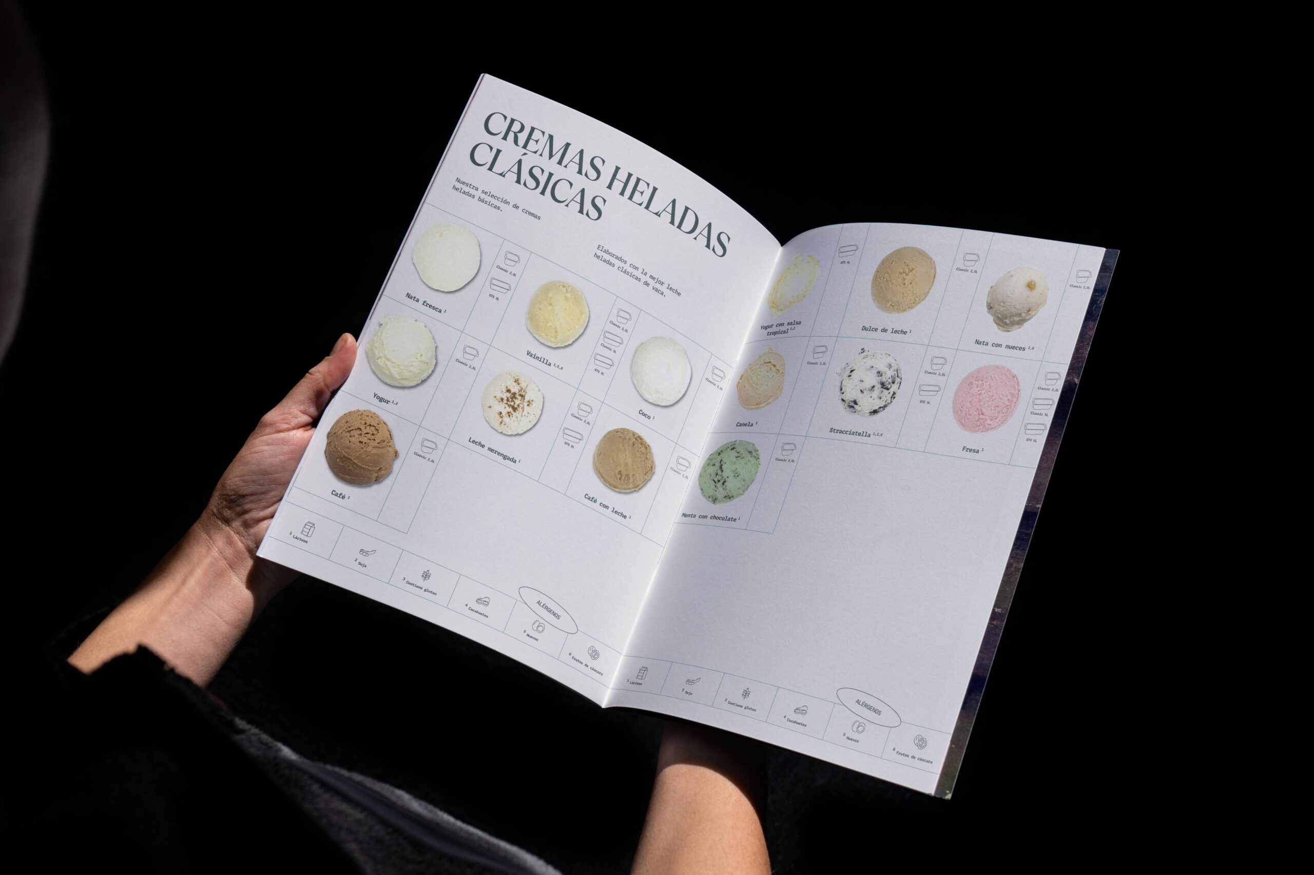
The result is a strong, coherent and scalable visual system that can evolve with the brand while preserving its essence and strengthening its positioning.
Packaging & Graphic System
The packaging system was conceived around typographic minimalism, giving absolute prominence to the logo, composition and colour palette.
Unnecessary illustrations and decorative elements were removed to communicate transparency and let the real product take centre stage.
As a nod to ice cream-making traditions, vertical stripe patterns were introduced across cups, cones and sticks, reinterpreting familiar codes from a contemporary perspective. This device connects with collective memory while reinforcing the artisan story.
The result is a strong, coherent and scalable visual system that can evolve with the brand while preserving its essence and strengthening its positioning.