
AOVE Pago de Amezcua
- Branding
- Packaging
- Illustration
- Social Media
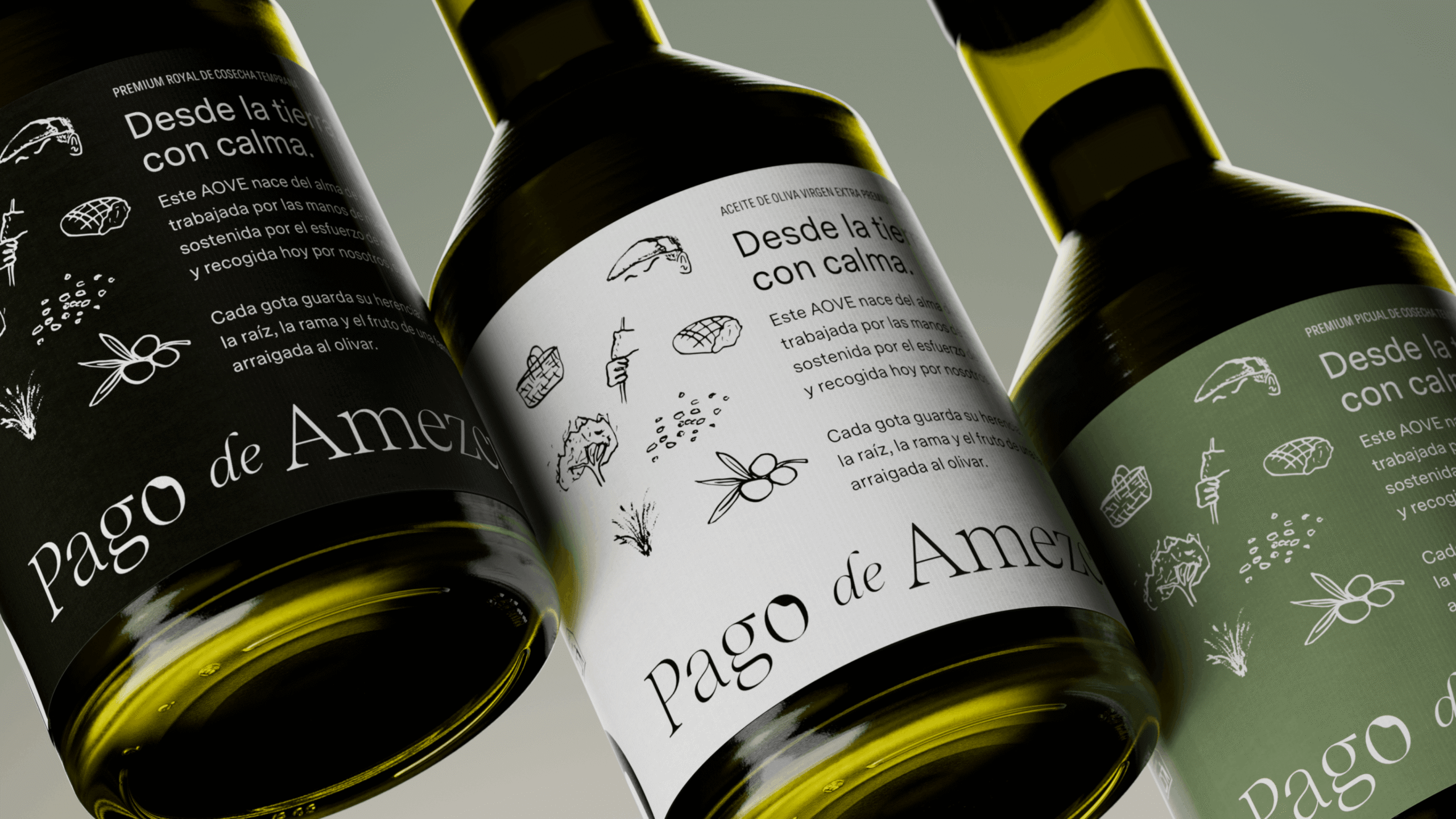
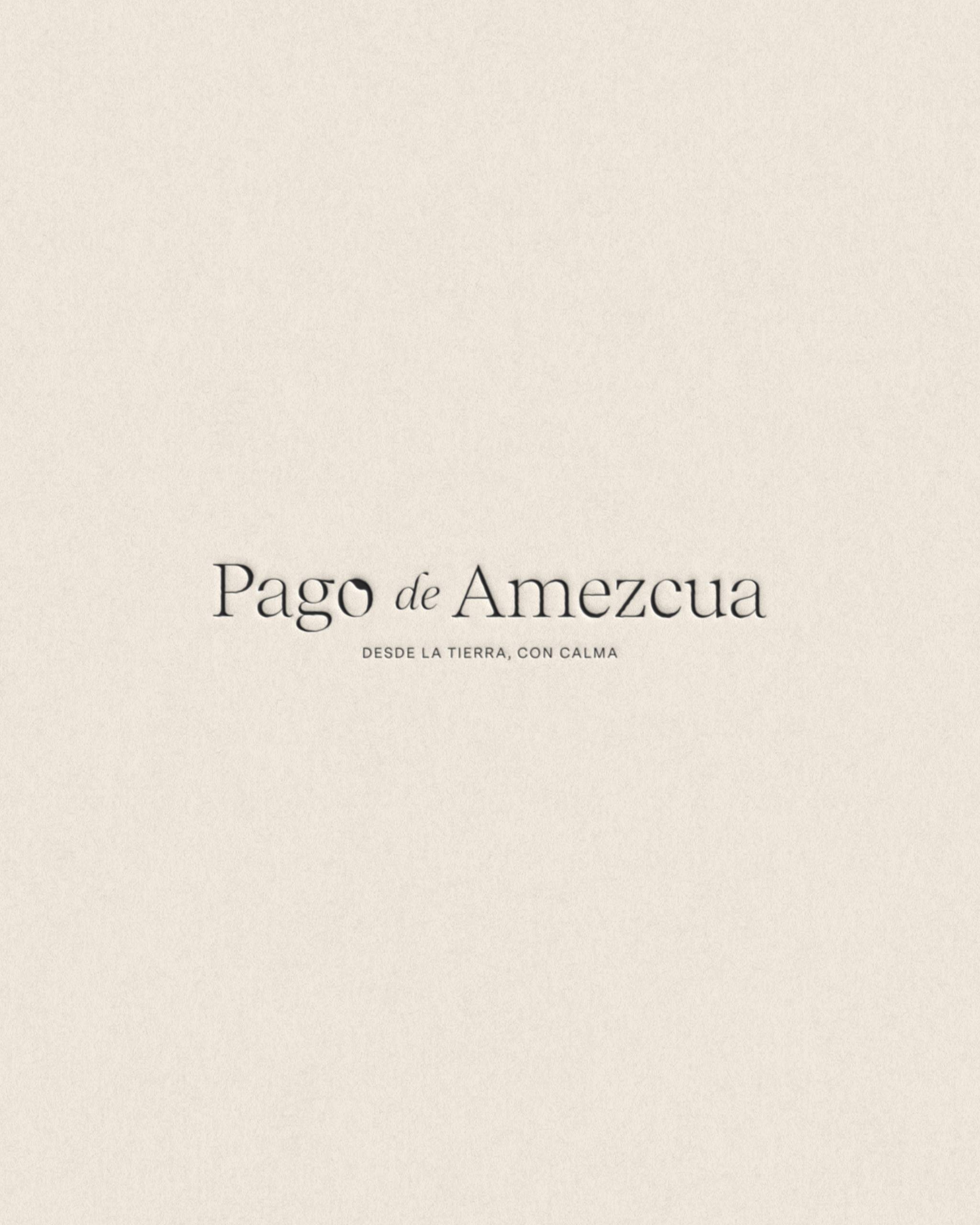
Visual identity and packaging design for Pago de Amezcua, an olive oil brand rooted in family heritage and the tradition of the olive groves of Jaén.
The project is conceived as a strategic approach to building the brand that goes beyond aesthetics, seeking to translate into a visual language a way of life rooted in origin, care, and respect for the land.
Concept & Positioning
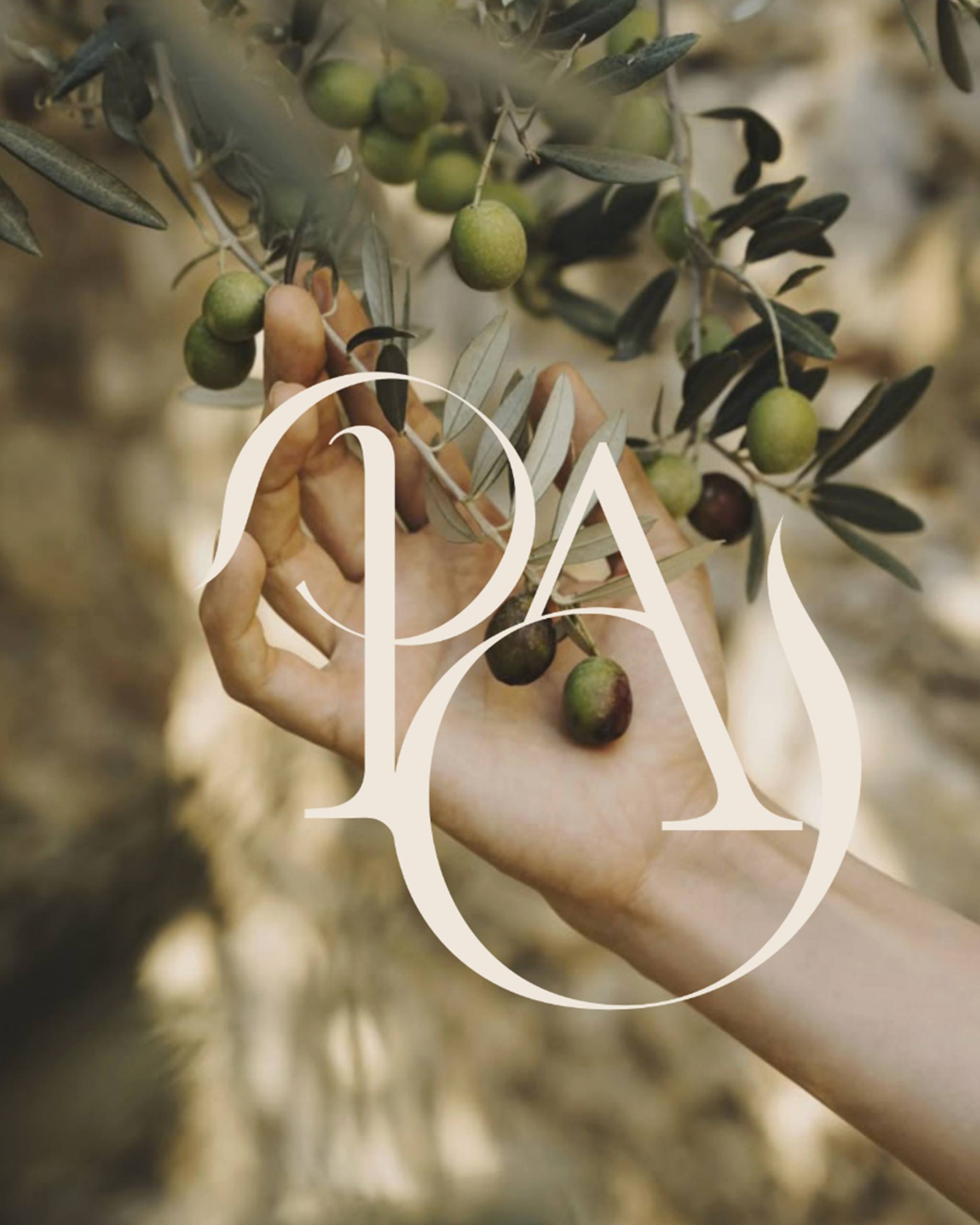
Pago de Amezcua is rooted in a sense of belonging: family roots, generational heritage and a deep connection to the land.
Its positioning is built around conscious quality rather than mass production. It is not about making more, but about making better. The brand needed to express calm, care and respect for the process, communicating authenticity without artifice.
The branding is built as a story, with every visual element reinforcing the ideas of origin, memory and connection to nature.
Concept & Positioning
Pago de Amezcua is rooted in a sense of belonging: family roots, generational heritage and a deep connection to the land.
Its positioning is built around conscious quality rather than mass production. It is not about making more, but about making better. The brand needed to express calm, care and respect for the process, communicating authenticity without artifice.
The branding is built as a story, with every visual element reinforcing the ideas of origin, memory and connection to nature.
Brand identity system
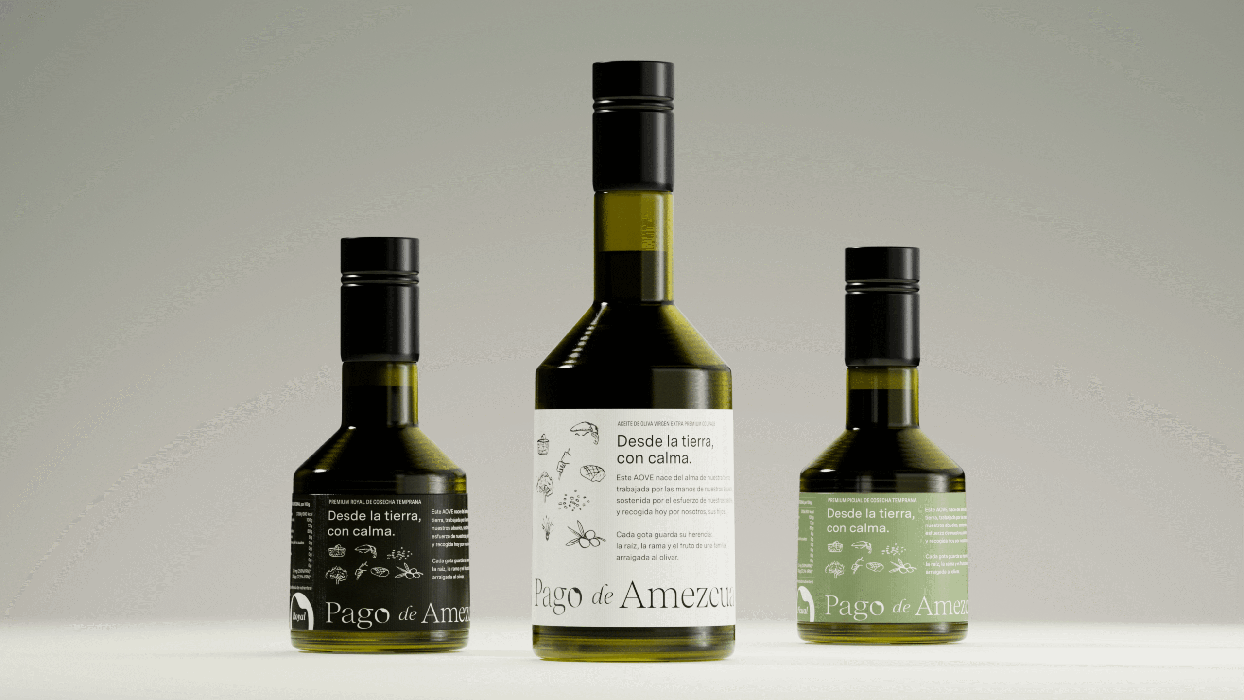
The visual identity draws from a colour palette inspired by the natural landscape. Deep olive green reflects the strength of the fruit and the understated character of the surroundings; stone and beige tones evoke the earth, hands and the passage of time; black adds balance, elegance and restraint.
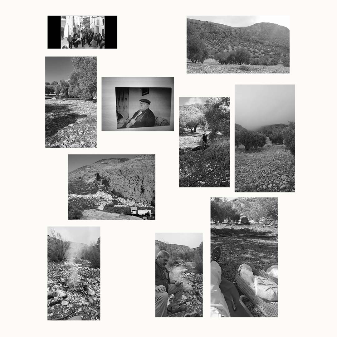
Illustration is an essential part of the graphic system. Inspired by real photographs of the family and the olive grove, the images are translated into lines that capture gestures, branches and fragments of the landscape. This turns the identity into a visual testimony of the brand’s origins and reinforces its human dimension.
The result is a restrained, coherent system with strong symbolic depth, where every element contributes to a clear narrative.
Brand identity system
The visual identity draws from a colour palette inspired by the natural landscape. Deep olive green reflects the strength of the fruit and the understated character of the surroundings; stone and beige tones evoke the earth, hands and the passage of time; black adds balance, elegance and restraint.
Illustration is an essential part of the graphic system. Inspired by real photographs of the family and the olive grove, the images are translated into lines that capture gestures, branches and fragments of the landscape. This turns the identity into a visual testimony of the brand’s origins and reinforces its human dimension.
The result is a restrained, coherent system with strong symbolic depth, where every element contributes to a clear narrative.
Packaging & experience
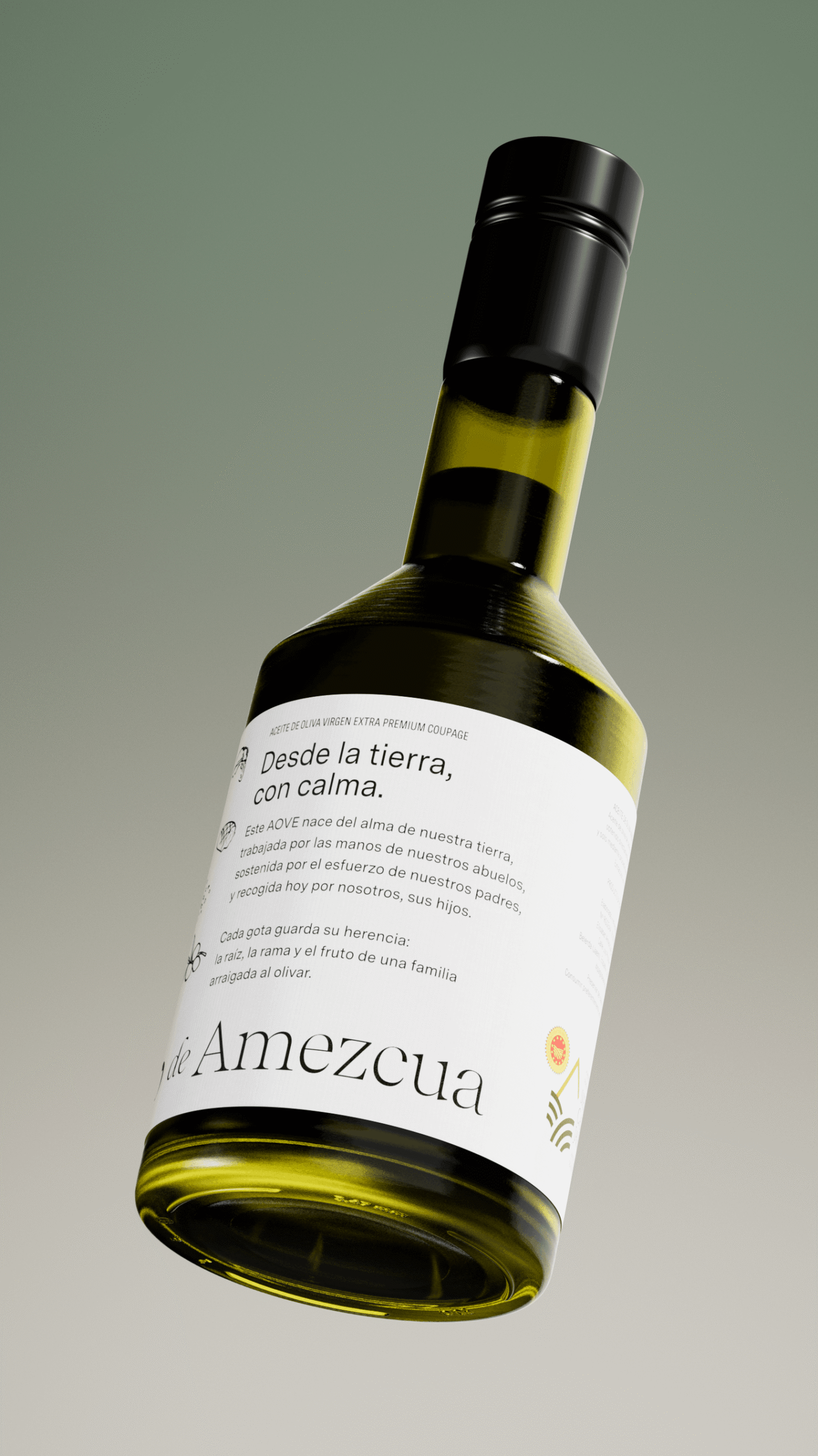
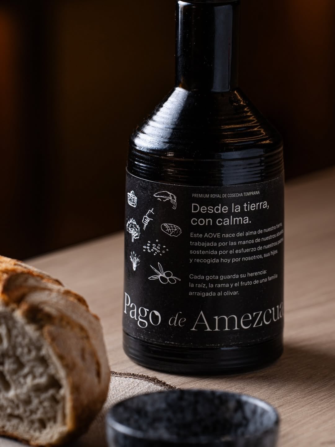
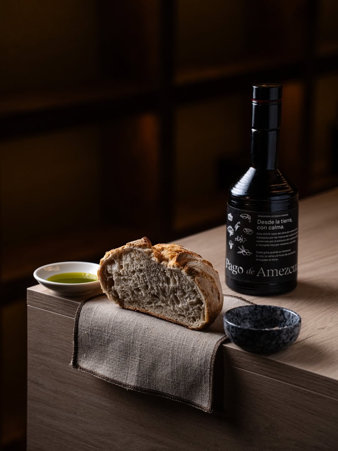
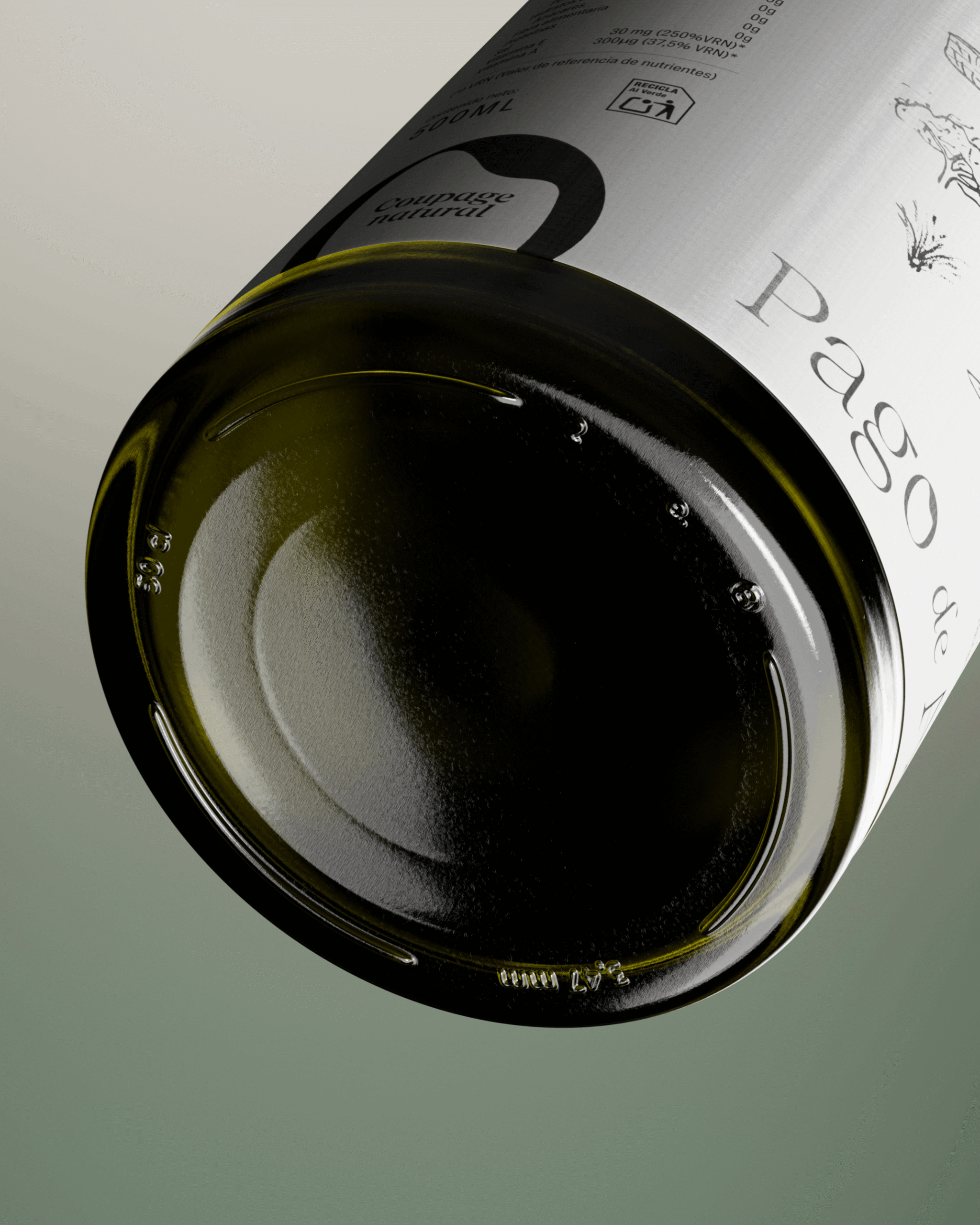
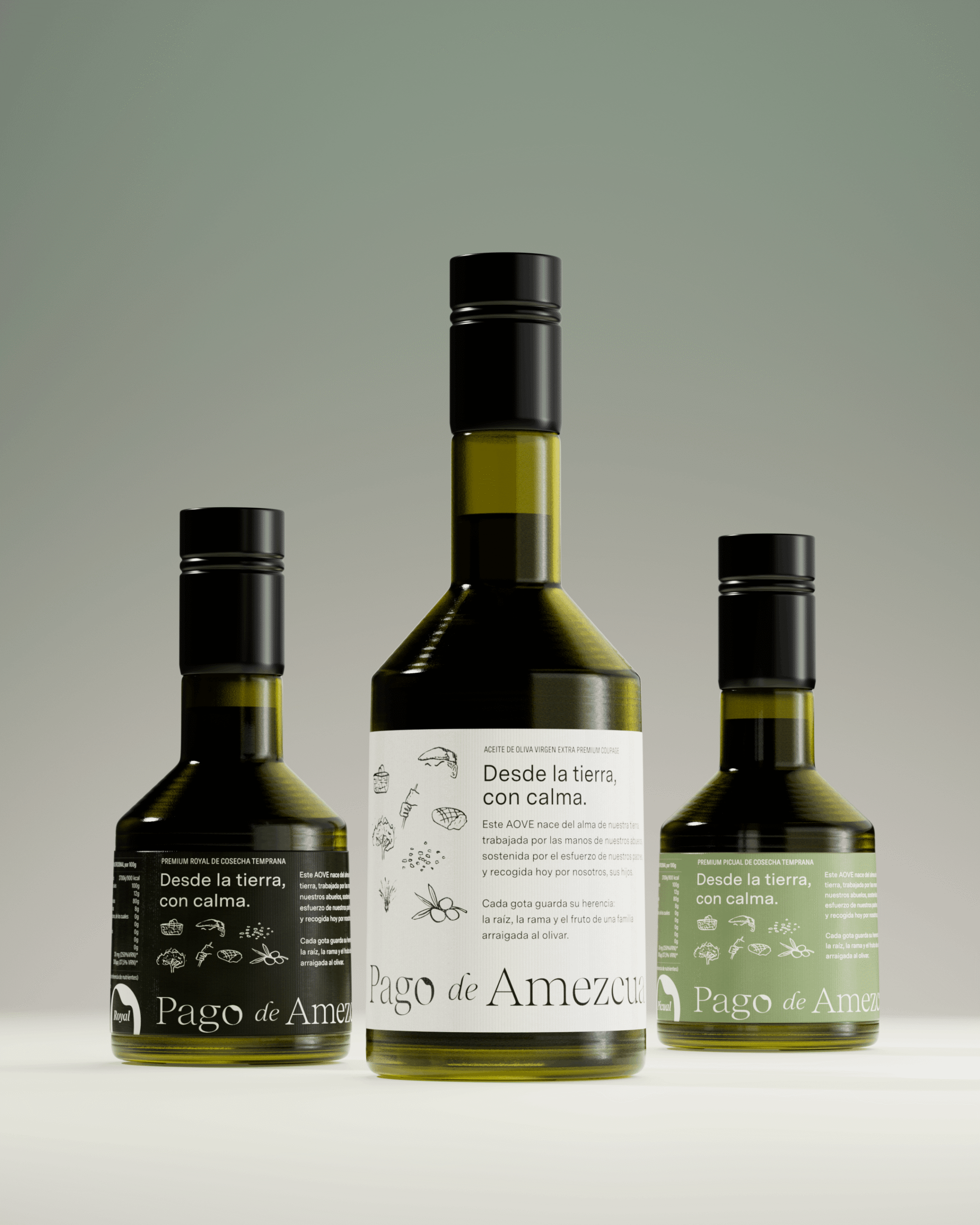
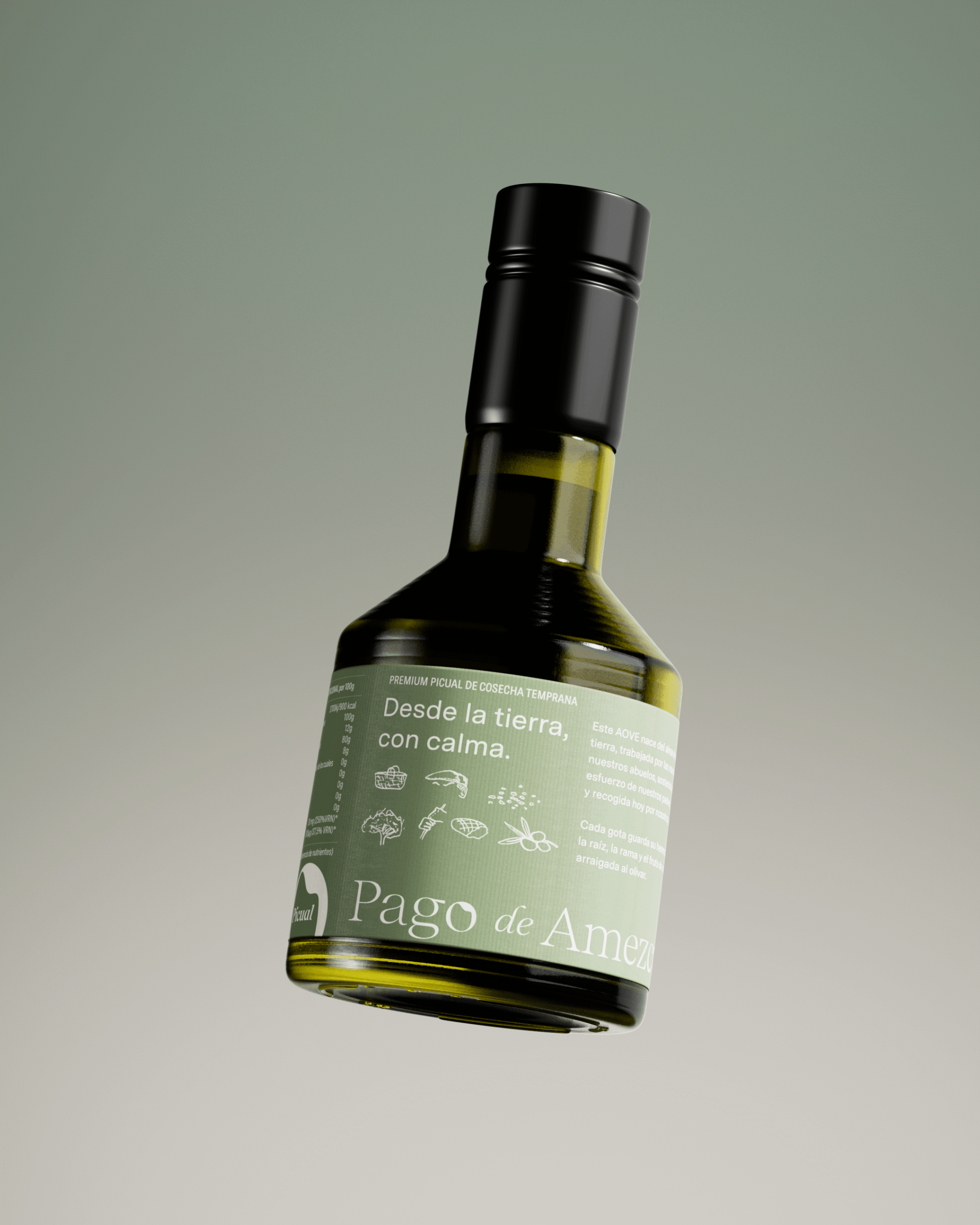
The label is conceived as a story that reveals itself gradually. The design invites you to turn the bottle, explore it with your eyes and pause over the details, creating a slower, more reflective experience.
Packaging is not simply a container, but a storytelling medium. Colour, composition and illustration work together to communicate calm, authenticity and a connection to the land.
The result is a brand that communicates not only quality, but a sense of belonging. An identity that turns every bottle into a sensory and emotional experience, deeply connected to its origins.
Packaging & experience
The label is conceived as a story that reveals itself gradually. The design invites you to turn the bottle, explore it with your eyes and pause over the details, creating a slower, more reflective experience.
Packaging is not simply a container, but a storytelling medium. Colour, composition and illustration work together to communicate calm, authenticity and a connection to the land.
The result is a brand that communicates not only quality, but a sense of belonging. An identity that turns every bottle into a sensory and emotional experience, deeply connected to its origins.
Illustrations: Julia Lasa
3D Artist: Edu Martínez
Motion graphics: Viva Visual
Photography: Muy Liados for Orma Restaurante
Illustrations: Julia Lasa
3D Artist: Edu Martínez
Motion graphics: Viva Visual
Photography: Muy Liados for Orma Restaurante