Sorbo Specialty Coffee
- Branding
- Packaging
- Illustration
Visual identity development for Sorbo, a specialty coffee brand that combines coffee culture, a contemporary character, and a clear emotional narrative.
The goal was to build a recognizable, cohesive, and distinctive brand within the sector, balancing a clean, minimalist aesthetic with an approachable personality.
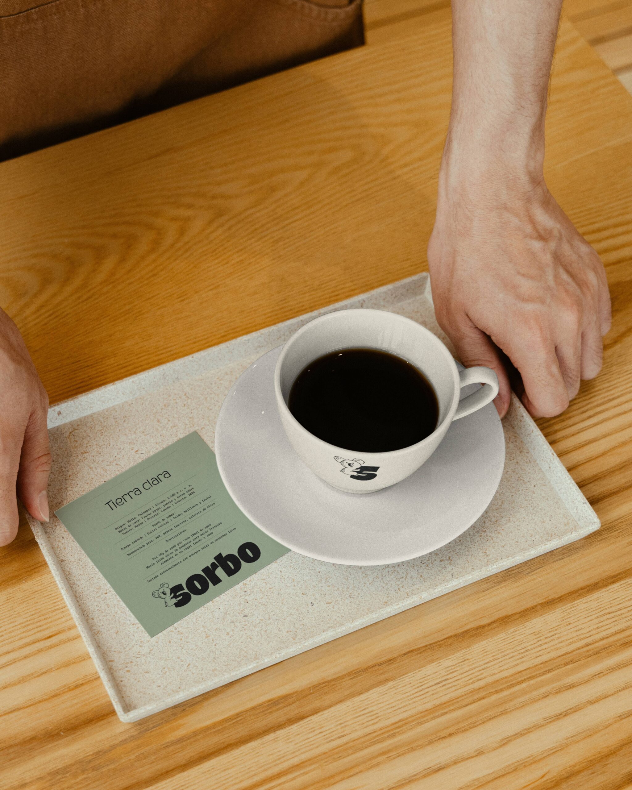
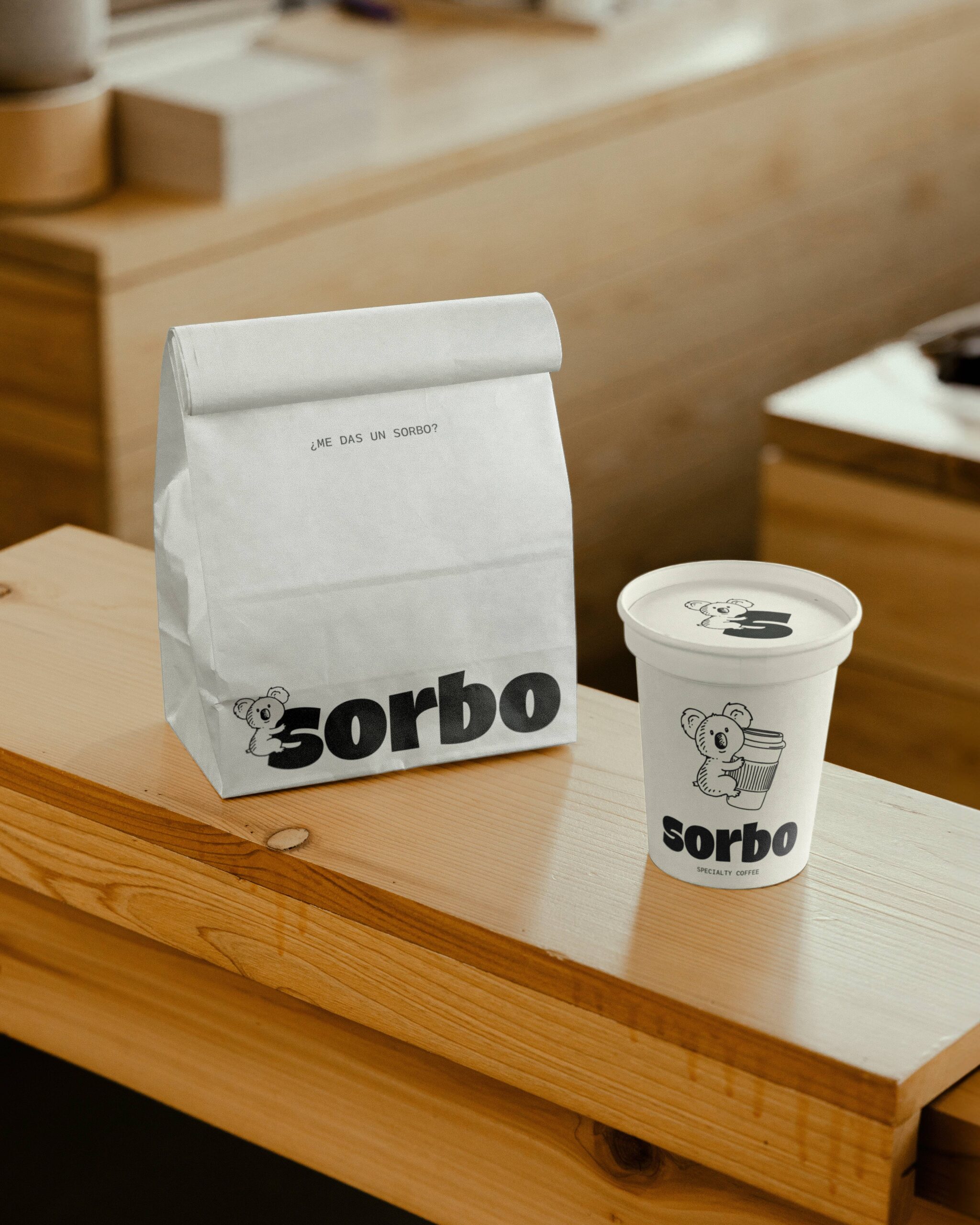
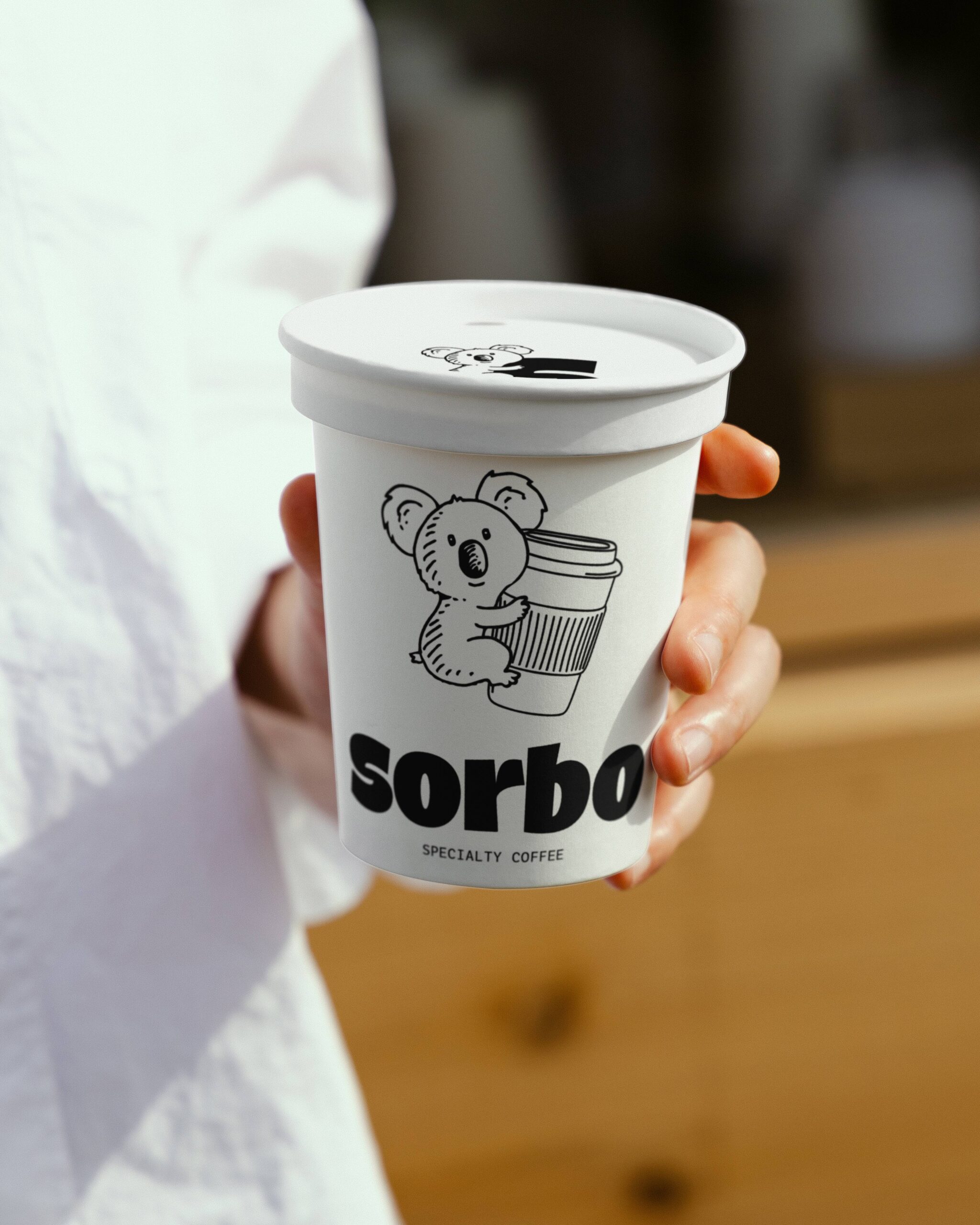
Concept & Positioning
Sorbo is a specialty coffee brand built around a clear duality: taking time to enjoy life without compromising on the intensity of a great coffee.
The brand takes the daily ritual as its strategic territory. Coffee is not simply a product, but a moment of activation, pause, and connection.
The idea of a “sorbo” — a small sip of coffee — becomes the verbal and conceptual thread of the brand: an invitation to share, start the day, slow down, and connect with others.
The positioning combines contemporary coffee culture, approachability, and a strong, distinctive identity within the specialty coffee sector.
Brand identity system
The visual identity is built around a clean, monochromatic aesthetic in black and white, bringing elegance, timelessness, and consistency to the brand.
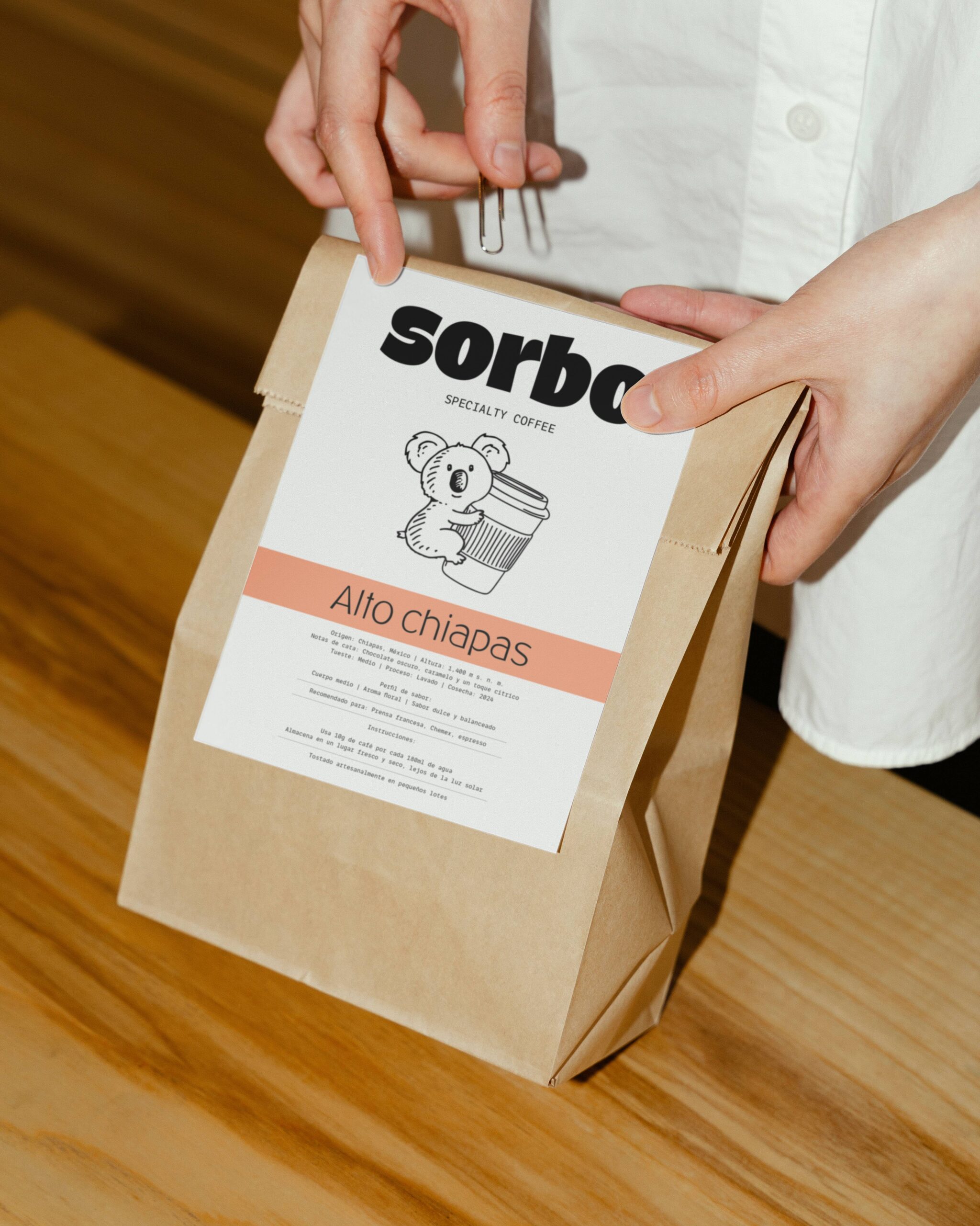
The koala acts as a symbolic device: it represents the state before the first coffee of the day, humanizing the brand without compromising its sophistication. Its use is carefully controlled within the graphic system to maintain a balance between character and professionalism.
Contemporary typography, clear composition, and a direct visual language come together to create a recognizable, versatile, and scalable identity.
Brand identity system
a identidad visual se apoya en una estética limpia y monocromática (blanco y negro) que aporta elegancia, atemporalidad y coherencia.
The koala acts as a symbolic device: it represents the state before the first coffee of the day, humanizing the brand without compromising its sophistication. Its use is carefully controlled within the graphic system to maintain a balance between character and professionalism.
Contemporary typography, clear composition, and a direct visual language come together to create a recognizable, versatile, and scalable identity.

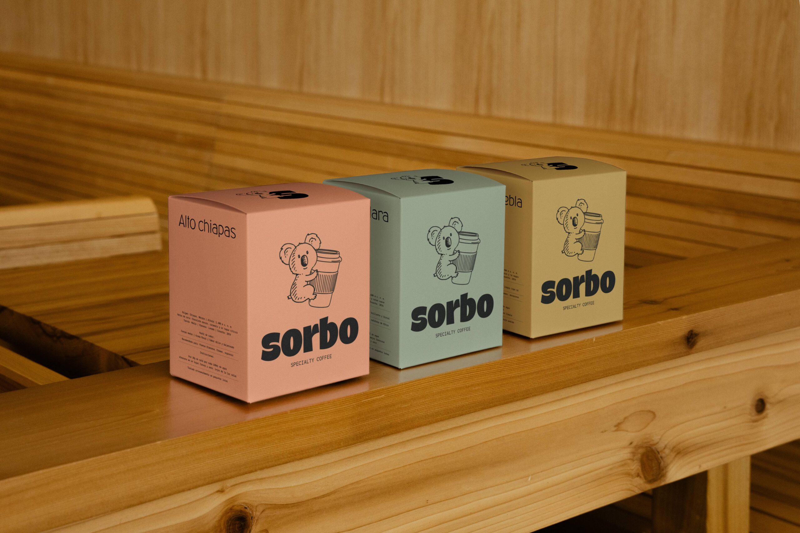
Color System & Applications
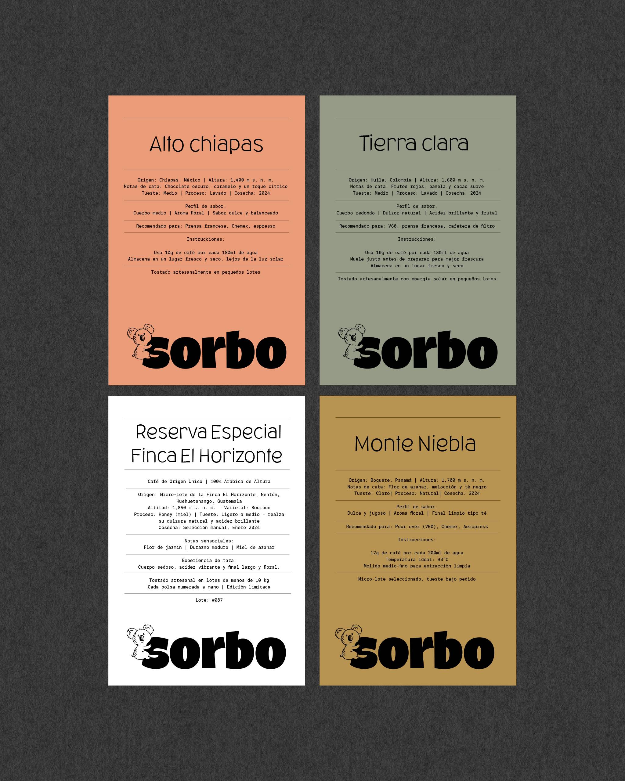
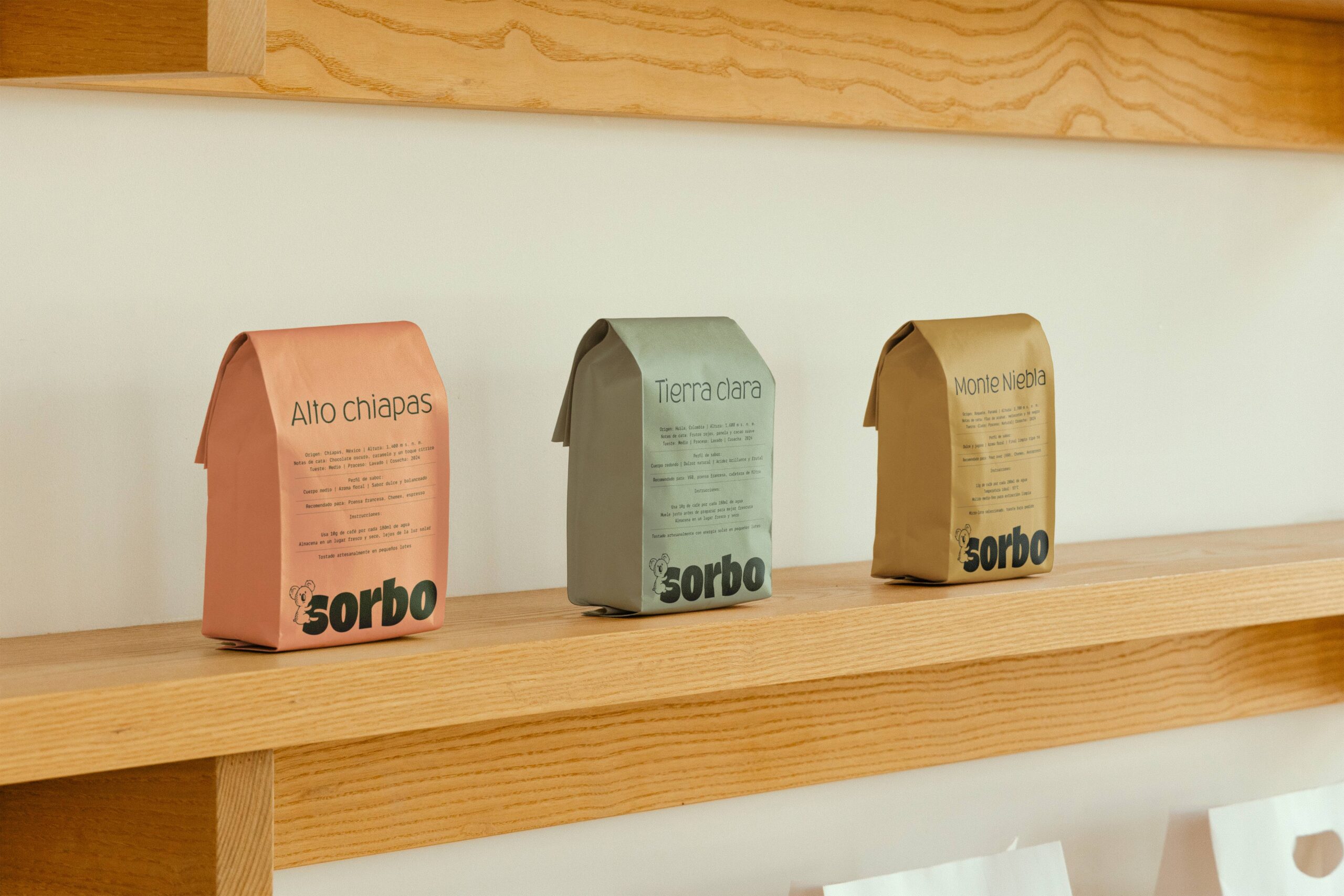
Although the visual foundation is restrained, each coffee variety is given its own distinctive color. This approach helps differentiate products, organize the range, and introduce dynamism without compromising overall consistency.
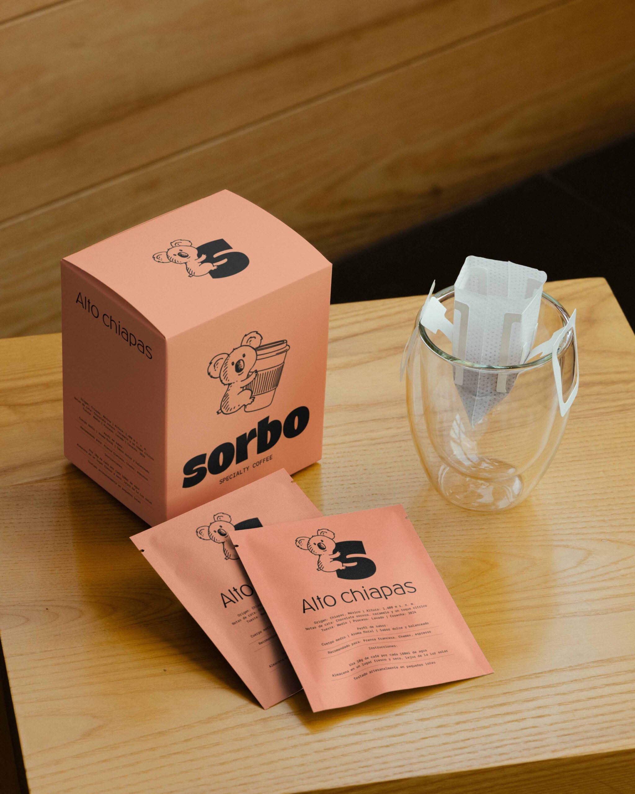
The system extends across packaging, digital communications, and corporate materials, ensuring consistency across every touchpoint.
The result is a contemporary, strategic brand that turns coffee into an experience, strengthening its emotional connection while maintaining a strong position within the specialty coffee segment.