Ephemera Chocolates
- Branding
- Packaging
Rebranding project for Ephemera Chocolates, a brand specialising in artisan gourmet chocolates.
The objective was to elevate its visual positioning while preserving its essence and strengthening the premium experience across every brand touchpoint.
Concept
Ephemera speaks of the ephemeral: the brief yet intense pleasure of tasting a chocolate.
The rebranding is built around this idea — the beauty of the moment — combining sophistication, delicacy and a contemporary aesthetic.
The identity needed to reflect the duality between artisan tradition and innovation, communicating exclusivity without losing its minimalist character.
Symbolic identity
The symbol —a butterfly subtly suggesting the silhouette of a chocolate bonbon— remains a central element of the system.
The butterfly represents lightness, transformation, and evolution.
At the same time, it conveys the ephemeral nature of the pleasure of chocolate and the brand’s constant pursuit of excellence.
Logo & Visual system
The logo adopts a refined and balanced aesthetic, aligned with the world of fine chocolate.
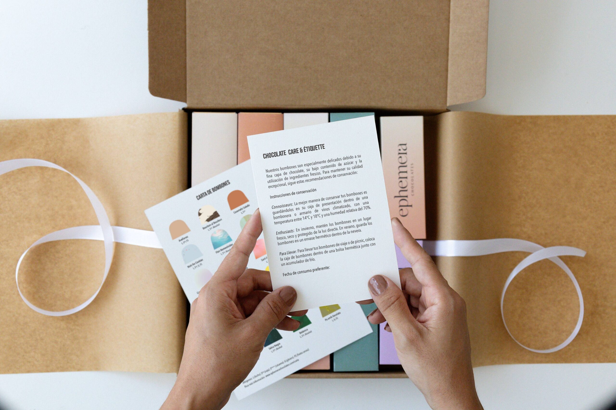
A cohesive visual system was developed across everything from corporate identity to packaging and the customer experience, ensuring consistency in every detail.
Logo & Visual system
The logo adopts a refined and balanced aesthetic, aligned with the world of fine chocolate.
A cohesive visual system was developed across everything from corporate identity to packaging and the customer experience, ensuring consistency in every detail.
Packaging
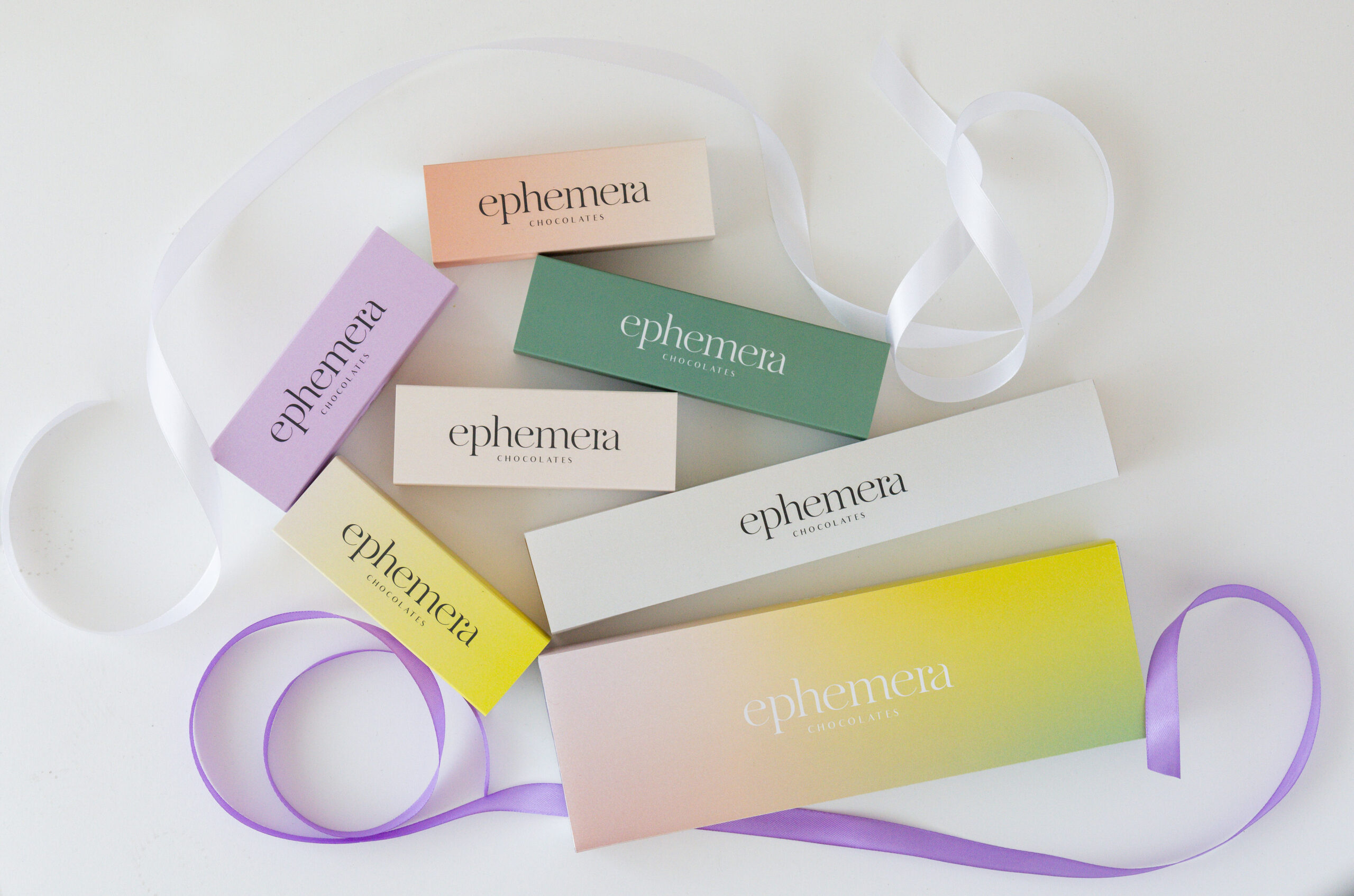
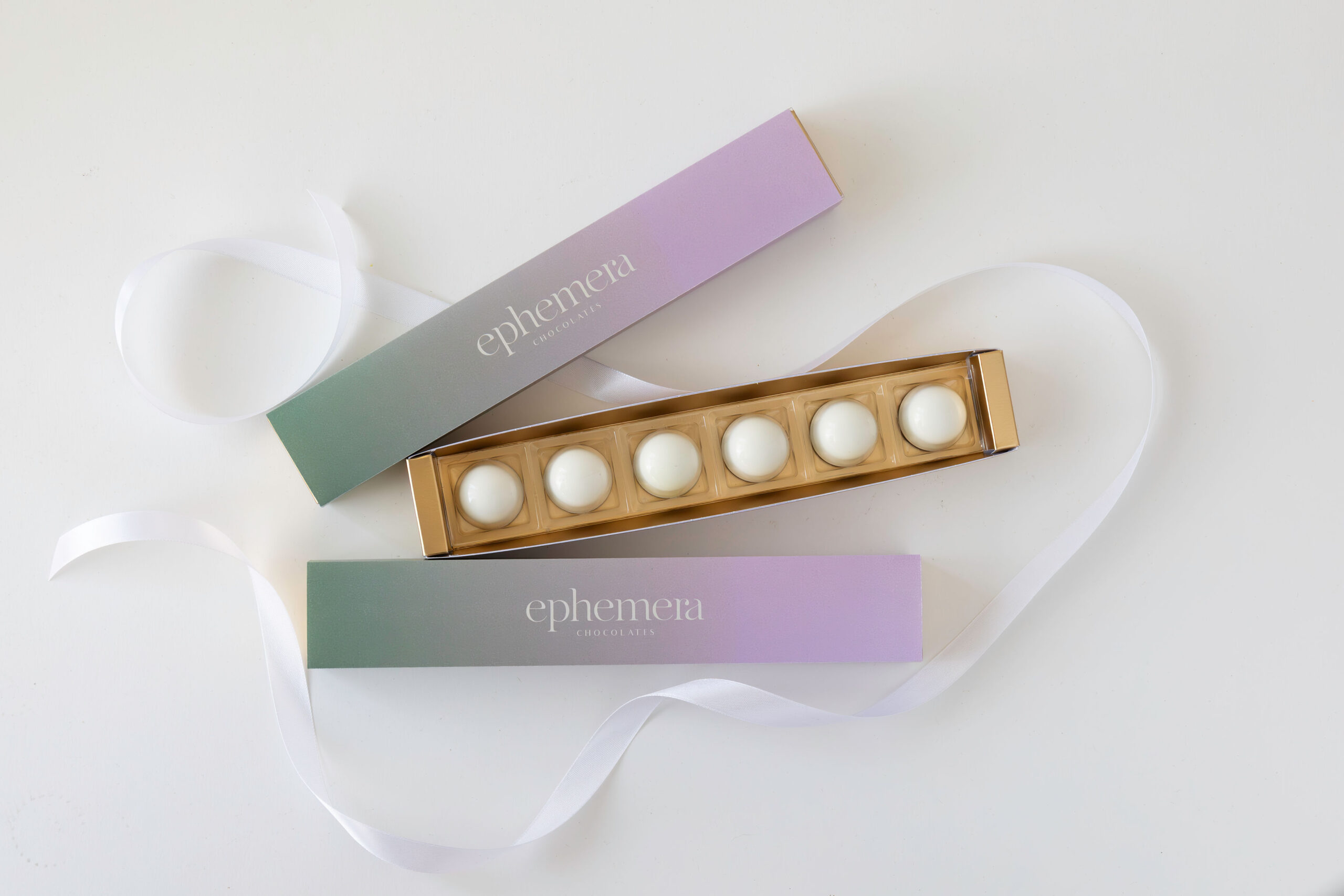
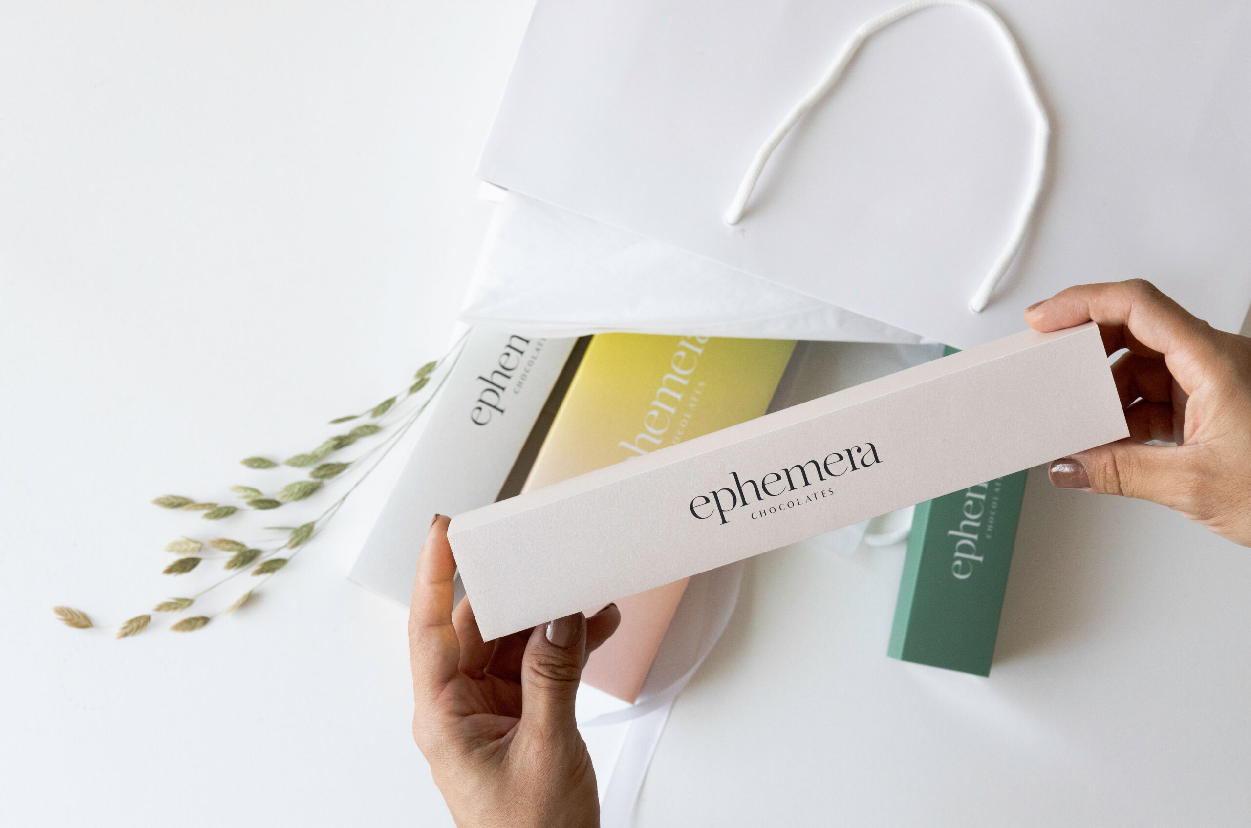
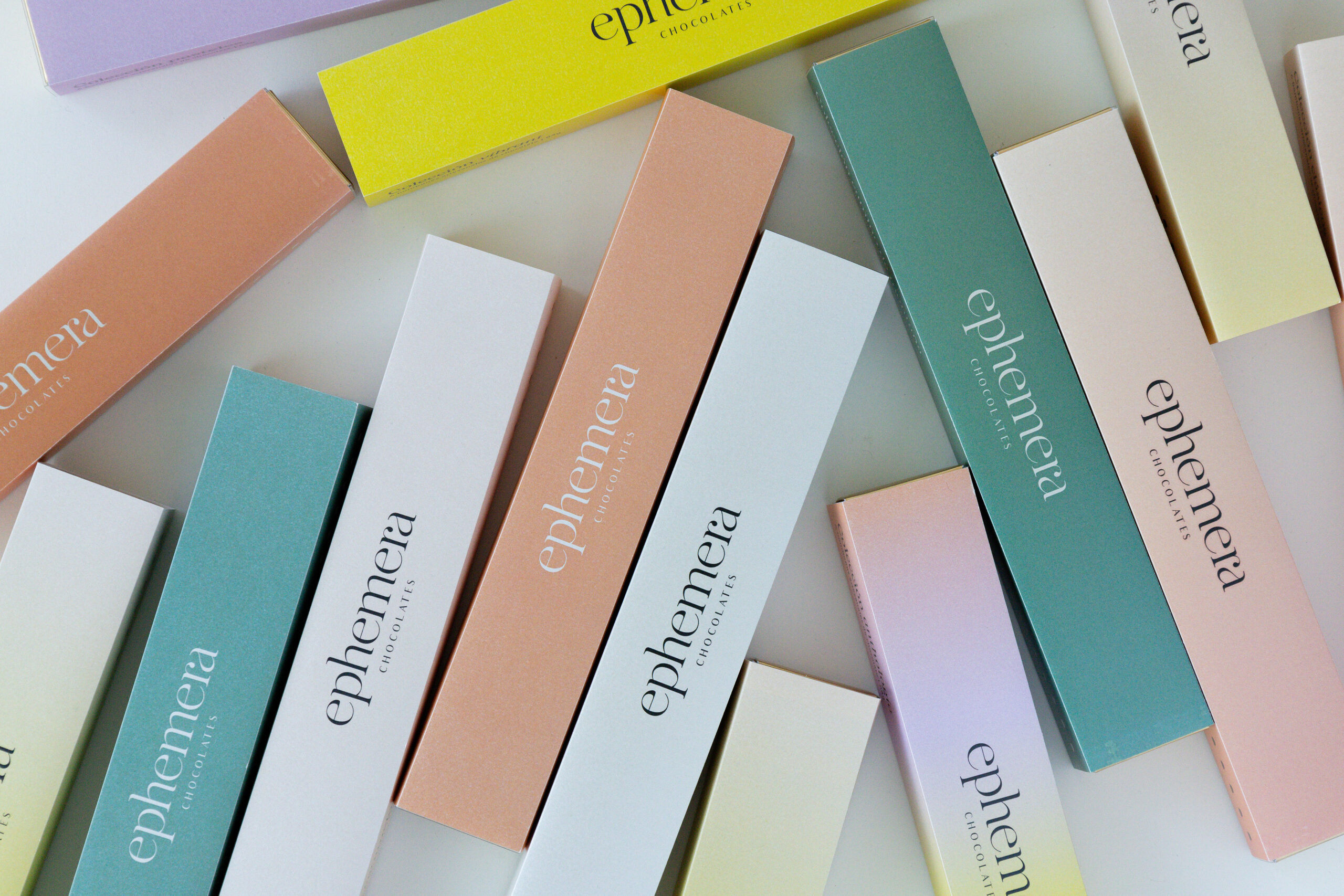
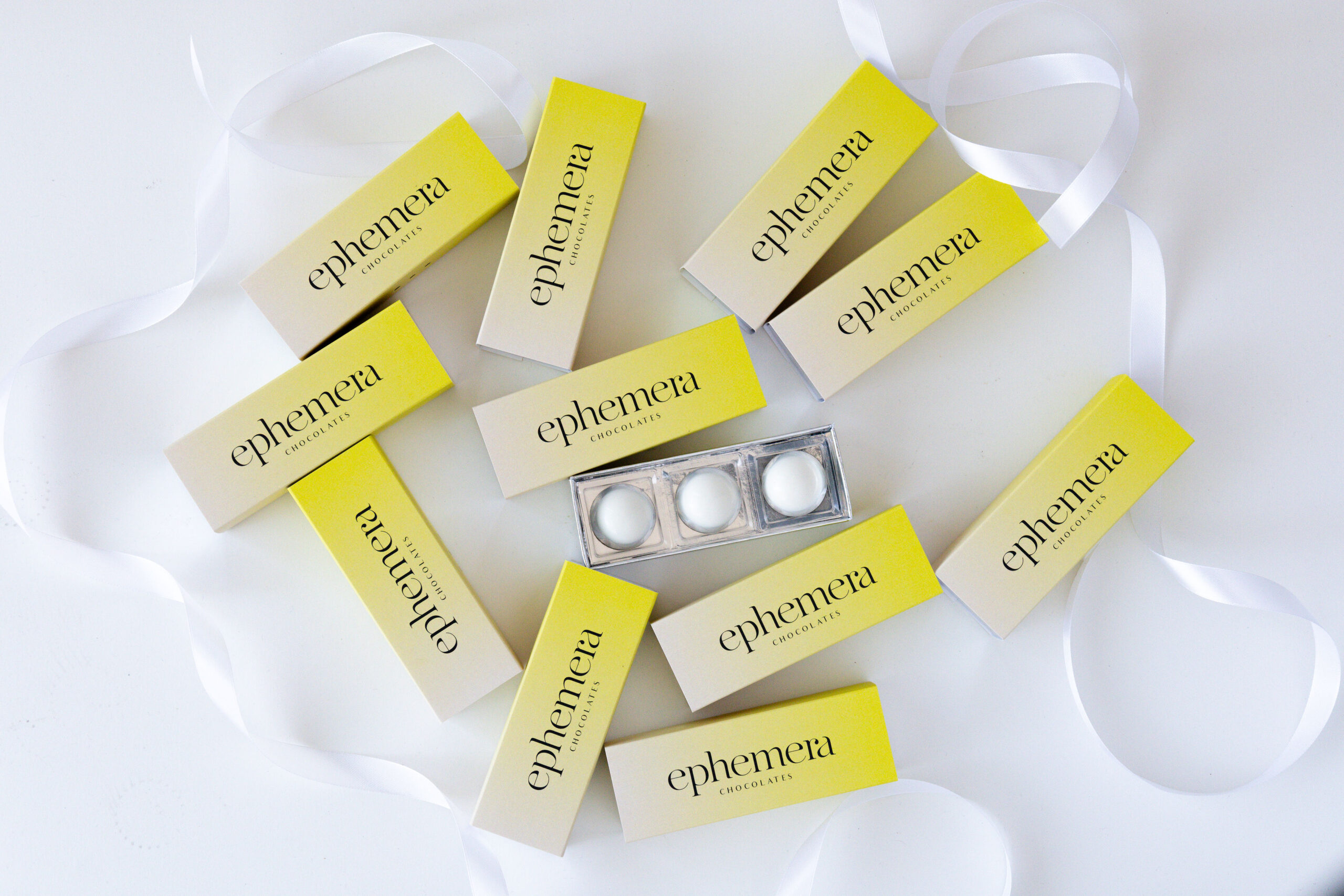
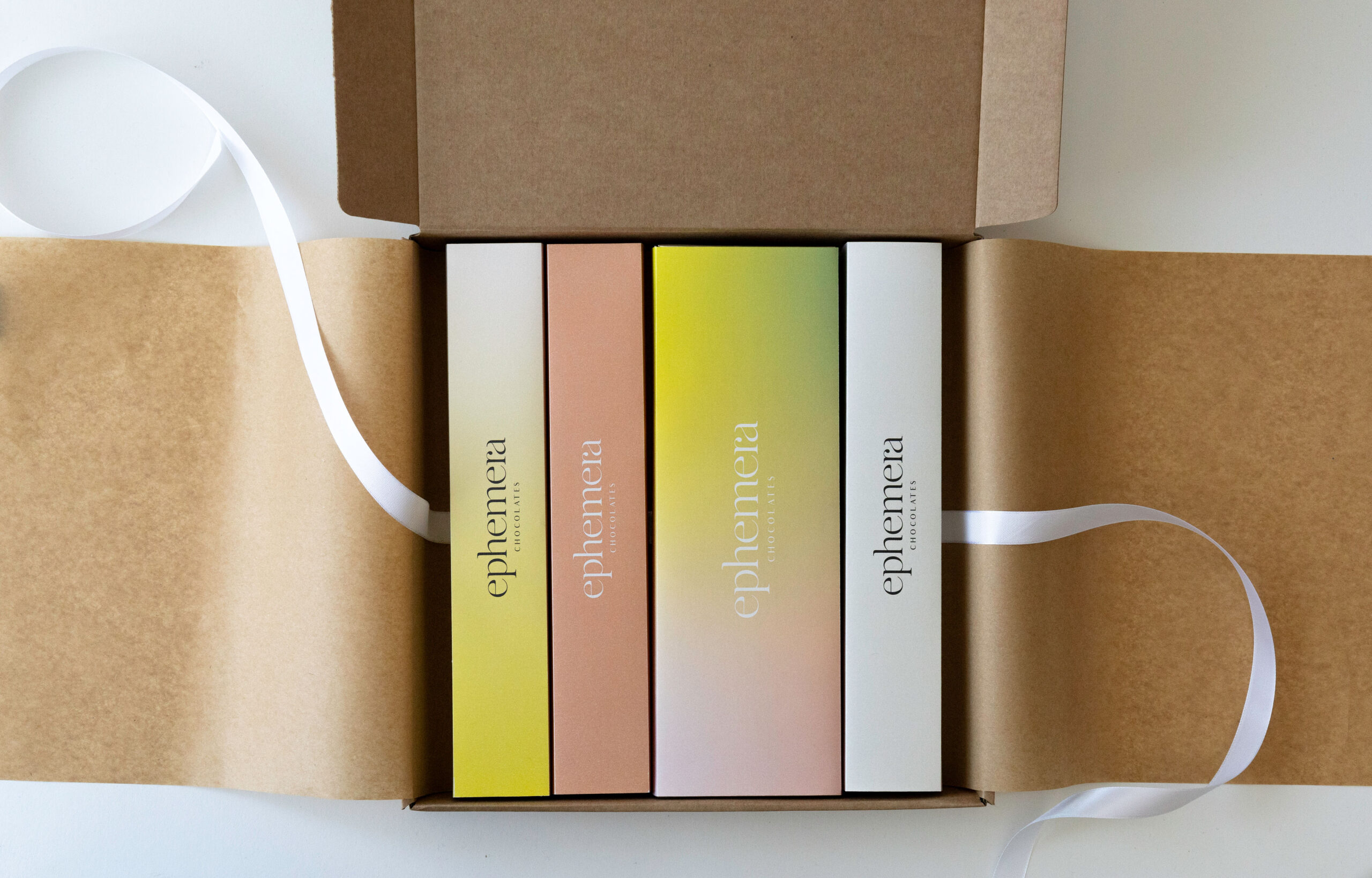
Gradients become a distinctive element of the new visual language.
This colour treatment symbolises the fusion of flavours on the palate and the ephemeral nature of the chocolate: a brief pleasure that leaves a lasting impression.
It also creates clear differentiation from the category’s more traditional aesthetic, positioning the brand in a more modern and forward-looking territory.
Color, Textures & Materials
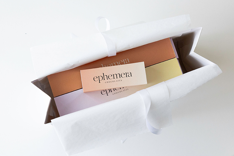
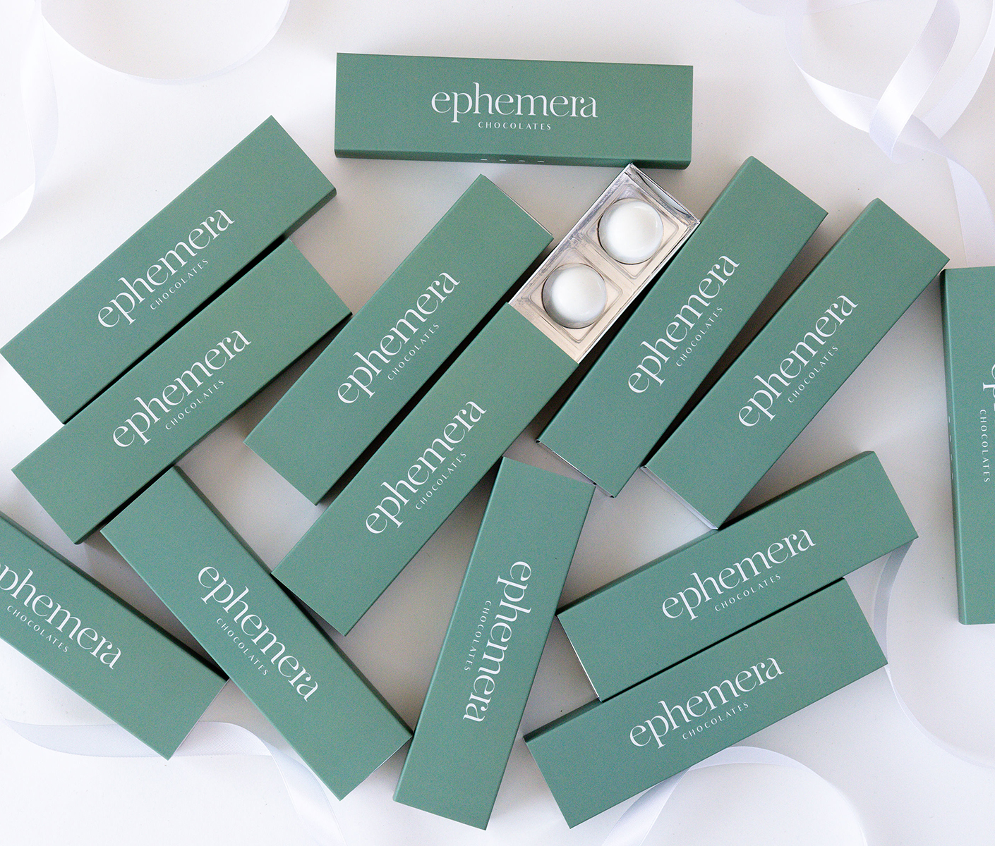
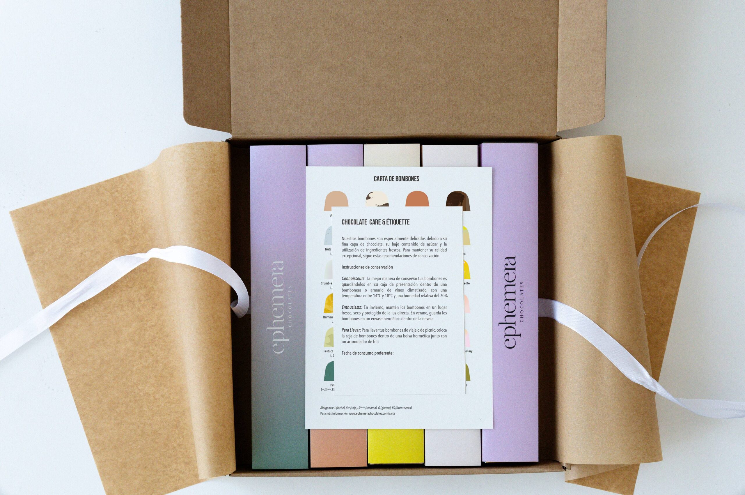
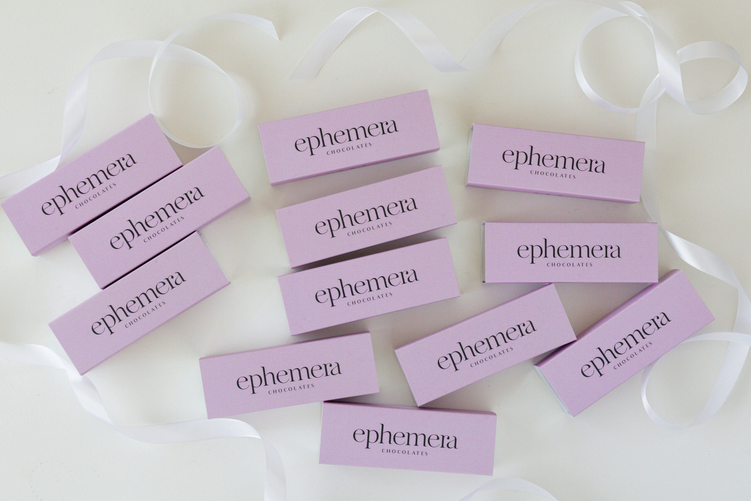
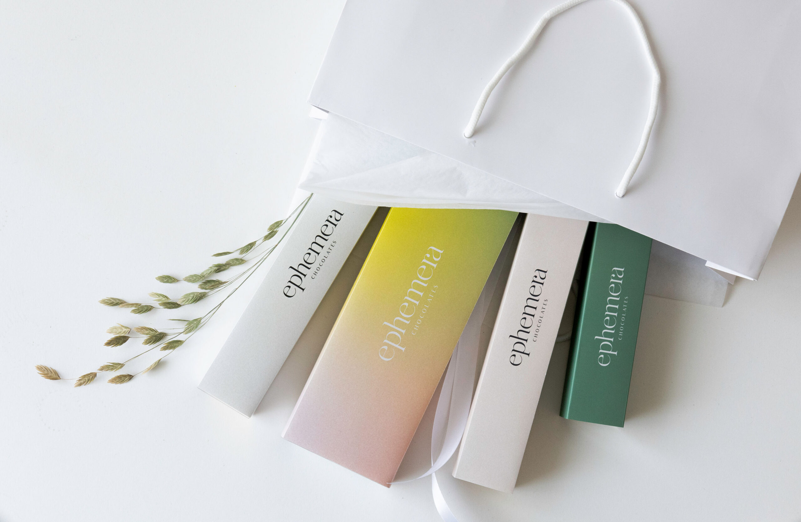
The color palette and material selection evoke the warmth, depth, and indulgence of chocolate.
Textures and finishes reinforce the artisan and exclusive perception, creating a sensory experience consistent with the product.
Color, Textures & Materials
The color palette and material selection evoke the warmth, depth, and indulgence of chocolate.
Textures and finishes reinforce the artisan and exclusive perception, creating a sensory experience consistent with the product.