Quesoteca
- Branding
- Packaging
- Illustration
- Social Media
A rebranding project for Quesoteca, a brand specializing in the selection and sale of high-quality cheeses.
The brief was to evolve its visual identity towards a more mature and sophisticated language, while preserving the warmth and authenticity that have always defined the brand.
Concept & Positioning
The strategy focused on strengthening Quesoteca’s core strengths: tradition, product excellence, and human values.
The brand needed to communicate a dual dimension: expertise and quality, combined with honesty and humility in its approach. The goal was to consolidate its positioning as a benchmark for premium-quality cheese, while making it accessible through a warm and transparent experience.
This balance between authority and approachability became the conceptual foundation of the project.
Brand identity system
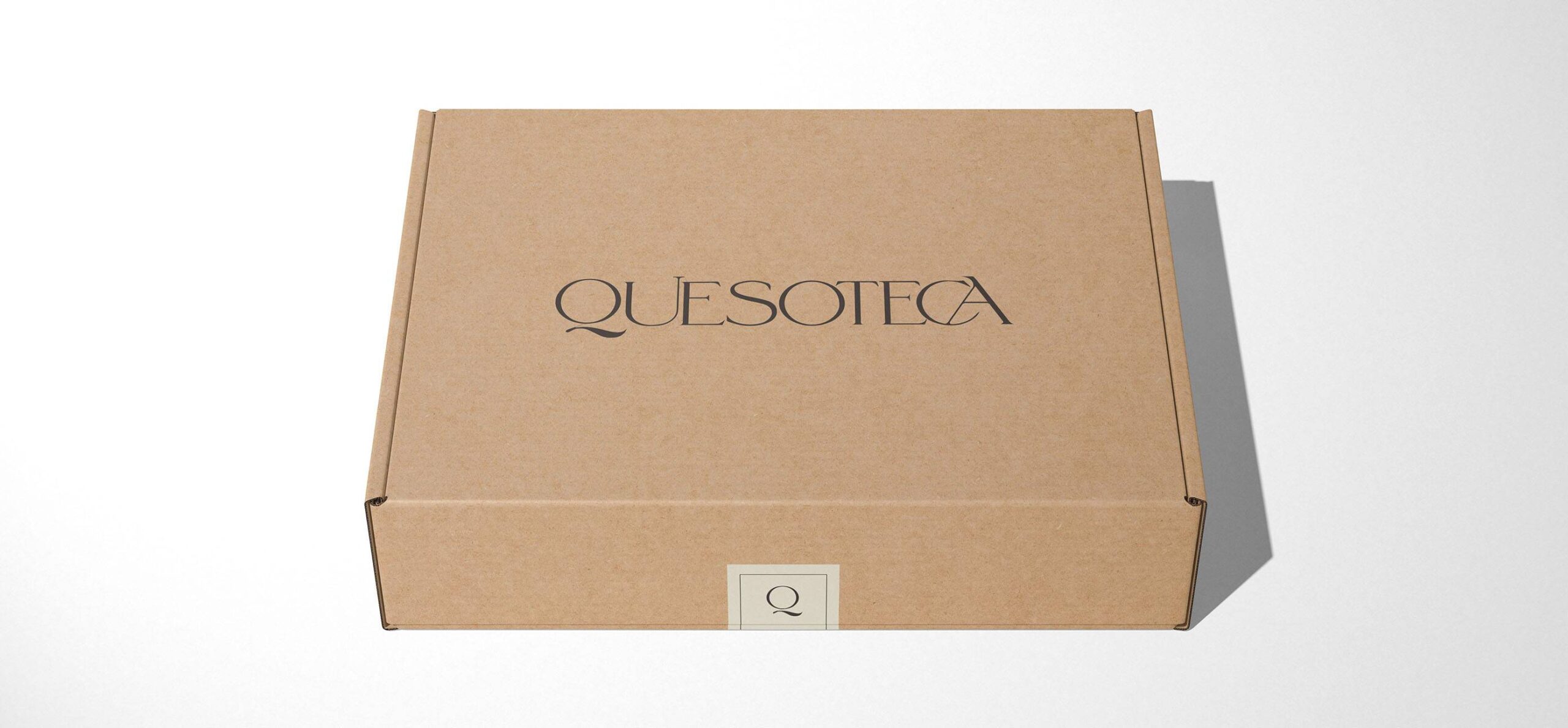
Typography becomes the core of the identity. A classic and elegant serif typeface was selected, with the “Q” taking center stage within the overall composition.
Each character was carefully refined to emphasize its serifs and evoke the tradition of written forms and the historical heritage associated with regions such as Castilla y León, Zamora, and Salamanca. This typographic construction adds cultural depth and reinforces the perception of heritage and expertise.
The color palette complements this approach, bringing a sense of restraint and coherence to the visual system.
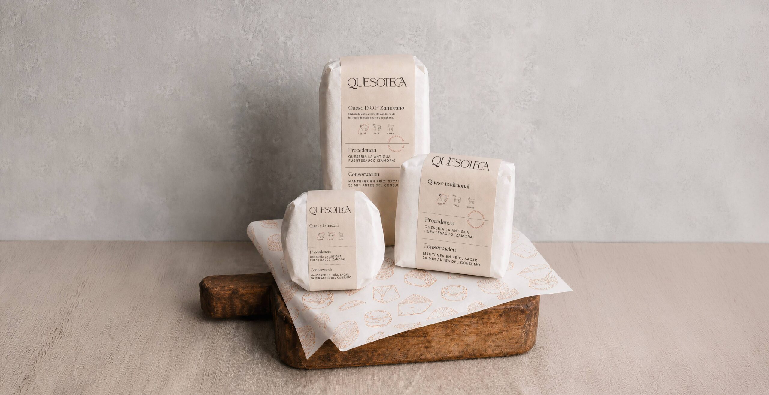
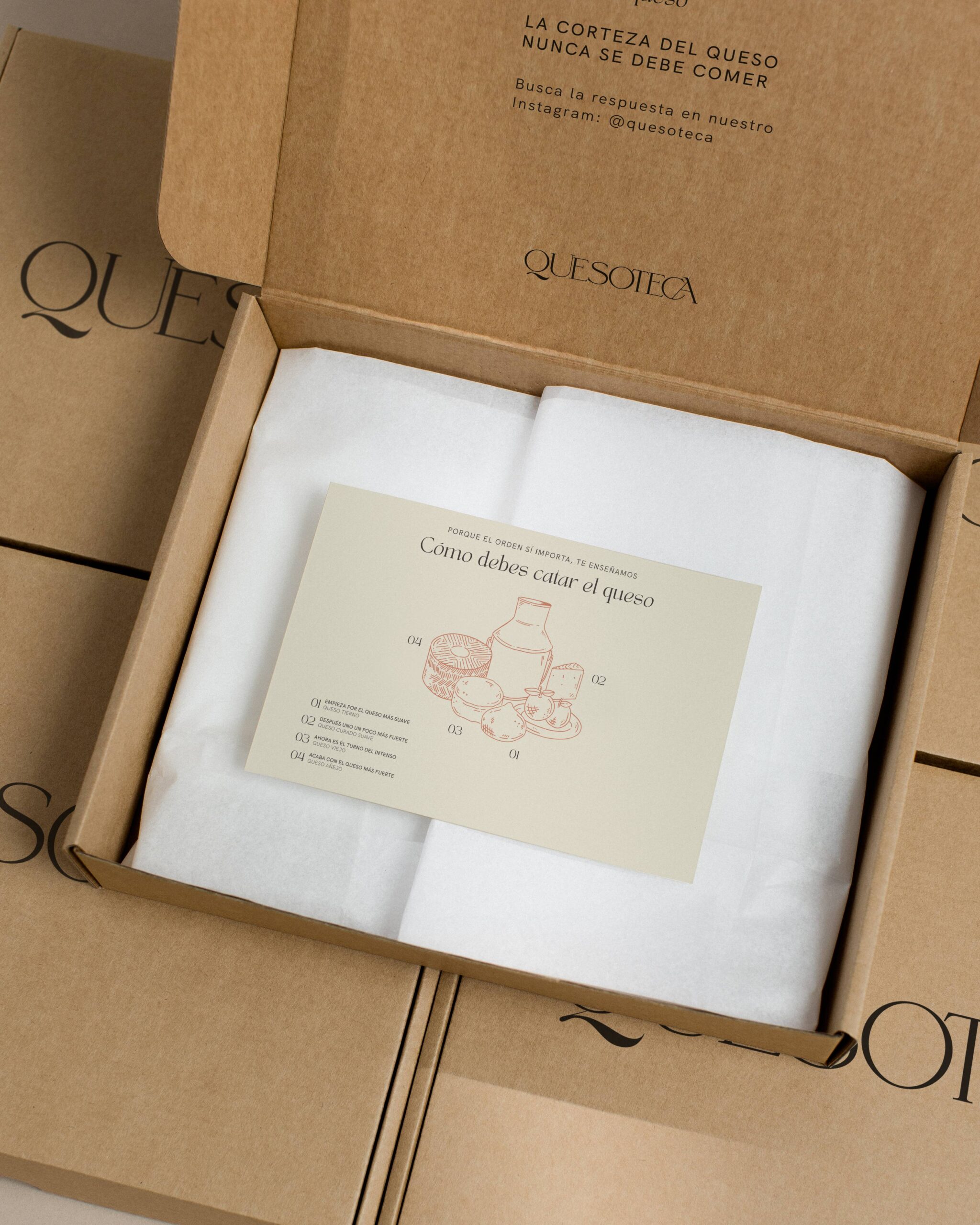
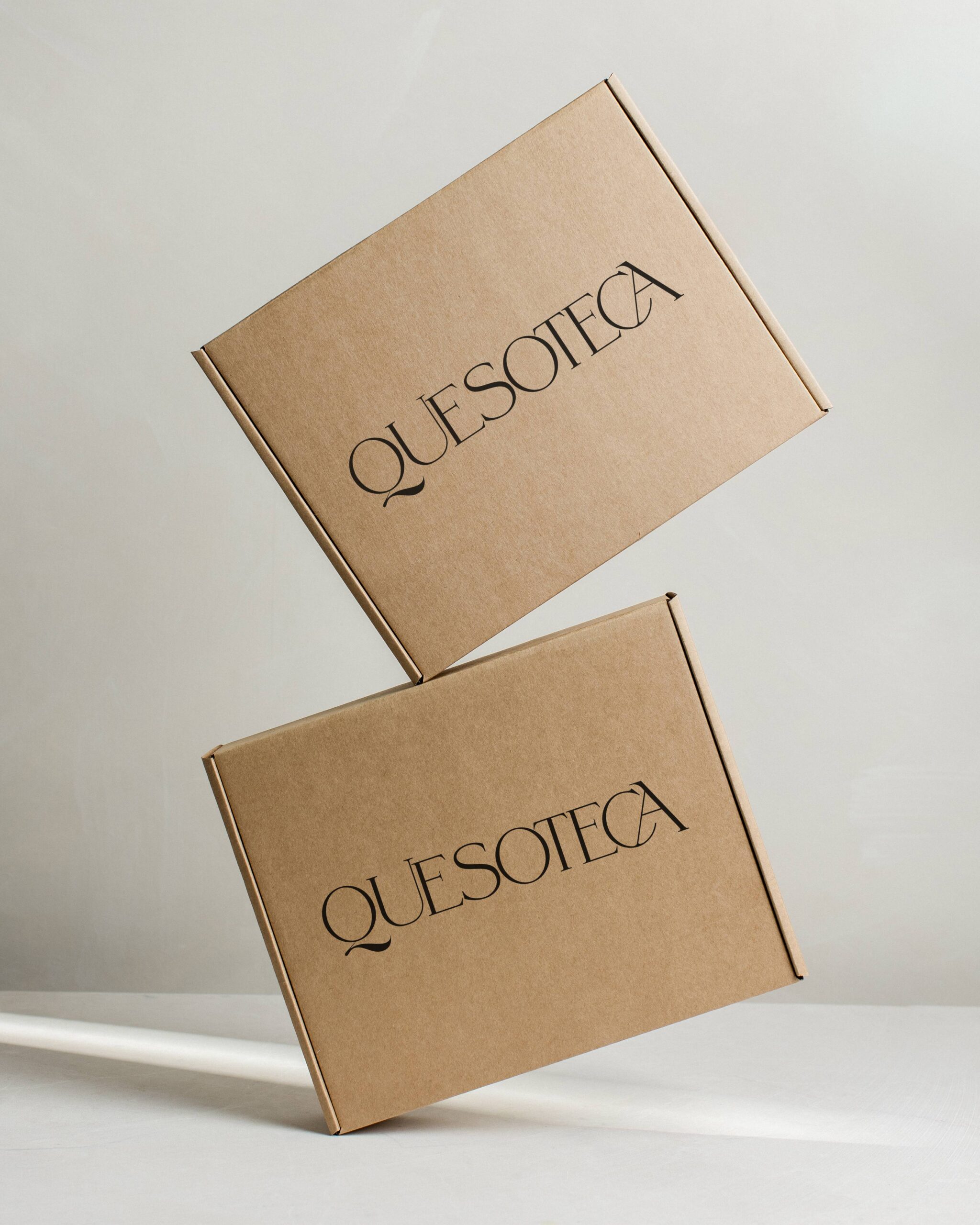
Packaging & Graphic System
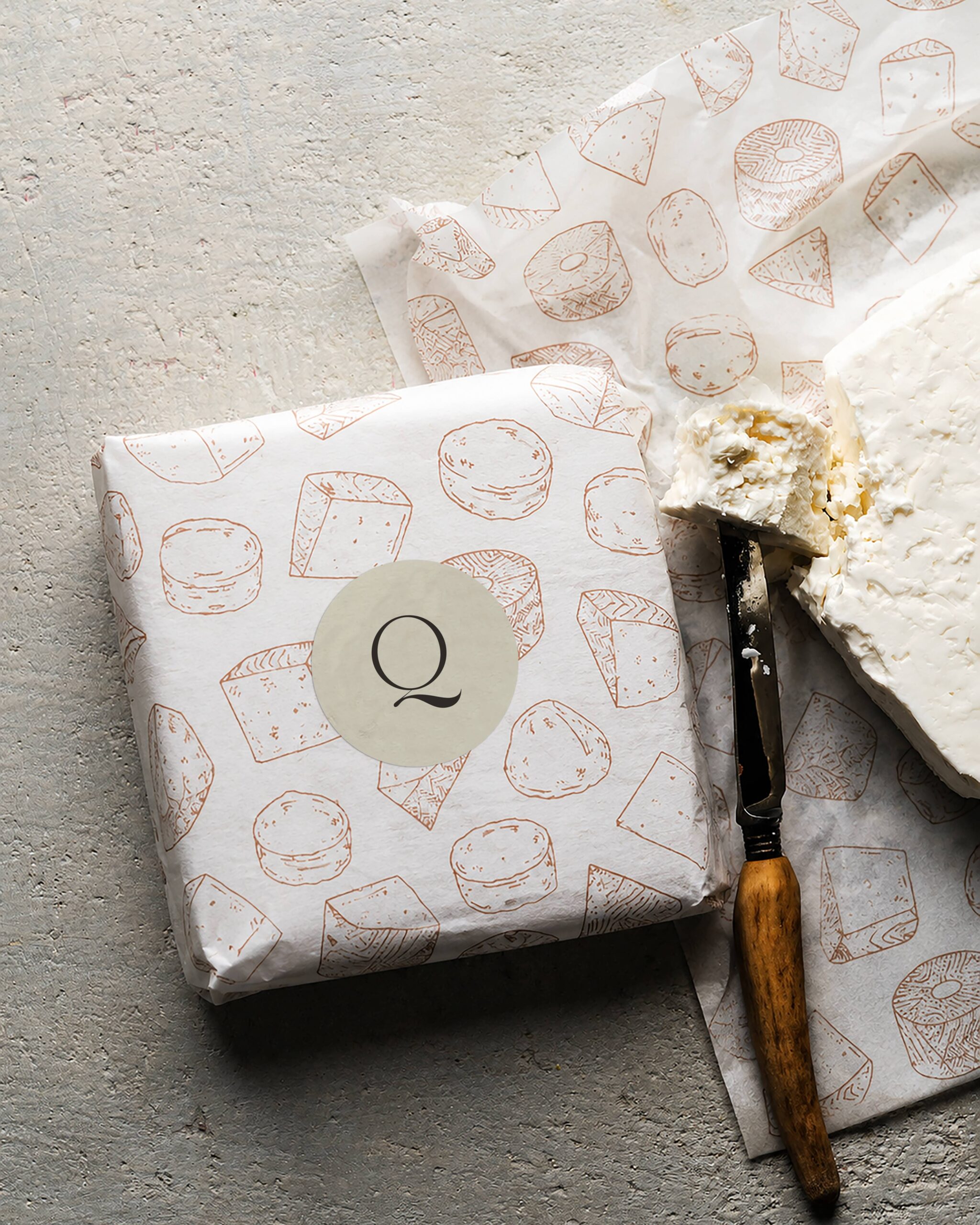
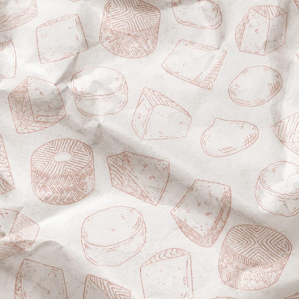
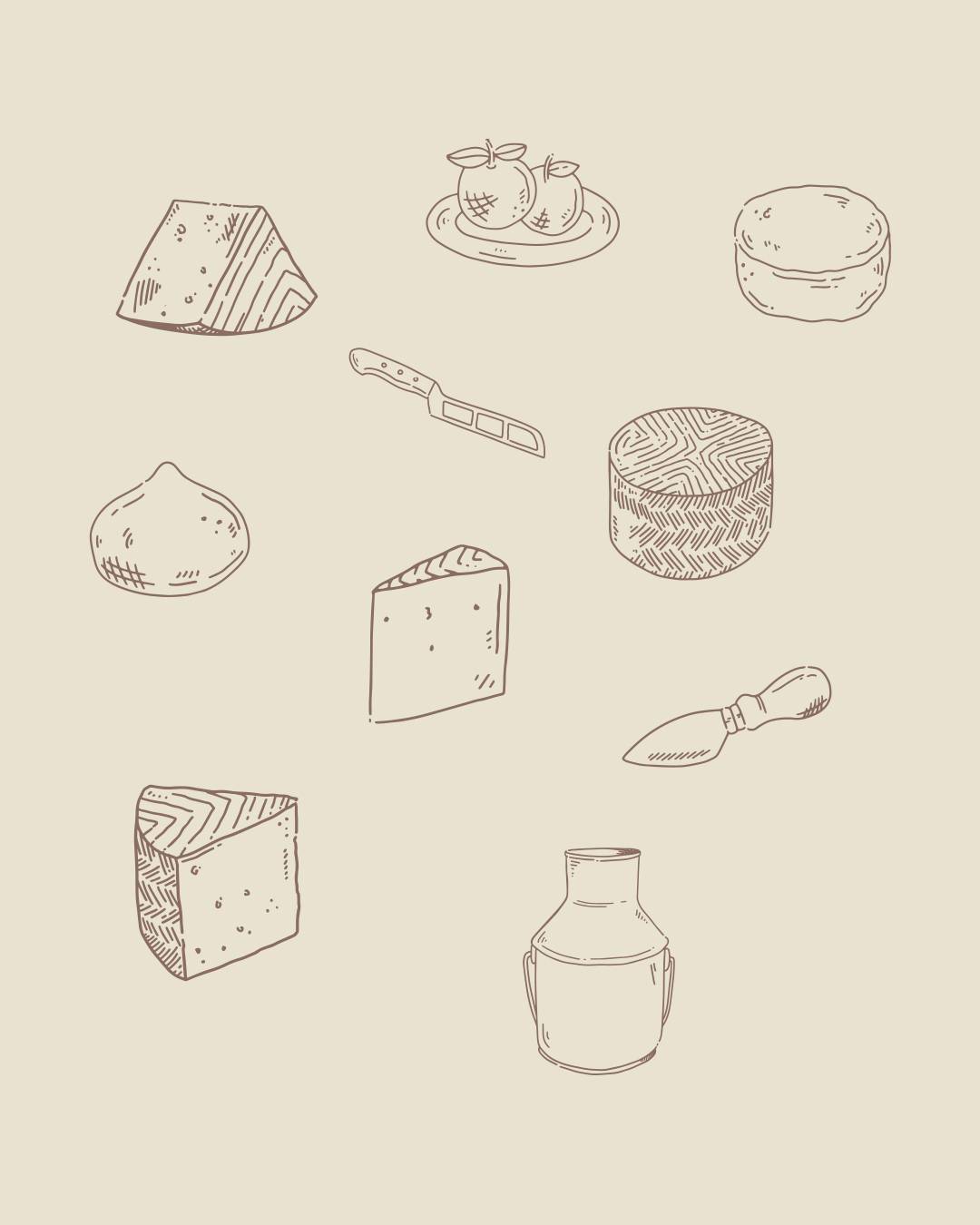
The development extended to the complete packaging system, incorporating custom illustrations that reinforce the brand’s artisanal and human character.
These illustrations balance the typographic elegance with a more approachable visual language, creating a strong and recognizable identity across every touchpoint.
The result is a visual evolution that matures the brand without losing its essence, strengthening its positioning as a trusted specialist within the sector.